blankblank blank


Archive Page 10 of 106


Easy Heat Maps From Spreadsheet Data With OpenHeatMap

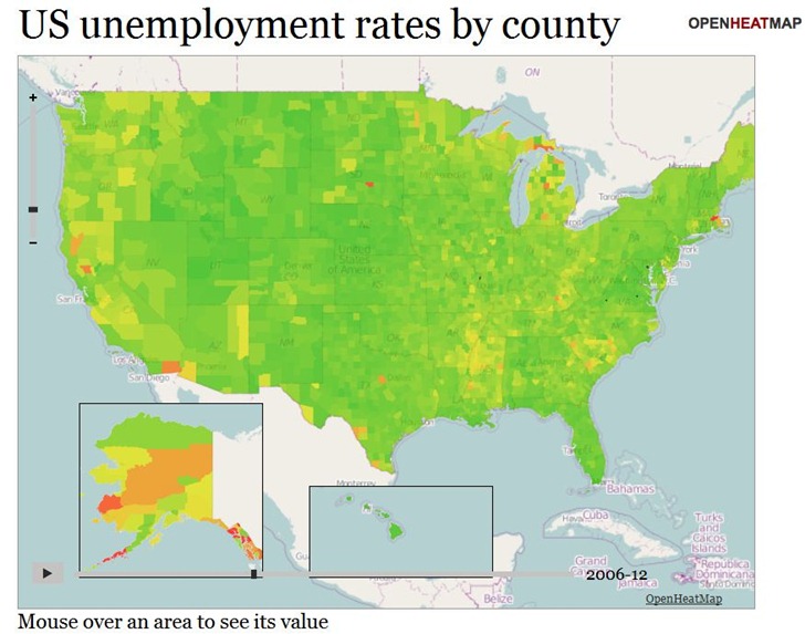
The OpenHeatMap site lets you create heat maps and choropleths from uploaded spreadsheet data (CSV format), or Google Docs Spreadsheet data (which makes it continuously updatable). It supports location coding by latitude/longitude coordinates, or by a large number of name/code attributes (e.g. address, FIPS code, zip code, state, province, country). And as a bonus, you can also have time as a variable, letting you create animated heatmaps or choropleths. Here’s a snapshot of a time-animation of US unemployment by county (see the live map here):
ohm1

There’s a gallery of sample maps, some of which are embeddable, like the map below of fast-food locations in the US. It’s still a little buggy; the map on the gallery page lets you select between McDonalds, Subway, and Chik-Fil-A, while this embedded map doesn’t show those options.

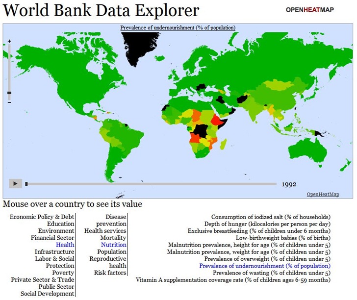
If you’re willing to dive deep into Javascript, you can create fairly sophisticated online maps allowing the choice between hundreds or even thousands of datasets. Below is a snapshot of the World Data Bank Explorer map from the Gallery; this map lets you choose from over 1000 different demographic/economic datasets, and offers animated views over time:
ohm2

But you’ll need to dive deep into Javascript to create such a sophisticated map; there’s a documentation wiki, but the available documentation is a bit sparse. Basic maps are pretty simple to create, though, and the data upload page offers links to sample datasets (Google Docs spreadsheet links) that you can create sample maps with; copying and pasting the Google Docs spreadsheet link addresses into a browser will give you examples of how the data should be formatted.

Here’s a short video from Pete Warden, developer of the site, with a intro to the service:


Basic Google Maps Heat Map

Tixik Heatmaps – Lets you add a basic heat map to a simple Google Maps display. Create a “CSV” file of latitude/longitude pairs, with coordinates separated by a semi-colon, and each pair on a new line:

48.0043953135;0.2025604248

39.7117426603;3.4630966187

42.6976396896;2.8954124451

etc.

(Taken from the sample file).

Put the file online someplace, and then substitute its web address for “CSV_URL” in the Google Maps code below:

var tilelayer = new GTileLayer(new GCopyrightCollection(), 0, 17);
 tilelayer.getTileUrl = function(tile, zoom) {
   return 'http://api.tixik.com/scripts/tile.php?x='+tile.x+'&y='+tile.y+'&zoom='+zoom+'&csv=CSV_URL';
 };
 tilelayer.getOpacity = function() {return 0.7;}
 map.addOverlay(new GTileLayerOverlay(tilelayer));

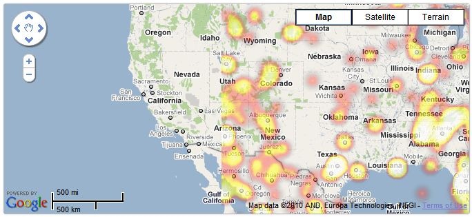
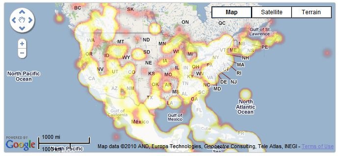
Add this code to your Google Maps embed code, and get a basic heat map (sample map from Tixik website):

heat1

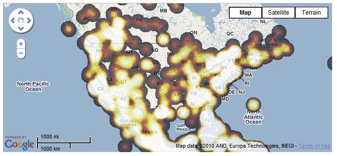
Fast, simple and basic – not a lot of options. Bit quirky/buggy, too – check out this zoomed-in area, which dropped some of the data (rest of the world looked fine:

heat2

Colors can also vary depending on the browser you use; the examples above are from Chrome, while the same map in Internet Explorer 8 looks like this:

ieheat

For quick and dirty heatmaps with Google Maps, Tixik Heatmaps seems like a decent option. But there’s an option for use with other map backgrounds that’s more flexible in display options, data format, and embeddability; more on that tomorrow.


SurveyMapper 1.2 – Now With Embeddable Polls

Posted not too long ago about SurveyMapper, a free site for geographically-enabled survey polls. Earlier versions only let you link to the poll page at SurveyMapper, but version 1.2 now lets you embed the poll on your own site, like this one I banged out in five minutes. The poll below is active; feel free to submit a response:

Had a problem with scroll bars in the original embed; you’ll need to play not only with the Width/Height inputs on the page that contains the embed code, but also in the embed code itself; try increasing the Width and Height by 50-75. You can also still link directly to the poll page at SurveyMapper if you like. Now if they’d only let you embed mapped poll results on your page …


Free 30-Meter-Resolution Elevation Data For Most Of The World From Aster GDEM

A number of sites (e.g. the BBC) have recently posted about the TanDEM-X and TerraSAR-X program, which is generating a worldwide digital elevation model (DEM) database with a horizontal resolution of about 12 meters. A comparison is often made to the best current worldwide database, SRTM-90, which has a poorer 90-meter horizontal resolution and limited coverage at high north/south latitudes. What they don’t usually mention is:

  • SRTM-90 data is available now; the TerraSAR-X dataset won’t be completed until 2014.
  • SRTM-90 data is free, and freely available; the TerraSAR-X program is a public/private partnership, with Infoterra GmbH having exclusive commercial rights to the data. So if you want that higher-resolution data, you’ll almost certainly have to pay for it.

I’ve posted about sources for SRTM-90 data before; what I haven’t posted about is even higher-resolution data available from the ASTER GDEM program . This DEM dataset was “created by stereo-correlating the 1.3 million scene ASTER VNIR archive, covering the Earth’s land surface between 83N and 83S latitudes”. Further data processing was done to fill in voids and fix obvious data flaws. It’s currently freely available from two websites:

  • NASA’s EOS Data Archive. The good news is that the data is here, along with a lot of other earth observation data. The bad news is that it’s a nightmare to find and download the data from this site.
  • Japan’s ASTER GDEM website. Still not an optimal experience, but easier to figure out than the NASA site. You can download DEM data in GeoTiff format in one-degree-square chunks, up to 100 at a time. Free registration is required; use the “Search” link to access the data selection and download pages.

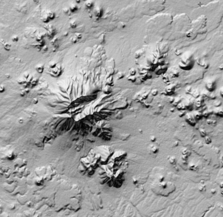
There’s a catch, though – while the GDEM data has a higher horizontal resolution than SRTM-90 data, it also has a lot more artifacts in it, even after being cleaned up. Here’s a SRTM-90 DEM image, 90-meter horizontal resolution:

SRTM

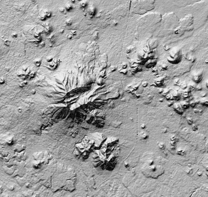
And here’s a GDEM image of the same area, 30-meter horizontal resolution:

ASTER

“ASTER GDEM is a product of METI and NASA”

The improved resolution is obvious, but so is the increased “bumpiness” and other odd features in the GDEM data, artifacts of the data collection/reduction process. Contributing factors to the creation of these artifacts include cloud cover, vegetation type, land type, and man-made features (e.g. the linear feature running N/S in the image above is US Highway 89). There’s a Validation Report that goes into the reasons behind all these artifacts; their final conclusion is that the data should be treated as “experimental” or “research-grade”, but with the hope that future refinements might improve its qualities. If you can live with the resolution of the SRTM-90 data, that’s probably a better choice; but if your area of interest isn’t covered by SRTM-90, or if you absolutely need higher horizontal resolution and can live with the artifacts, ASTER GDEM could be a useful alternative.

Note: the original data of ASTER GDEM is the property of METI and NASA.


New Version Of USGS dlgv32 Geodata Viewer Released

The old USGS geodata viewer dlgv32 was the code foundation for the excellent Global Mapper data viewer and format converter. Global Mapper has granted the USGS a license to continue to release a feature-limited version of Global Mapper under the dlgv32 Pro name, primarily as a data viewer.The latest version of dlgv32 Pro was released a few weeks ago, and includes both 32-bit and 64-bit versions.

The main limitations of dlgv32 are the inability to export data, and the limitation of four raster data files loaded at one time; you can get around this latter limitation by putting all the raster files into a single directory, and then using the File => Open All Files in a Directory Tree option. It has import support for virtually any vector and raster data format you can think of, as well as most projections/datums. There’s also access to online raster data sources, including high-resolution Digital Globe imagery (watermarked, with a daily quota), along with USGS topo maps and black-and-white ortho imagery. Additional features include GPS support, measurement tools, and data attribute query tools. The lack of any export capabilities (except perhaps by doing a screen capture), as well as no way to save a workspace, are big minuses, but it’s still worth a look.

HT to Tyson Domer.


Where’s The Path – UK OS Mapping Viewer And Tool

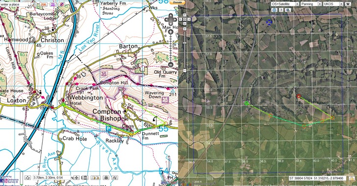
Where’s The Path lets you display UK Ordnance Survey 1:50K topographic maps side by side with other kinds of maps, including:

  • Google roads/satellite/terrain/hybrid
  • OpenStreetMap
  • 1930s and 1940s OS maps

Cursor movement on one map is mirrored in another; you can import  GPX/KML files, and also draw features on the map and export them to in GPX/KML format. Overlay multiple types of grids (lat/long and UKOS); toggle a Panoramio layer to see photos taken at locations within the map view:

wheresthepath

Most annoying aspect is that it’s only for the UK; wish someone could put something similar together for the US.

HT to Trev Broomfield.


Hand-Drawn Maps

A few sites with collections of hand-drawn maps, cartography with a more human feel than what you often get online, or from a GIS. Click on the titles to visit the site. Your suggestion for other sites are welcomed in the comments section.

subk.net

the conventional function of a map is to contain universal symbols and keys; icons that people will recognize as streets, monuments, etc. As in organized tours, they emphasize what is commonly thought of as interesting and important.

i collect personal maps people draw. one’s memory and perception of a place is very personal, so each is a reflection, however small or large, of how the individual connects to their environment: knowing, organizing, and understanding it.

in short, each one is a small token of memory and experience, whether created in order to help me understand a place, to direct me to the nearest gas station, or as an answer to my persistent requests to find the local gem of a strange little town. feel free to browse my MAPSPROJECT.


Hand Drawn Map Association

Annotated gallery of hand-drawn maps, plus artist collections.  New contributions solicited.


MollyMaps

MollyMaps is a cartographic project devoted to celebrating the places that matter to us both as individuals and as communities, through the engagement of hand-drawn mapping practices.


Online GPS Satellite Geometry Error Predictions

Two of the factors in determining the accuracy of your GPS positions measurement are how many GPS satellites are visible from your location, and how evenly distributed over the sky they are. Generally, the more satellites that are visible, and the more evenly they’re distributed, the more accurate your position. This is expressed numerically by a parameter called the Dilution Of Precision, DOP for short; the smaller the DOP, the more accurate your GPS position is likely to be.

A few consumer-grade GPS receivers will show you the current DOP; more advanced commercial models can show you a predicted plot of DOP over the course of the day, useful in figuring out the best time to get an accurate position measurement. I’ve posted previously about the free Trimble Planning software, Windows-only software that can generate plots showing the change in DOP over the course of a day. For non-Windows people, there’s now a limited online tool from Ashtech (formerly Magellan Pro) called Web Mission Planning that can provide you with some of that information.

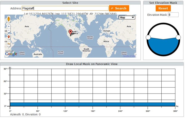
Select your desired location from the first screen – it defaults to your current IP address’s location.  Elevation Mask sets the minimum altitude that a GPS satellite needs to have to be considered in the calculations, a simple way to account for sky blockage by objects like trees and buildings. There’s also a “Local Mask” tool at the bottom that lets you fine-tune that blockage to account for individual objects:

wmp1

You then select a single date, a start and stop time during that date, and which satellites you want to use for the calculation: GPS (the US system), GLONASS (the Russian system, not used by most GPS units), and SBAS (the WAAS/EGNOS real-time correction system). You’ll then get your choice of four plots, some with interactive components.

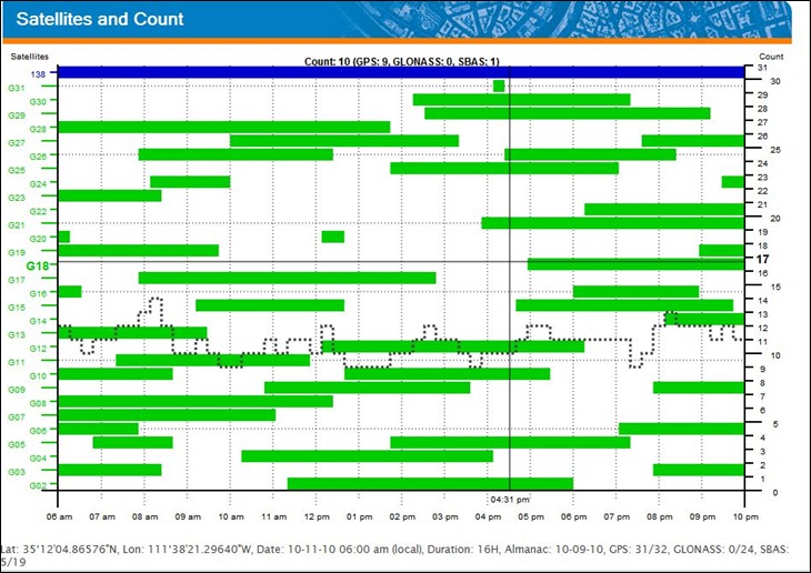
1. The total number, and ID numbers, of satellites visible at any time (interactive; move the cursor over the plot to get more info):

satellitecount

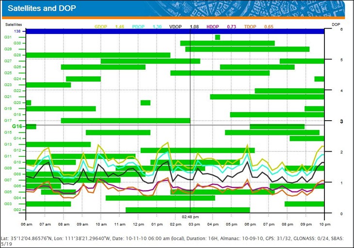
2. A similar plot, but with DOP plotted in colored lines:

dop

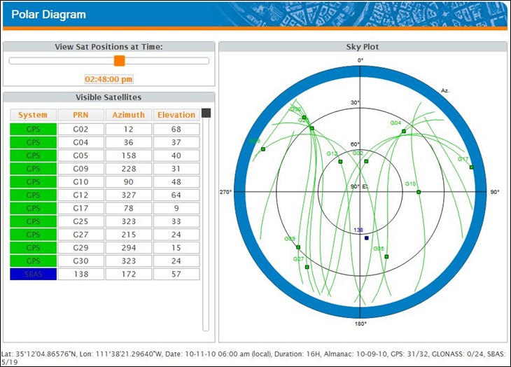
3. A polar diagram that shows the satellite positions in the sky; change the time interactively by moving the slider at upper-left:

polar

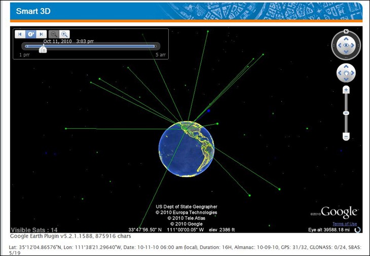
4. A Google Earth plugin view that shows the satellites and the line of sight to your location; a time animation control runs through the entire specified time duration. Fun to watch, but not terribly useful:

gegps

Biggest problems with the site are the cluttered diagrams, and the inability to print or output the data into a more convenient format for use in the field; the only option for the latter is to do a screen capture. So if you already have a copy of Trimble Planning software, you can probably skip this site; that program has better controls, and more output options. But if you’re not running Windows, or don’t have access to Trimble Planning, the Web Mission Planning site might be a useful alternative.

Via GPS Tracklog.