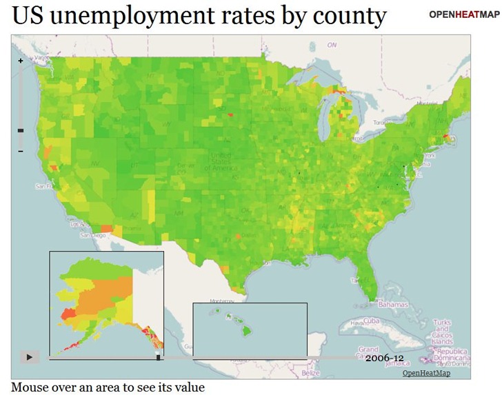
The OpenHeatMap site lets you create heat maps and choropleths from uploaded spreadsheet data (CSV format), or Google Docs Spreadsheet data (which makes it continuously updatable). It supports location coding by latitude/longitude coordinates, or by a large number of name/code attributes (e.g. address, FIPS code, zip code, state, province, country). And as a bonus, you can also have time as a variable, letting you create animated heatmaps or choropleths. Here’s a snapshot of a time-animation of US unemployment by county (see the live map here):

There’s a gallery of sample maps, some of which are embeddable, like the map below of fast-food locations in the US. It’s still a little buggy; the map on the gallery page lets you select between McDonalds, Subway, and Chik-Fil-A, while this embedded map doesn’t show those options.
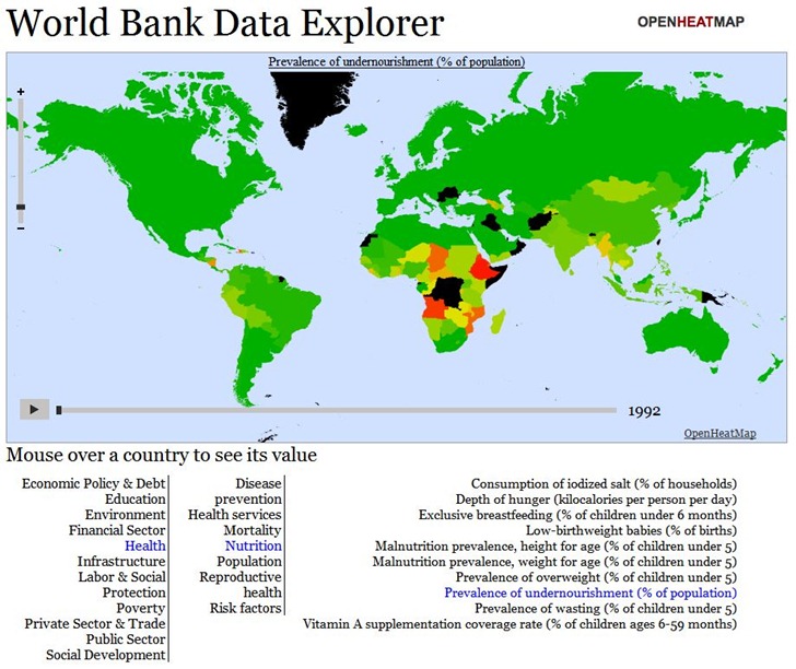
If you’re willing to dive deep into Javascript, you can create fairly sophisticated online maps allowing the choice between hundreds or even thousands of datasets. Below is a snapshot of the World Data Bank Explorer map from the Gallery; this map lets you choose from over 1000 different demographic/economic datasets, and offers animated views over time:

But you’ll need to dive deep into Javascript to create such a sophisticated map; there’s a documentation wiki, but the available documentation is a bit sparse. Basic maps are pretty simple to create, though, and the data upload page offers links to sample datasets (Google Docs spreadsheet links) that you can create sample maps with; copying and pasting the Google Docs spreadsheet link addresses into a browser will give you examples of how the data should be formatted.
Here’s a short video from Pete Warden, developer of the site, with a intro to the service: