blankblank blank


Archive for the 'shapefile' Category

Convert A Shapefile Into A Google Fusion Table

Google Fusion Tables is a free service from Google that lets you visualize, map, analyze and combine data. Standard data formats for import are spreadsheet data (including direct export from Google Docs), CSV and KML files. But you can use the Shape to Fusion website to convert shapefile data directly into Fusion Table format, including not just points but also lines and areas. Note: You will need to have a Google account, and will also need to give the Shape to Fusion website permission to access your Google account to upload the data.

The first thing you’ll need to do is prepare a zipped file for upload that contains the .shp, .shx and .dbf files associated with the shapefile; you’ll also need to include a .prj file that specifies the coordinate system used by the shapefile. You’re limited to 200 MB in total uploaded data, and a maximum of 200,000 rows of data. For line and area shapefiles, you have the option of simplifying the geometry to reduce the total row count; you can also create a centroid point for areas.

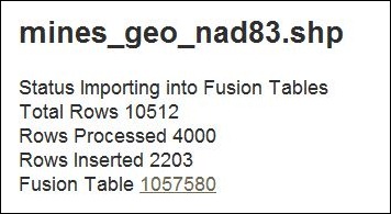
Depending on the size of the file, it can take a while to process; this sample file of mines in Arizona with 10,512 rows took about 10 minutes. A regularly-refreshed text page will show you the status:

mine_status

Once completed, you can directly access the Fusion Table data through the link at the bottom, or go to your Fusion Table data list and select the dataset; you can then analyze/visualize the data any way you choose, including maps. If you specify the data as public, you can embed it into a website. Here’s the active embedded map of Arizona mines used as sample data above; click on a point to get a pop-up with the name and products of the mine:

Note: Doesn’t seem to display properly in my copy of Internet Explorer 9; works fine in Chrome and Firefox.

Data can also be exported back out again in spreadsheet format, as a static KML file, or as a dynamic KML link that updates if the data changes.

Note: The source code for this app is available at this Google Code page.


Hey, ArcGIS Explorer Desktop Has Turned Out Pretty Good!

Yeah, that’s not news to a lot of you, but it is to me. My last significant exposure to ESRI’s ArcGIS Explorer digital globe software (Windows only) was back when it came out, quite a few years ago. I tried it, and found it inferior to Google Earth in performance in 3D, and too complicated to bother learning it; since then, I’ve stuck strictly with Google Earth. A recent post on the free Garmin Tool application, which creates Garmin Custom Map overlays using ArcGIS Explorer, forced me to look at it again, and I was surprised to discover that it’s turned into a pretty cool, and pretty useful tool. Not perfect – the 3D performance is still pretty weak compared to Google Earth, and the out-of-the-box configuration isn’t as strong. But it has it’s own very strong set of features, and when used in 2D mode, is a good addition to any geography toolbox. Nice re-organization of tools/features in a MS-Word-like ribbon format, much better than the original interface.

  • A good selection of basemap imagery sets, including Bing Maps (aerial/road/hybrid), general world imagery/topographic/road maps, OSM, general terrain shading and National Geographic shaded topo maps:

natgeo

No vector basemap data, like the roads you’ll find in Google Earth.

  • Add raster/vector data from multiple data sources and types: ArcGIS Online, GIS web services (ArcGIS servers, GeoRSS, WMS), ArcGIS lyr files, shapefiles, KML, GeoDatabases, text files, georeferenced raster imagery (e.g. GeoTiffs), and GPS data files (GPX).
  • Vector editing tools: Point, Line Area, Circle, Rectangle.
  • Export data in KML format (for user-created vector data), nmc map content packages for other ArcGIS Explorer users, or lpk layer files for ArcGIS.
  • Driving directions/routing
  • Add links to non-geographic data (documents, images)
  • Measurement tools for distance/area
  • Create a slide presentation by saving a series of map views
  • Time/flight animations

Oh the “needs work” side:

  • In the default install, I can’t find a way to set shapefile colors/sizes/symbols to depend on attribute values. For example, if you have an area shapefile with multiple subareas, each depicting an area with a separate property, they’re all displayed with the same color. For a GIS data viewer, this is a major missing feature. No selection/filtering by attribute either. The only way to view attribute data is through an on-screen pop-up; no tabular views of the DBF data.
  • I initially thought there was no adjustable transparency for raster/vector layers, but it’s under the Appearance ribbon tab, instead of in the Properties window for each layer, which is where you’d normally expect to find it.
  • Zoom and tilt controls are the opposite of every other digital globe I’ve used; scroll the mouse wheel away from you to zoom in, click the center button and move the mouse away from you to tilt the view to an oblique angle. And boy, can it be unresponsive sometimes in 3D mode! I usually only use the program in 2D mode only, so as not to have to deal with those issues.
  • There’s a nice interface for querying/previewing datasets available in ArcGIS Online, but there’s no comparable gallery of pre-packaged content files (NMC/NMF files) anywhere on the ArcGIS website, at least that I could find.
  • The app comes with the ability to add GIS-like analysis tools, as well as utilities like the Garmin Tool mentioned above (created with .Net and a free SDK kit from ESRI). By default, it comes with a buffer tool only; the process for adding additional tools isn’t explained very clearly in the help file. And while there’s a fair number of tools available, they’re hard to find; there doesn’t seem to be any systematic directory or catalog of them on the ArcGIS site. With some work, I tracked down some of them, and will post on them tomorrow.


Crowdsourcing And Coordinating Data Collection With Handheld GPS Units

Got an email today from someone with a data collection/coordination/assembly problem. They have multiple people out in the field with Garmin GPS units recording data, and bringing it back to a central location for collation/combination when they’re done. Since Garmin GPS units have limited capabilities for data storage – coordinates, name, comment, date and time, elevation, and that’s pretty much it – additional data associated with a point has to be recorded by hand. Once back from the field, data has to be downloaded from individual units, associated with the additional attribute data from forms, all the data combined together into a single dataset, then converted into GIS-friendly format. And the process they had come up with wasn’t really working well for them.

I think this highlights some of the major limitations of classic stand-alone handheld GPS units. They’re really designed for us in personal data collection, not combined data collection; assembling data from multiple units can take a lot of work. Plus, their limited data collection capabilities require offloading data attribute acquisition to other formats (e.g. pencil and paper), adding the addition problem of associating that data with coordinates later on. There are lots of professional solutions for these problems, like Trimble or MobileMapper GPS units, Terrasync and ArcPad software, but these can be complicated and expensive. I challenge you to find anyone with enough patience to use Terrasync for a single day without swearing at least once; I know I can’t  ;-).

For a few years, I’ve had CyberTracker on my list of potential topics to post on. CyberTracker is a terrific data acquisition and collation tool for field data with tons of great features, like custom data acquisition form design for easy data entry, moving maps, easy data collation and conversion to GIS-friendly format. Plus, the software is free, and the hardware is (relatively) affordable. But unfortunately, I think time and technology are passing Cybertracker by:

  • While the central data software runs on Windows, the field data collection software runs on old-school Palm OS and Windows Mobile. Palm OS is dead; Windows Mobile development has stopped with version 6.5, and only maintenance updates are scheduled. So the useful lifetime of any data collection system built around CyberTracker is limited. If you need a fast/cheap/short-term solution, CyberTracker is free for non-profit use, and you could probably pick up the hardware very cheaply on eBay. Long-term, I don’t see it having much of a future in its current form.
  • The data collation model is also becoming obsolete. With CyberTracker, you have to bring all the data units to a single data download/collation computer. While there are still places in the world where this might make sense, an increasingly-connected world means that data download/collation to the cloud instead of an individual computer makes more sense.

I’m really excited about the possibilities for crowdsourced geographic data collection and collation using portable devices running Android OS (yeah, iOS too). There are already several interesting apps for doing this, and I hope to cover some of those soon on my AndroGeoid website. And I suspect that the small number of apps that can currently do this will be quickly joined by far more apps, and far more capable apps, in the very near future. But that doesn’t help with my emailer’s current problem. I suspect there are many different ways you could do this, but here’s the first approach that came to me using all-free software and services.

1. Make sure that everyone on the project has a Google account (i.e. Gmail); completely free.

2. Have the project leader created a single main data spreadsheet on Google Docs, with all the desired data attributes (e.g. point name, coordinates, comments, additional data fields from the paper forms, etc.) and share a link to that spreadsheet with other project members so that they can edit it as well.

3. Project members can download data from their Garmin units using DNRGarmin, and then export the data from DNRGarmin in CSV format.

4. Load the data into the spreadsheet program of your choice, and add/edit data from data forms to make it conform to the data structure of the main Google Docs spreadsheet.

5. Copy the data cells in the spreadsheet program, and paste them into the main Google Docs spreadsheet. Note: Use Ctrl-C and Ctrl-V to copy and paste cells into Google Docs instead of using the Google Docs Edit menu to perform those operations, as the latter doesn’t seem to work for pasting data from different applications into Google Docs. You no longer have a single computer as a choke point for data entry; multiple people can add data to a spreadsheet at the same time, and Google Docs will coordinate data entry so that nothing is lost. And if you save the spreadsheet data from steps 3 and 4 as separate files, you’ll have backup copies of the original data as well.

For those who aren’t comfortable with working with spreadsheets, Google Docs lets you set up a “Form” to let anyone add data to a Google Docs spreadsheet directly; however, this increases the chances of coordinate data entry error.

6. Now that you have all the data centralized in Google Docs, you have lots of flexibility in how you can handle it:

  • Export the data in CSV format, and you can then import it into any GIS program that supports CSV data. If your GIS program doesn’t, use MapWindow to convert your CSV file into shapefile format first.
  • Unlike shapefile attribute tables, where adding/removing/re-ordering attribute data columns can be a pain, you can easily perform those operations in Google Docs and then re-export the data in CSV format.
  • Convert the data directly into a continuously-updated KML network link for display in Google Earth or Maps using Google’s Spreadsheet Mapper tool.
  • Use any of Google Docs built-in tools to analyze/plot/sort/visualize data, including their way-cool Fusion Tables.
  • And I’m sure there are more options I haven’t thought of.

Know an alternate approach? Have any additional ideas?  I welcome your links and suggestions in the Comments section below.


World Vector Data (VMAP0 and VMAP1) In Shapefile Format

About three years ago, I posted about Penn State’s Digital Chart Of The World Server, which hosted old 1991/1992 VMAP0 world vector data from the National Geospatial Agency in E00 format. More recent data is available directly from the NGA, some of it in the higher-resolution VMAP1 dataset not available from Penn State, but the NGA data is in the uncommon VPF format that many GIS programs can’t handle. The Russian GIS Lab website has converted more recent VMAP0 and VMAP1 data into the more-commonly-used shapefile format, and made it openly available for download. You can get VMAP0 data for the whole world at this link, and the higher-resolution VMAP1 data for selected areas at this link.

While you can get similar and much fresher shapefile data for some of this info from the CloudMade OSM shapefile data site, and from the Natural Earth vector dataset, the VMAP0/VMAP1 files include data like railroads, utilities, cultural landmarks and others that can be difficult to track down.


GISCloud – An Online Geographic Information System Application

I’ve been playing around a bit with GISCloud, a web-based GIS program. Looks interesting, and promising, but still has serious limitations. Feature set includes:

  • Raster and vector data display
  • Vector layer import and editing, including shapefiles, MapInfo, KML, tab-delimited and GPX
  • Built-in datafile coordinate reprojection; recognizes prj files, and lets you select the output coordinate system (including the one for your current project)
  • Advanced GIS analysis tools, including buffering, spatial selection by analysis, layer comparison (e.g. intersection), and area calculations.
  • Export vector data layers in shapefile, MapInfo, CSV or KML; this makes it a handy online format converter.
  • Share map editing with other users (or just publish it for viewing)
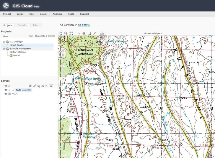
  • Easy-to-decode classic-looking GIS interface:

GISCloud

On the downside:

  • Only data layers imported into or through a PostGIS connection can be used for analysis and editing. I’m not up on PostGIS so I couldn’t test these functions, and none of the data sample sets have PostGIS data, either. You can apparently upload data and import it into a PostGIS database, though.
  • Uploading files can take a while (though they’re saved locally); GISCloud recognizes files in compressed archives, so you’re best off zipping up your data before you upload it.
  • For PostGIS data, I suspect that upload times are going to limit the size of the vector/database layers you can use.
  • Apparently no thematic (attribute-based) display colors yet; this is a major drawback.
  • Raster imagery updates during zooms can be slow.
  • Not all raster image types supported (e.g. 8-bit indexed GeoTiffs don’t work, 24-bit do).
  • It’s not exactly the zippiest GIS platform I’ve ever worked with.
  • It’s Flash-based, so Flash haters and iPad users should avoid, and everyone should expect CPU/performance/crashing issues. Flash 10.1 is supposed to be out soon, and supposedly will address some of those problems.

An interesting early effort in cloud-based GIS, and I’ll be watching its development. But unless you have access to, and/or experience with, PostGIS, of limited utility for now. And I don’t expect to see cloud-based GIS replacing dedicated GIS programs any time in the near future – too slow, and too limited.


Free Vector Country Borders, Administrative Boundaries, And Soon More

Wish I’d known about this site when I was hunting for a high-res border outline for the province of Umbria in Italy. The Global Administrative Boundaries website offers free vector GIS data for country borders and administrative areas within those borders. Data is available in geographic coordinates (lat/long), WGS84 datum, in multiple formats:

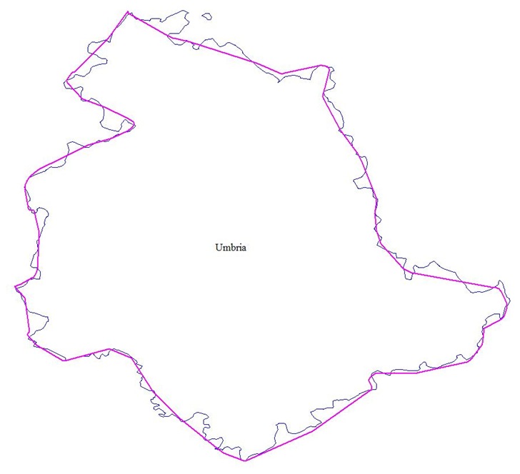
Coverage is worldwide for level 1 data (country borders), but diminishes as you go down as far as level 4 (sub-administrative units), though for the latter there are some countries for which such a data level isn’t relevant. You can see maps of current level coverage here, and missing data will likely be added in the future. Data is licensed under Creative Commons for the US; other unspecified terms may apply for the rest of the world. Here’s the Italian province of Umbria, with the best free data I could initially find plotted in purple, and the high-res GADM data in blue:

umbria

Via Slashgeo.

Just around the corner, scheduled for unveiling at the October 2009 NACIS conference, is Natural Earth Vector. While there’s some overlap with GADM at the upper boundary levels, Natural Earth Vector may not include some of the finer administrative boundaries available in the GADM . But it will have a wide variety of other geographic features not available in GADM in vector format at multiple zoom levels (list from the web post):

  • Continents (North America, Europe, Asia, etc)
  • Cultural regions (South Asia, West Africa, etc)
  • Countries (US, Canada, Mexico, etc)
  • Country sub-divisions (for the US, states, semi-independent territories, dependencies, associations)
  • Disputed territories (like Kashmir, Northern Cyprus)
  • 1st order admins (states, provs)
  • Bathymetry
  • Lakes
  • Lake Center Lines
  • Rivers (including attributes that allow easy “tapering” of drains)
  • Islands
  • Glaciers
  • Populated places (urban boundaries, not city points)
  • Cities (point locations)
  • Physical features like peaks, ranges, valleys, plains

I’ll try to post again when it’s officially released.

Via Kelso’s Corner.


Habitat Digitizer Extension For ArcGIS

Stumbled across this the other day, and while I don’t currently have the need for it (or a copy of ArcGIS to try it out on), it sounds useful enough to post about. NOAA’s Center for Coastal Monitoring and Assessment offers a free extension for ArcGIS called the Habitat Digitizer:

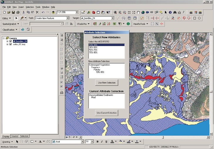
The Habitat Digitizer Extension is designed to use a hierarchical classification scheme to delineate habitats by visually interpreting georeferenced images such as aerial photographs, satellite images, and side scan sonar. The extension allows users to create custom classification schemes and rapidly delineate and attribute polygons, lines, and points using simple menus. The extension allows new hierarchical classification schemes to be easily created, modified, and saved for use on future mapping projects. There are several advantages to using classification schemes with a hierarchical structure including: the detail of habitat categories can be expanded or collapsed to suit user needs, the thematic accuracy of each category/hierarchical level can be determined, and additional categories can be easily added or deleted at any level of the scheme to suit user needs.

Habitat_Digitizer

While written for habitat digitization, it could prove useful for any digitization projects with extensive classification requirements. Versions are available for ArcView 3.0, ArcGIS 9.0, and ArcGIS 9.2 from the product page; download files include a PDF manual.


Convert Shapefiles Into SVG Format With Thematic Coloring

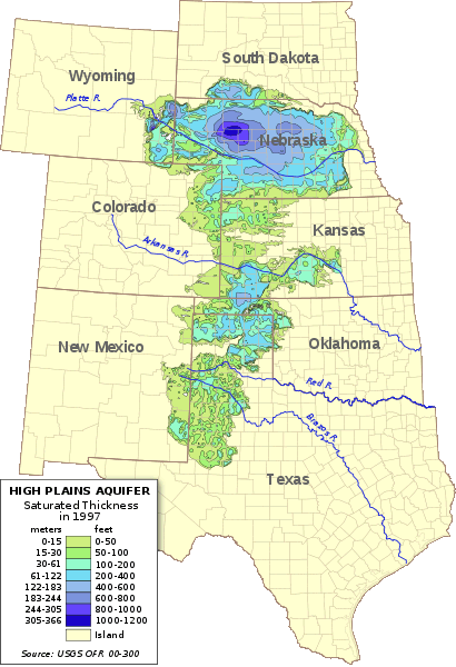
Not too long ago, I covered an online application from indiemapper that converts shapefiles into SVG format, a standard format for vector illustration programs like Adobe Illustrator or the open source Inkscape. One drawback of that site was the inability to color/shade the SVG output based on shapefile attribute data. Ken Hardy has a Perl utility called shptosvg that will take shapefiles and convert them into SVG format, and includes the ability to color files based on their attributes:

410px-Ogallala

Features (from the website):

  • Accepts source SRS specs on the command line, allowing multiple input files to have disparate coordinate systems.
  • Generates the results projected to any SRS using Geo::Proj4.
  • Works on multiple shapefiles at a single invocation, layering them in order into the SVG map.
  • Supports specification of color and other rendering options, per source file, on the command line.
  • Optionally select subset of shapes by regex on arbitrary attribute fields.
  • Support coloring of shapes by value of an attribute field.
  • Allow specification of a shapefile to use in scaling but not in rendering. That supports independent production of layers to be later combined in an SVG editor; they can all be scaled and translated according to the geometry of the base/largest layer to aid layering after the fact.

You’ll need to have Perl installed on your system; see the download page on the official Perl site for links to several different versions. And you’ll need to be comfortable working in a command-line interface; no GUI available yet. Ken has a page documenting usage, along with an example page that describes how he created the image above.

HT to Ken (of course).