Ducky Sherwood writes to point out a free new service she’s created called Mapeteria. With Mapeteria, you can take a CSV file (comma-separated values) of data for US States, Canadian provinces, or French departements, and plot them as a choropleth map (color shade depends on the value of the data) in either Google Maps or Google Earth.
You’ll have to put the data in a specific format, but the Mapeteria website has full directions, and it’s a logical and straightforward format. You’ll also have to upload the CSV file to a webserver, and enter the web address for the CSV file on the Mapeteria site. Beyond that are a few more optional parameters to enter:
- Divisor – you can divide your data by population, area, or the default of nothing
- Color mapping -Set the colors for low and high data values
- Descriptive text
- High or low resolution
Then just click on the Give me a KML file! or Show it on Google Maps! button, and you’re good to go. A simple alternative to using GE-Graph.
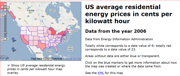
Ducky has some sample datasets to look at in either Google Maps or Google Earth. Here’s the price of electricity for the US in Google Maps:
And here’s the data I’ve always been looking for on French milk production in kiloliters by departement:
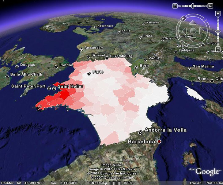
About the only thing I wish it had was an automatic scale marker, but you can always add those in the descriptive text.
More info is available on a posting on the KML Developer Support Group
Thanks, Ducky!
A while back, I posted on GooPs, one of a number of options to feed GPS data directly to the free version of Google Earth, lessening the need to spend $20 on Google Earth Plus, while getting fewer features. Today, a Google Earth Blog post indicates that GooPs has gone through some recent updates and changes.
1. A new website for GooPs.
2. Before, GooPs was donationware; now there is a fully free version, and Plus/Pro versions that offer more features for $9.95 and $19.95 respectively. Here’s the features chart from the website:
| |
GooPs Free |
GooPs Plus |
GooPs Pro |
| Fast real-time tracking |
* |
* |
* |
| Remote Tracking |
Two vehicles |
Five vehicles |
Unlimited |
| SpeedTrack |
|
* |
* |
| AutoView |
|
Pre-configured |
Fully Configurable |
| Classic 3D Cursors |
* |
* |
* |
| Image Cursors |
* |
* |
* |
| Lifelike 3D Model Cursors |
|
|
* |
| Real-time tracks |
* |
* |
* |
| TimeStamps |
|
* |
* |
| PointMarkers |
|
|
* |
| Record/Playback NMEA Log |
|
|
* |
| Native Google Earth View Control |
* |
* |
* |
| Integrated FTP Client |
* |
* |
* |
| Save trip to Google Earth |
* |
* |
* |
The integrated FTP client is especially cool – if you have a live Internet connection, you can continuously upload your position to a “live” link, letting others track your live position in Google Earth. DestinSharks had done that as part of a weekend boating run.
Functionally, the program doesn’t seem to have added any major features since I last posted about it (except maybe your choice of 3D cursors). Still, it’s one of the best free options, and the paid versions are cheap and offer useful additional features.
For general map relief shading, my first choice is usually 3DEM, since it usually gives the best results. But MicroDEM also does a decent job at terrain relief shading, and has a few other shading options that 3DEM lacks.
Continue reading ‘Elevation, Slope, Terrain And 3D Anaglyph Map Shading In MicroDEM’
Last week, I posted on how to create an animated depiction of sea level rise due to a storm surge or global warming. Here’s a movie of the flooding for the Manhattan/NYC area:
Got a note from Frank Taylor over at the Google Earth Blog saying that it looked pretty interesting, and that he would have linked to it if it were in Google Earth. That got me to thinking about how you could show the effects of coastal sea level rise in Google Earth with high spatial resolution, both static and animated. I’ll start with the easy one: static.
Continue reading ‘High-Resolution Sea Level Rise Effects In Google Earth’
In a previous post, MicroDEM was used to determine when the sun was visible from a particular location for any day of the year, including blockage by topography. But MicroDEM can also assess that data for a number of contiguous locations, determine for each of them how much sunlight they get during the day, and create a map of that total daily insolation. In a sense, it can create a solar “viewshed” map for a specific area. That might be of interest to solar energy enthusiasts, or those studying plant/animal microhabitats.
Continue reading ‘How Much Sun Does That Spot Get – Plotting Solar "Viewsheds"’
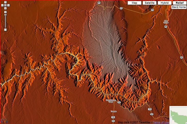
Hans writes to say that they’ve updated their World: Relief Map And Geolocations website, covered in an earlier post. There’s a new button labeled “Maximize”; click on it and the Google Maps view expands to fill your entire screen. Click on it before zooming in; if you click after you zoom, it will zoom you way out again. You can now get some spectacular wide-area colored terrain relief images that you can save with a screen capture program:
An earlier post described how to use MicroDEM in conjunction with Trimble’s Planning Software to assess the effects of GPS satellite signal blockage by topography on GPS position error. But MicroDEM also has a built-in function that lets you calculate the times of day when the sun is blocked by the local terrain, and when it’s visible. Handy for photographers looking to shoot in sunlit conditions, campers who’d prefer shade early in the morning, and so on.
Continue reading ‘Determining Sun Blockage By Topography’
a.placebetween.us takes two locations, finds the spot halfway between them as the crow flies, and plots and lists locations of venues where you can meet in Google Maps (default is coffee, but you can enter a different type of meeting location in the search box looks like it’s mainly coffee houses). So I should meet my brother for coffee in Missouri:

Via Lifehacker.

