While most maps, paper or computer, are flat, the world isn’t. Map projections are mathematical methods for representing part or all of the quasi-spherical Earth (irregular oblate spheroid, to be more precise) on a flat surface. The book Flattening the Earth: Two Thousand Years of Map Projections, covers the history and many of the hundreds of projections devised to “flatten the earth”. And I’ve covered a few map projection viewers on this blog before.
Just as a map projection viewer alone, Flex Projector (Java; versions for Windows, Linux and Mac) would be worth a look. It has over 25 pre-defined map projections that you display (along with listed values for their areal/scale/angular errors), and includes the ability to display two projections at once for comparison purposes (here, Plate Carree in black vs. Mercator in gray):
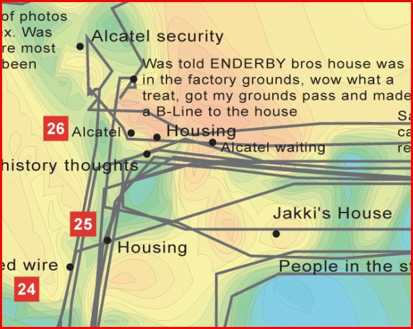
People re-explore their local area by walking the neighbourhood with the device and on their return a map is created which visualises points of high and low arousal. By interpreting and annotating this data, communal emotion maps are constructed that are packed full of personal observations which show the areas that people feel strongly about and truly visualise the social space of a community.
Last week, I posted about a free new PDF publication from MapAction called the Field Guide To Humanitarian Mapping, an excellent introduction to GIS and GPS for humanitarian mapping. John Krygier’s Making Maps blog links not only to that guide, but two other freely-downloadable publications from TacticalTech that cover the use of maps and graphics by NGOs and other groups for informational and advocacy purposes:
Mapping Worlds has created two sites for the USA and the world with animated cartograms, maps where the value of a parameter is used to adjust the drawn size of a geographic area. Here’s an animated cartogram showing military spending for world countries; click on the clockwise circular arrow on the map to have the countries resized based on their military expenditures:
Click on the Resize button (the counter-clockwise circular arrow at the upper left) to reset the countries to their original size. Repeat at will.
Data can be very timely; here’s a USA cartogram showing stimulus bill jobs by state:
Over 140 datasets are currently available with demographic, economic, trade, environmental, etc. data; you can also submit your own datasets for inclusion. Direct links are immediately available for every cartogram page, but you can also get images and embeddable code (like the examples above) emailed to you if you agree to Mapping Worlds’ Terms Of Use.
Making Maps posts about HistCarto, a site with 4000 searchable and viewable historic maps of France, dating from the 17th to 19th centuries. The site is in French, so you may want to have Google Translator handy if you don’t speak the language. But for a quick view of some of the maps:
Click on the “Acces a la base” link at the right to go to the database page
Click on “Recherche” (Search) at left, then “Simple”
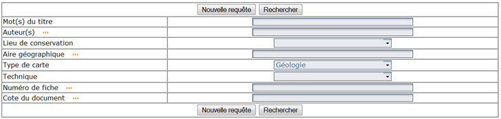
Click on the “Type de carte” (type of map) dropdown, then choose a type of map you’d like to see; many types will be obvious to many non-French speakers. In the example below, I’ve select “Geologie”, which oddly enough is geology:
Other search options are “Mot(s) du titre” – words in the title; “Auteur” – author; “Lieu de conservation” – source of the map; “Aire geographique” – geographic area; “Technique” – whether the map is a printed map (“Carte imprimee annotee” or hand-drawn (“Carte manuscrite”). Caveat: my high school French is a bit rusty :).
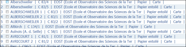
Click on “Rechercher” to retrieve a list of maps of that type:
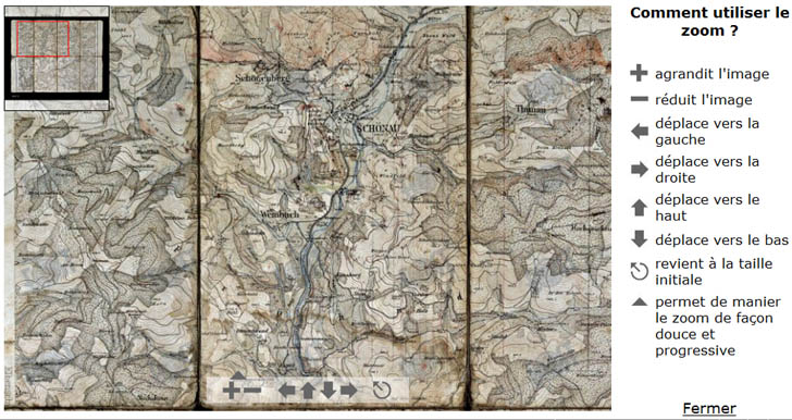
Click on a listing to retrieve the info page for that map; click on the map image at the bottom of the info page to bring up a pop-up Flash Zoomify viewer with the map loaded:
Note: The map is of a region in France, but was created in Germany, hence some of the German names.
No downloadable versions of the maps, unfortunately.
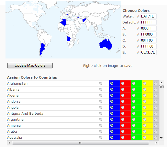
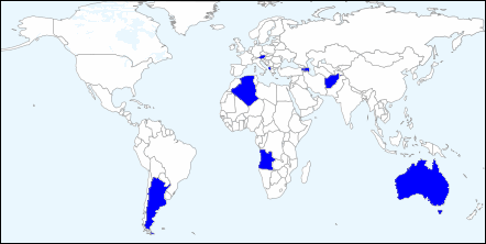
A while back, I covered a web app that lets you color in countries on a world map, then download the resulting graphic. Since then, it’s added more features, including the ability to add text, lines and labels. Mike Piaget writes to tell me of a similar app he’s created, the Customizable Map Of The World. Not as many options as the other app, but easier to use:
Click on a color next to the country name, then click “Update Map Colors” to color the country on the map; here, I’ve colored all world countries that start with the letter “A”. There’s only six colors available for country colors (including the default), plus one for water, but you can modify those colors with the appropriate hex code at upper right. To save a copy of the map to your computer, right-click on the image and choose the “Save Picture As ..” option (or the equivalent in your browser):
Unfortunately, you’re limited to the single on-screen size; however, there are closeup maps available for the subregions Africa, Europe, Asia, the Middle East and South America (links at the bottom of the web app page).
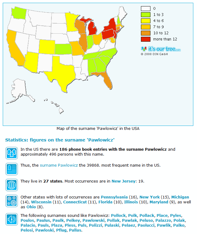
A while back, I covered the World Names Profiler, a program for plotting the population density for surnames for countries around the world. Dynastree Maps is a similar application for the US, Canada, and Germany, and includes additional information:
Note: Currently only works in Internet Explorer and Safari. I also get a Javascript error message, but it doesn’t seem to affect functionality.
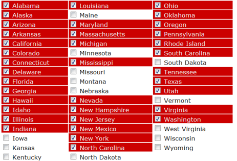
Guess I need to spend some time in the Plains states :). There’s also a button which leds you embed the map directly into your Facebook page. For a site that creates a similar KML file for Google Earth, try Color Your Map.
Contents of the Free Geography Tools Blog copyright 2007-2018; all rights reserved.
Determining the accuracy, reliability, validity, or appropriateness of any of the software or data written about in this blog for any uses is the sole responsibility of the reader, not the authors of the blog posts. The blog authors have no liability for any uses of the software or data described here.
Shopping at Amazon through the link below helps support the site. Thanks!


 by John Krygier and Denis Wood
 by Edward Tufte
 by Richard LeGates