blankblank blank


Archive for the 'cartography' Category Page 2 of 14


Free Marine Navigation Software

Got an email the other day recommending a free marine navigation software package, which reminded me that I had a bunch of those bookmarked/archived for a future post. I’m landlocked at 6820 feet, and the only boating I do (rarely) is putting the inflatable canoe out onto a local lake or stream, so, I can’t really comment intelligently on the benefits/drawbacks of any of these. If you have any experience with any of these, feel free to post your opinion in the Comments section. Click on program title below to go to the website.

OpenCPN

OpenCPN is a free software (GPLv2) project to create a concise chartplotter and navigation software for use as an underway or planning tool.  OpenCPN is developed by a team of active sailors using real world conditions for program testing and refinement.

Open-source (GPL2); versions for Windows, Mac and Linux.

  • BSBv3 raster and S57 ENC chart support.
  • CM93 vector chart support.
  • IHO S52 compliant display of S57 vector charts.
  • Single-chart and Quilted display modes.
  • North-up, Course-up and Skewed-up display modes.
  • Moving-map display mode.
  • Route navigation with ship tracking functions.
  • Waypoint navigation.
  • Dashboard for configurable on-screen display of ship’s NMEA data.
  • NMEA 0183 GPS interface at selectable baud rate.
  • gpsd library support.
  • Autopilot output support.
  • AIS input with full target tracking and collision alerting.
  • Anchor watch/alarm functions.
  • GRIB file input and display for weather forecasting.
  • GPX Waypoint, Track and Route input and output file support.
  • Tide and Current prediction and display by location.
  • Multi-language support.

Extensive documentation at the website. Useful list of free supplementary software as well. GPS support requires an NMEA-capable GPS device (pretty much a given for all these programs.

HT to Pat for the link.


CapCode

Capcode is a free software suite for sailors that provides NMEA acquisition from all instruments of the boat, including GPS, Computation of the true wind, the polar of the speeds, the target speed, the laylines, etc., (and) displays (this information) on nautical charts (position of the boat, speeds vectors, polar, waypoints, grib weather information, etc).

  • Windows only; open-source (GPL).
  • Supports raster (BSB) and vector (S57) data
  • NMEA support (GPS, wind, depth, etc.)
  • GRIB (weather data)

Apparently many other functions as well, but online documentation is sparse. There’s a wiki, but not a lot of info there. Best source for current info, and new features, appears to be the blog.


SeaClear

SeaClear is a PC based chart plotter for Windows 2000/XP/Vista/7/NT/95/98/ME. With a GPS connected it displays the current position, speed, heading and other data on the screen. The chart is repositioned and new charts are loaded automatically as needed. Tracks may be saved to file for later reviewing and log book entries can be manually and automatically entered. Unlimited number of routes and waypoints can be created and used to assist the navigation. The screen area for charts is maximized with most functions accessed with the right mouse button. Zooming is provided with support for IntelliMouse wheel. SeaClear is created for nautical navigation but can probably be used for other navigation needs.

Windows only.

  • Most modern GPS units with PC communication will work.  Virtual serial ports, such as USB GPS units with serial drivers, are supported. Optionally other NMEA instruments may be connected. Depth, Compass and Wind is displayed if present. With AIS receiver connected targets are displayed on screen. On units capable of receiving NMEA waypoint and route data, uploading from the PC is supported.
  • SeaClear II uses raster charts and can use most BSB/KAP version 1 – 3 and GEO/NOS commercial charts. Encrypted charts, like BSB/CAP can not be used. Most common projections are supported. Chart datum’s are supported. You can add your own charts, scan or capture them, save as PNG, BMP or other common format. Skewed and rotated charts can be calibrated. Chart border can be set to reduce the actual chart area.
  • Unlimited number of routes are easily created. Maximum number of route points limited by memory only. Several routes may be joined.  Tracks can be imported. Cross track error alarm. Calculation of time to go, total time to go, bearings, steering indicator and output to NMEA.
  • Unlimited number of waypoint files can be created. Maximum number of waypoints limited by memory only. Multiple files can be merged. Quick locate of waypoint loads map and centers waypoint on screen.
  • Tracks are saved to file and plotted. Saved tracks can later be plotted and used to create routes.
  • Automatic and manual log book entries into a text file.
  • Import and export of routes, waypoints and tracks using G7ToWin and to G7T and Waypoint+ text file format. Export of waypoints and routes to supporting NMEA devices.
  • NMEA Depth, Wind, Compass and AIS. GPS based Log, Hours and estimated fuel consumption. Night modes with shaded charts.

Full documentation in English included with the program; links to manuals in other languages, and additional help resources, at the website.


OpenPilot

Included for completeness. Looks like an open-source project, but tough to say. Open-source; see the comments section for more info from the developer. Documentation is sparse/missing, and no binaries are available from the download site, only source code (compile-your-own). Screenshots show it running on a Linux system.
Shaded Relief Archive

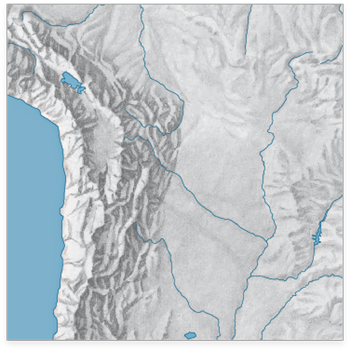
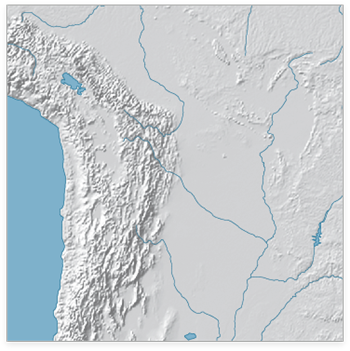
The WeoGeo blog highlights the Shaded Relief Archive, a collection of hand-shaded relief maps freely usable and distributable. This is a joint effort from Tom Patterson, creator/manager of the Natural Earth Data website (see this post for more info on the latter site), and Bernhard Jenny (author of the Terrain Bender and Scree Painter tools). While you can generate shaded relief from digital data (using reflectance), hand-shading can often do a better job of highlighting subtleties of terrain detail, as in this comparison of hand-shaded data (left) and digitally-derived data (right) taken from the Shaded Relief Archive comparison page:

manualrelief_1 digitalrelief_1

Some maps come in georeferenced GeoTiff format (along with shapefiles that define map area and coastlines); others have yet to be georeferenced. Most are at fairly small scales, so they’ll be best for maps covering large areas; an exception is the set of 100+ shaded relief maps for US National Parks.

Note: Some of these shaded relief maps, as well as many others, are also available at the WeoGeo Market site.


Nuke A City With The Ground Zero Mapplet

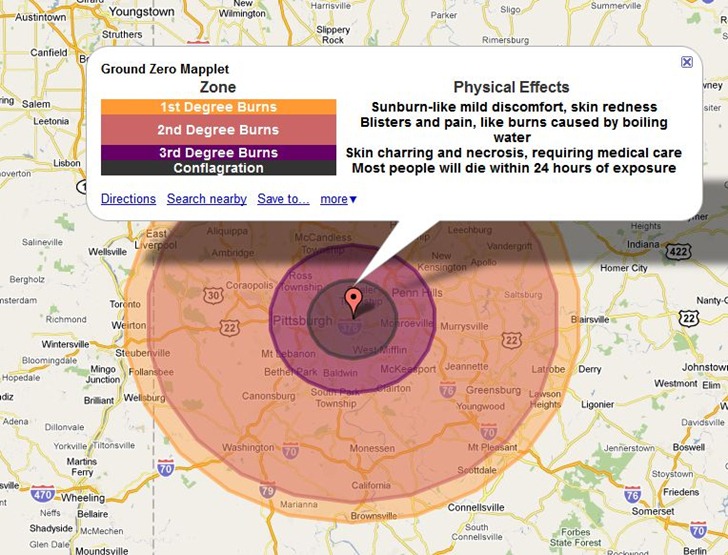
Bit of a grim app, but the CarlosLabs Ground Zero Mapplet will show the effects of various-sized nuclear weapons on a number of preset world cities. Here’s the impact on Pittsburgh of the “Tsar Bomba” blast, the most powerful nuclear weapon ever tested at 50 megatons:

tsarbomba

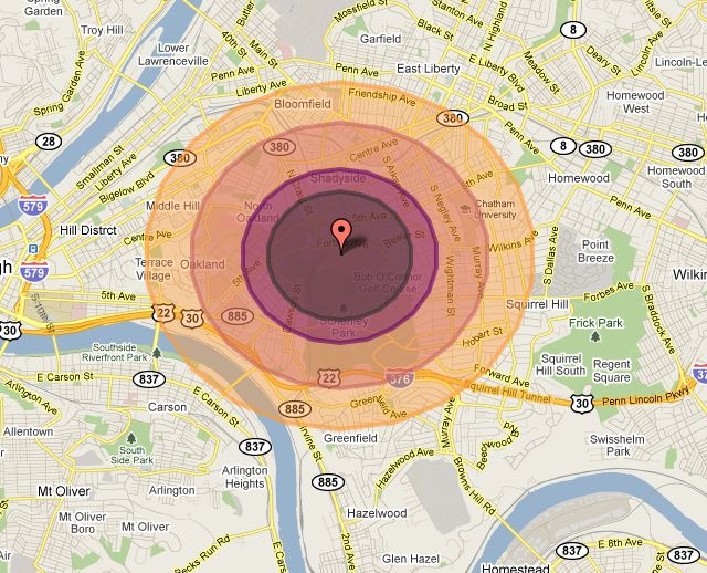
Most other blast options are for much less, like the 15 kiloton “Little Boy” dropped on Hiroshima:

hiroshima

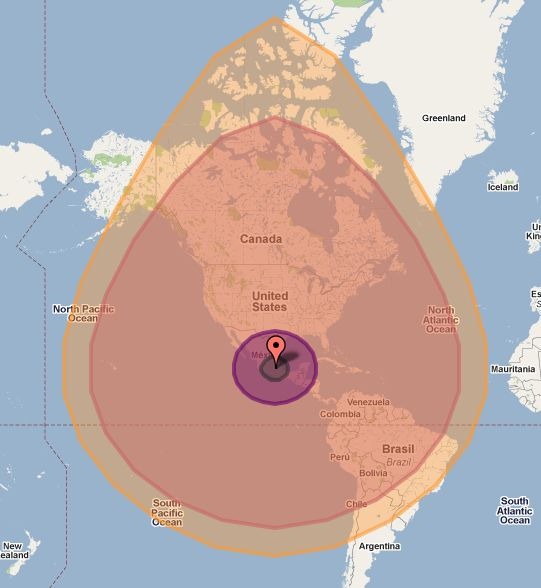
But the largest explosion model available is an asteroid impact comparable to the Chixculub impact 65 million years ago that caused dinosaurs to go extinct:

asteroid

The main version is a Google Maps Mapplet, so you’ll need a Google account to use it in your My Maps collection. There’s a direct link to install it into My Map at the CarlosLab website. The Maps API link will take you to a page with embeddable code that lets you put a comparable app into your web page, like the live example below:

Unlike the Mapplet, the embedded app lets you select any location, but the overall map size is constrained. Source code for this app is available at the link above.


Easy Magnetic Declination Value Website

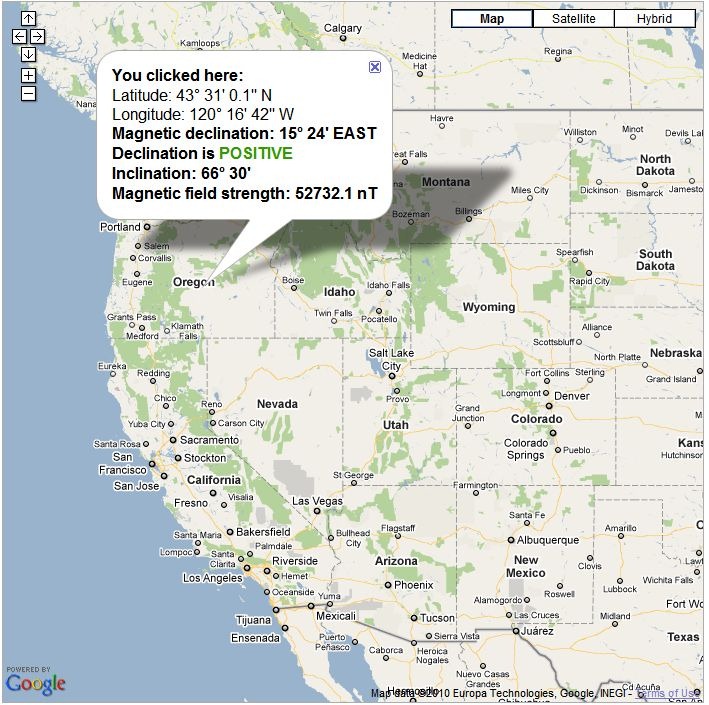
I’ve linked to sources for magnetic declination, the difference between true north and magnetic north, in the past. But for the current value, the Magnetic Declination website may be the easiest to use. When you visit it, it will determine your location based on your IP address, and give you a Google Map view with pop-up showing magnetic field data for your position, including the declination. But you can also scroll the map to any location, click on it, and get comparable data for that spot:

mdoregon

To correct a magnetic compass bearing to a true bearing, add the magnetic declination if it’s described as POSITIVE (as above), subtract it if it’s negative. I do wish it gave values in decimal degrees, but it’s not too hard to convert DM to decimal (divide minutes by 60, add to the degrees).

Inclination is the angle of the magnetic field relative to the surface at that point; good compasses often have the needle weight balanced to compensate for the magnetic field angle, which otherwise would cause the needle to skew forward or back. Since the angle shifts from positive to negative as you go south across the “magnetic equator”, this needle balancing is usually optimized for either the Northern or Southern Hemisphere for a particular compass. More expensive compasses are available with balancing systems that will work across most of the globe.


Cartography 2.0 – Online Textbook

Cartography 2.0 is (was?) an attempt by geographers at Penn State, University of Wisconsin – Madison, and Axis Maps to create an online up-to-date textbook (Creative Commons license) on making modern digital interactive maps. Current chapters online:

  • Overview of Animated Maps: Learning from others
  • History Of Animated Maps
  • Conceptualizing Time, Change and Geographic Process
  • Representing Time on Animated Maps
  • Representing Time on Static Maps
  • Cartographic Text
  • Cartographic Interaction: Introduction and Overview
  • Multiple, Coordinated Views, Brushing, & Highlighting
  • Data Probing and Info Window Design
  • Overview: The User Interface
  • Interface Evaluation 1: Philosophy
  • The Nature of Geospatial Information Uncertainty

Not a how-to guide, more a discussion of history and basic principles, but worth reading just for that. Status is unclear: all of the above chapters are dated September 2009, and while the site states it’s active, there don’t appear to have been any recent additions. I hope it is still active – lots of good stuff just in what’s been posted already.


Easy Heat Maps From Spreadsheet Data With OpenHeatMap

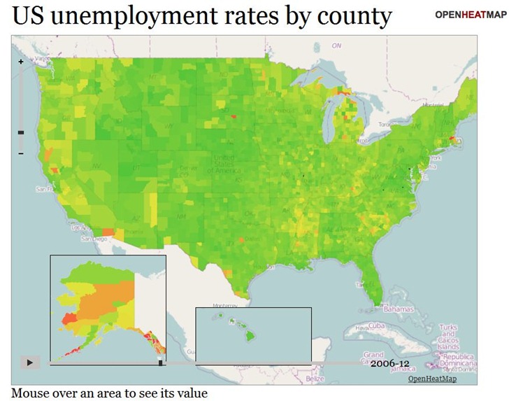
The OpenHeatMap site lets you create heat maps and choropleths from uploaded spreadsheet data (CSV format), or Google Docs Spreadsheet data (which makes it continuously updatable). It supports location coding by latitude/longitude coordinates, or by a large number of name/code attributes (e.g. address, FIPS code, zip code, state, province, country). And as a bonus, you can also have time as a variable, letting you create animated heatmaps or choropleths. Here’s a snapshot of a time-animation of US unemployment by county (see the live map here):

ohm1

There’s a gallery of sample maps, some of which are embeddable, like the map below of fast-food locations in the US. It’s still a little buggy; the map on the gallery page lets you select between McDonalds, Subway, and Chik-Fil-A, while this embedded map doesn’t show those options.

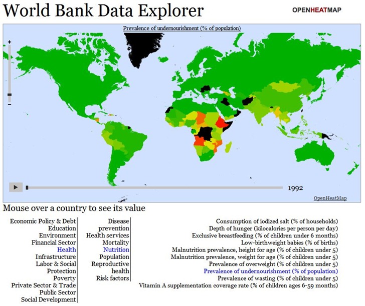
If you’re willing to dive deep into Javascript, you can create fairly sophisticated online maps allowing the choice between hundreds or even thousands of datasets. Below is a snapshot of the World Data Bank Explorer map from the Gallery; this map lets you choose from over 1000 different demographic/economic datasets, and offers animated views over time:

ohm2

But you’ll need to dive deep into Javascript to create such a sophisticated map; there’s a documentation wiki, but the available documentation is a bit sparse. Basic maps are pretty simple to create, though, and the data upload page offers links to sample datasets (Google Docs spreadsheet links) that you can create sample maps with; copying and pasting the Google Docs spreadsheet link addresses into a browser will give you examples of how the data should be formatted.

Here’s a short video from Pete Warden, developer of the site, with a intro to the service:


Basic Google Maps Heat Map

Tixik Heatmaps – Lets you add a basic heat map to a simple Google Maps display. Create a “CSV” file of latitude/longitude pairs, with coordinates separated by a semi-colon, and each pair on a new line:

48.0043953135;0.2025604248

39.7117426603;3.4630966187

42.6976396896;2.8954124451

etc.

(Taken from the sample file).

Put the file online someplace, and then substitute its web address for “CSV_URL” in the Google Maps code below:

var tilelayer = new GTileLayer(new GCopyrightCollection(), 0, 17);
 tilelayer.getTileUrl = function(tile, zoom) {
   return 'http://api.tixik.com/scripts/tile.php?x='+tile.x+'&y='+tile.y+'&zoom='+zoom+'&csv=CSV_URL';
 };
 tilelayer.getOpacity = function() {return 0.7;}
 map.addOverlay(new GTileLayerOverlay(tilelayer));

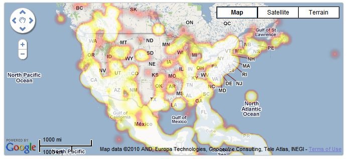
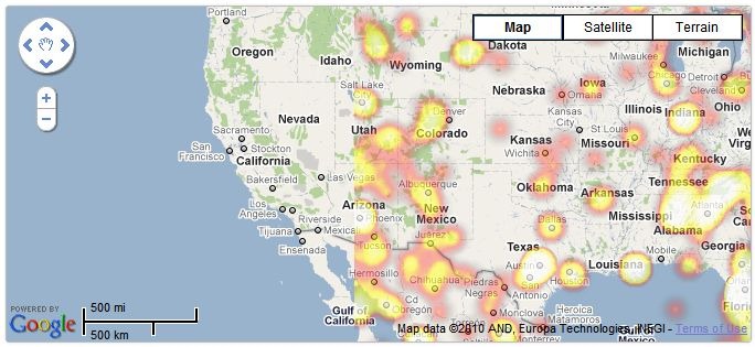
Add this code to your Google Maps embed code, and get a basic heat map (sample map from Tixik website):

heat1

Fast, simple and basic – not a lot of options. Bit quirky/buggy, too – check out this zoomed-in area, which dropped some of the data (rest of the world looked fine:

heat2

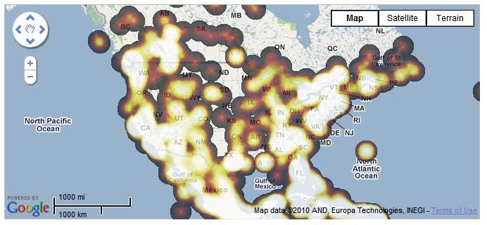
Colors can also vary depending on the browser you use; the examples above are from Chrome, while the same map in Internet Explorer 8 looks like this:

ieheat

For quick and dirty heatmaps with Google Maps, Tixik Heatmaps seems like a decent option. But there’s an option for use with other map backgrounds that’s more flexible in display options, data format, and embeddability; more on that tomorrow.


Hand-Drawn Maps

A few sites with collections of hand-drawn maps, cartography with a more human feel than what you often get online, or from a GIS. Click on the titles to visit the site. Your suggestion for other sites are welcomed in the comments section.

subk.net

the conventional function of a map is to contain universal symbols and keys; icons that people will recognize as streets, monuments, etc. As in organized tours, they emphasize what is commonly thought of as interesting and important.

i collect personal maps people draw. one’s memory and perception of a place is very personal, so each is a reflection, however small or large, of how the individual connects to their environment: knowing, organizing, and understanding it.

in short, each one is a small token of memory and experience, whether created in order to help me understand a place, to direct me to the nearest gas station, or as an answer to my persistent requests to find the local gem of a strange little town. feel free to browse my MAPSPROJECT.


Hand Drawn Map Association

Annotated gallery of hand-drawn maps, plus artist collections.  New contributions solicited.


MollyMaps

MollyMaps is a cartographic project devoted to celebrating the places that matter to us both as individuals and as communities, through the engagement of hand-drawn mapping practices.