blankblank blank


Archive for the 'cartography' Category Page 3 of 14


Compare Geographic Areas With “How Big Really”

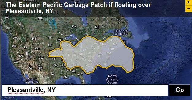
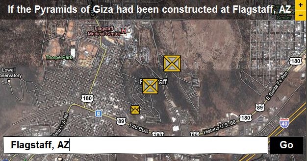
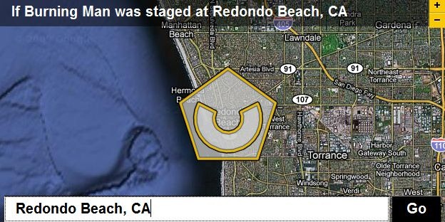
The previously-covered “Move Outlines” site let you trace a border around a geographical feature, then compare that border size with any other area in the world. The BBC’s Dimensions website (aka How Big Really) is a nice companion site; while it doesn’t let you draw your own border, it has pre-drawn areas covering a number of different topics, like Environmental Disasters:

garbagepatch

Ancient Worlds…

pyramids

Festivals and Spectacles …

burningman

… plus Space, Depth, The War on Terror, The Industrial Age, Battle Of Britain, and Cities In History. Great for getting a sense of scale.

Via Digital Geography.


Daylight Hours Explorer

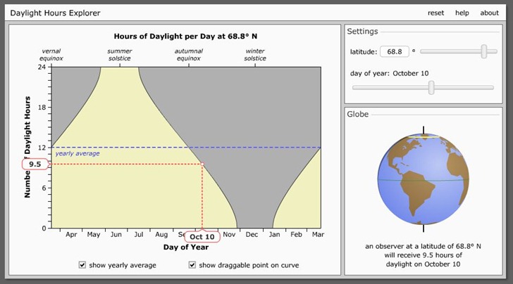
Daylight Hours Explorer is a simple online tool to visualize how many hours of sunlight a particular latitude gets during the course of a year. Move the upper-right slider to change the latitude; move the lower-right slider to change the date, with hours of daylight below the globe. With “show draggable point …” checked, you’ll see the dotted lines on the graph, and also be able to change the date by clicking and dragging on the point on the curve:

daylight

Option to show yearly average (as above). You can also click and drag the globe to spin it around, useful for seeing how the day/night terminator orientation changes with time. Links to download the Flash animation to your desktop for offline use. From the University of Nebraska-Lincoln Astronomy Department; site has lots of additional animations, most astronomy-oriented (but a few with geographic connections).


Compare Point Latitudes And Longitudes With Iso-Longitude-Latitude

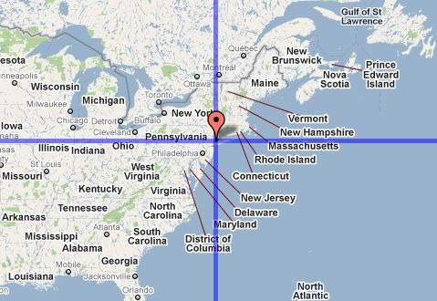
For some reason, I have this mental picture of Europe being at about the same latitude range as the US, and I’m often startled when reminded that much of Europe lies well north of the lower 48’s northern border. The Iso-Longitude-Latitude site shows this graphically; put a marker on a point in a Google Maps interface, say near New York City:

nyc

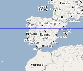
And lines of constant latitude and longitude will be drawn through that point in the first map window, and in a second one directly below it. By scrolling the map eastward, I can see that Madrid is at about the the same latitude as NYC:

madrid

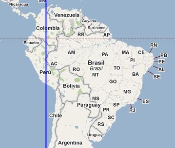
And that most of South America is east of NYC:

sa

You have the option of showing the “anti-latitude” and “anti-longitude” of a point as well; anti-latitude is the equivalent south latitude of a northern latitude (and vice-versa) e.g. +40 and -40, while anti-longitude is180 degrees opposite longitude, e.g. –75 and +115. “Anti” lines are drawn in red.

You can enter multiple point positions on a map, and their coordinates will show up in a text box; alternately, you can copy and paste coordinates into the text box and display them on the map. Finally, you can save a URL that will save and display all the points you’ve entered.


Everything Sings: Maps For A Narrative Atlas

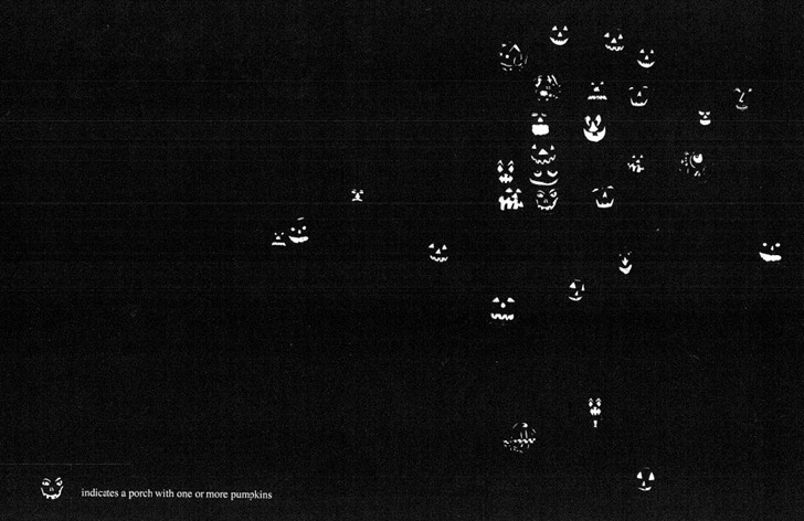
Several posts at other blogs over the past week about cartographer/artist Denis Wood’s upcoming book Everything Sings: Maps For A Narrative Atlas; see Making Maps and The Map Room for examples. This looks like a unique depiction of aspects of a community not captured by normal maps, sort of a true geography of neighborhood. Showed this to a friend who’s interested in maps as way of framing the distinguishing aspects of a community, and she pronounced it, “Great Stuff!”. Exploring outward from the blog posts, I found direct links to a number of sites of interest, either directly or tangentially related to the book:

  • An earlier post on Making Maps on earlier versions of these maps, including PDF links to some of them, like this oft-seen one of jack-o-lanterns on Halloween:

pumpkins


Compare Geographic Boundaries With Move Outlines

I can remember as a kid (way too many years ago) being impressed with a map of the lower 48 United States that had the outline of Alaska superimposed on top of it. The Alaska outline virtually covered the entire map, and there was a comment to the effect that,”Alaska is almost as large as the lower 48 states”. It wasn’t until years later that I realized the creator of that map had just traced an outline of Alaska off of a Mercator projection map and laid it on top of the US map without compensating for the change in scale.

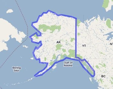
If only the map maker had had access to  Mapfrappe’s Move Outlines site, he might not have made that mistake. Draw an outline of a geographic area in one Google Maps window:

tracedoutline

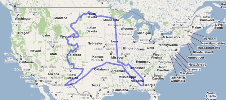
And have the outline be superimposed on top of another Google Maps window, scaled correctly to compensate for changes in the Mercator scale at different latitudes:

superimposed

Alaska’s still pretty dang big, but this shows it at its true scale, roughly one-third the size of the lower 48.

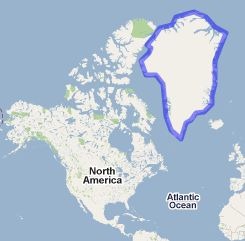
Another classic example of this is Greenland, which looks humungous on a standard Mercator projection:

greenlandoutline

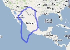
In true area, though, it’s roughly the same size as Mexico; big, but not gargantuan:

greenmex

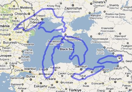
The site has some pre-drawn comparisons, like the Great Lakes against the Black Sea:

greatlakesvsblacksea


Do-It-Yourself Aerial Mapping At GrassrootsMapping.Org

The Grassroots Mapping wiki collects information, how-tos, current projects and general resources for creating your own georectified aerial imagery using cheap hardware to acquire the imagery (balloons, kites, and UAVs). Check out the main site for blog entries on current projects as well. From the website:

Seeking to invert the traditional power structure of cartography, the grassroots mappers used helium balloons and kites to loft their own “community satellites” made with inexpensive digital cameras. The resulting images, which are owned by the residents, are georeferenced and stitched into maps which are 100x higher resolution that those offered by Google, at extremely low cost. In some cases these maps may be used to support residents’ claims to land title. By creating open-source tools to include everyday people in exploring and defining their own geography, Warren hopes to enable a diverse set of alternative agendas and practices, and to emphasize the fundamentally narrative and subjective aspects of mapping over its use as a medium of control.

One of the resources highlighted is the Cartagen Knitter, a simple online application for knitting together multiple aerial images into a single one for georeferencing using GIS software or an online service like Map Warper. Here’s a video demo:

Cartagen warping tool demo from Jeffrey Warren on Vimeo.

More related videos here.


Geographic Polling Website SurveyMapper Now Live For The United States

The Centre for Advanced Spatial Analysis, University College London’s SurveyMapper site has been live for the United Kingdom for a while now, but just added the ability to do geographic-based survey polls for the United States as well as Europe and the entire world. The process for creating a survey couldn’t be easier. After free registration, click the “Create Survey” button; the first page will ask for basic info:

Continue reading ‘Geographic Polling Website SurveyMapper Now Live For The United States’


Learn/Plan Compass Use In A Google Maps Interface

I’ve been known to take three GPS units with me out into the field, because … I’m an idiot. But regardless of how many I’m carrying, I always bring a compass and paper map as well. GPS displays are too small to give you the same sense of geographic context as a big paper map, and a compass is a necessary tool for bearing determinations. The Barcelona Field Studies Centre has created an online compass training site, the Google Maps Compass Tool, for learning how to use a compass with a map.

Start up the app, and select a starting point using the Search box; enter a city/town/POI, or enter a latitude/longitude directly. Once you’ve selected that point, a button labeled “Show Compass” will come up in the lower right-hand corner; click on this, and the compass will appear on the map near your specified point:
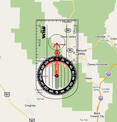
startcompass

You drag this compass so that its center sits on top of your starting point. Two additional buttons will appear at the top of the map as well. In the upper-left-corner, the Menu button lets you:

  • Undo/redo steps
  • Change the length of the red arrow by slider or by manual dragging
  • Clear everything
  • Load/Save/Import a Route
  • And more …

In the upper right corner, the “Draw Route” button shows up.

It’s a bit confusing to figure out what to do the first time you run it, but the basic operation flow is:

1. Drag the compass to the starting location.

2. Click on the compass to let you rotate it to the desired direction; click again to freeze it.

3. Change the length of the red arrow so that its end is at your desired destination.

4. Click the “Draw Route” button; a pop-up window will come up with the distance/bearing to that desired destination.

5. Click the “Move Next” button to move the compass to that destination.

6. Repeat steps 2-5 for the remaining legs of your trip, if any.
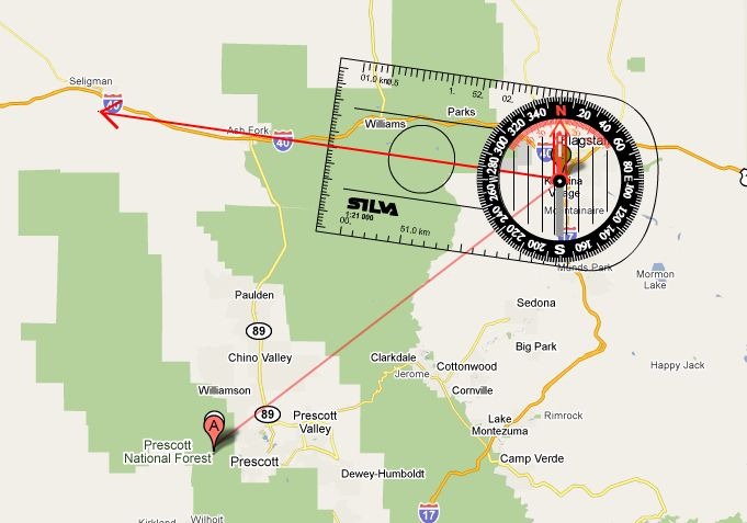
routelegs

Once you’re done, you can View/Print a Route:
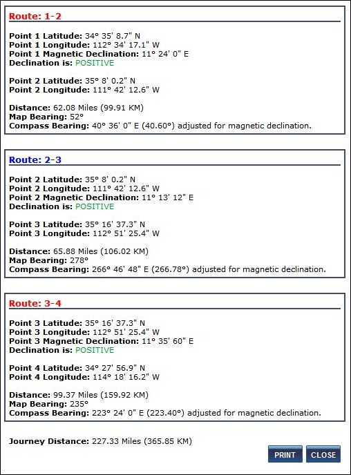
routeprint

You can also save a route, and have a unique URL/ID # emailed to you so that you can access/import it later. There’s a Print Map option on the Menu, but it printed out a solid black square for me.

A few observations/suggestions:

1. Use the “Maximize This Map” option on the front page to generate a large map window to work with – makes things a lot easier.

2. Getting the compass alignment and red arrow distance right is tricky, as the compass response to mouse movements is “quirky”, to put it mildly – drove me nuts for 10 minutes until I finally got the hang of it. So getting the compass alignment right ma take some practice.

3. Bearings are given in both absolute map numbers, and compass-corrected for the for the local magnetic declination value, which is also listed. If your compass lets you adjust the magnetic declination, you have the option to do that and use the uncorrected map bearings.

4. The help section is a bit scattered and non-linear in organization, but still worth looking at; it contains some useful animated demonstrations followed up with animated examples that you can interact with.

5. The “Test Myself” button on the front page appears to be a dead link at present.

Via GoogleMapsMania.