I can remember as a kid (way too many years ago) being impressed with a map of the lower 48 United States that had the outline of Alaska superimposed on top of it. The Alaska outline virtually covered the entire map, and there was a comment to the effect that,”Alaska is almost as large as the lower 48 states”. It wasn’t until years later that I realized the creator of that map had just traced an outline of Alaska off of a Mercator projection map and laid it on top of the US map without compensating for the change in scale.
If only the map maker had had access to Mapfrappe’s Move Outlines site, he might not have made that mistake. Draw an outline of a geographic area in one Google Maps window:
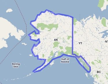
And have the outline be superimposed on top of another Google Maps window, scaled correctly to compensate for changes in the Mercator scale at different latitudes:
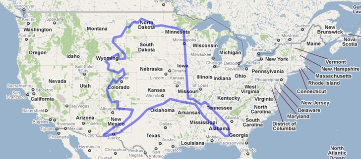
Alaska’s still pretty dang big, but this shows it at its true scale, roughly one-third the size of the lower 48.
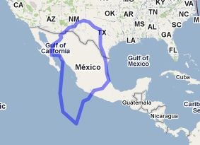
Another classic example of this is Greenland, which looks humungous on a standard Mercator projection:
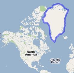
In true area, though, it’s roughly the same size as Mexico; big, but not gargantuan:
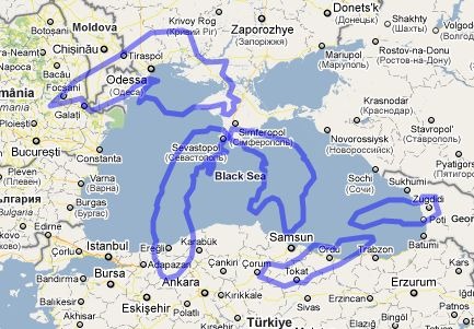
The site has some pre-drawn comparisons, like the Great Lakes against the Black Sea:
