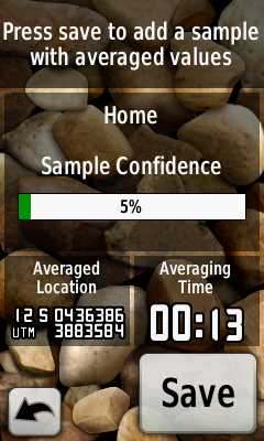
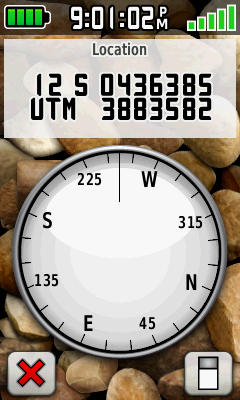
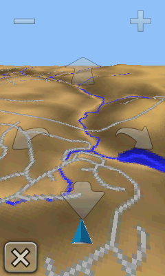
See this post for Part I of this review.
Starting with their Colorado GPS unit, which had a click-wheel-like “Rock N Roller” controller, and moving on to their Oregon and Dakota units, which rely exclusively on a touch screen interface, Garmin has moved away from having multiple physical buttons on their units to access functions and different screens. There’s nothing inherently wrong with that; replacing physical buttons with a touch screen lets you make a smaller unit, with less parts that can break. And it can give you greater flexibility in designing an optimal user interface. But separate buttons also allow you immediate access to unit functions regardless of what’s currently being displayed on the screen; you have to be careful and clever in designing a touch screen interface that works in a similar manner. Unfortunately, the touch interface for Garmin’s Oregon GPS units (and the Dakota series as well) fails in that respect; operations that were simple and easy on older units are now a chore on the newer ones.
Let’s take one of the basic procedures you’re likely to do on a regular basis with your GPS: record your current position as a waypoint. I’ve been using handheld GPS units for 17 years now, starting with the Motorola Traxar, the first “consumer-grade” GPS unit. With every one of those units up until the Oregon, if I wanted to bring up a screen to record and edit all of the parameters of my current position, regardless of where I was in the menu/interface, I could push a single button and bring up the waypoint recording screen. Fast, simple, easy.
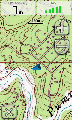
Not so on the Oregon/Dakota. If you’re in the map display, which is where you’re likely to be most of the time, you’ll see something like this:
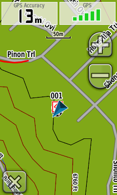
There’s no single button to push to record your position (the “x” in the lower left takes you back to the main menu screen); instead, you have to:
1. Exit from the map screen.
2. On the menu screen, press the “Mark Waypoint” button.
3. Choose either the “Save” option (to save it with the default name and icon), or press the “Save and Edit” button to bring up another screen to let me modify various parameters.
4. If I choose to edit, I have to scroll down a screen of various parameter buttons (Name, Photo, Symbol, Comment, Depth, Elevation, etc.), press a button to change that single parameter, exit that screen, press another parameter to change that one, and so on.
You have more parameters to choose from, I suppose, and the touch screen makes entering data a bit easier. But why isn’t there a simple way to reach a single screen that lets you see and modify all the parameters at once, instead of this “one-at-a-time” piecemeal approach? What should be the simplest operation you do on a regular basis becomes a chore. Why isn’t there the option for one or two user-selectable buttons that can access common functions with a single press from any screen? Or, for that matter, a few more physical buttons on the outside of the unit that the user can assign functions to?
The more time I spent with the Oregon, the more frustrated I became with the interface choices Garmin made; everything seems to be organized to take far more time than necessary. Take, for example, the main menu where you access functions. There are about 20-odd functions that can be included in this main menu, but Garmin made the function buttons so large that only six can appear on the screen at one time, two columns by three rows:
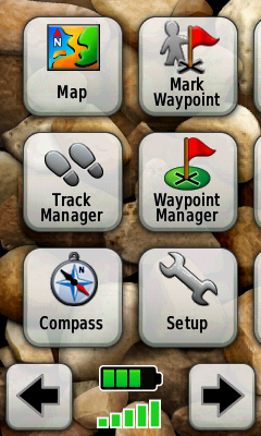
To access additional functions, you have to use the scroll buttons at the bottom; if you leave all the function buttons enabled, that’s four screens to scroll back and forth across. Shrink the buttons just a bit, and they could fit 3 x 4 = 12 buttons on a single screen, and all the buttons on two screens.
A few more annoyances:
– Garmin is in love with scrolling/expanding/shrinking display changes, when a function screen appears or disappears. It’s clever the first few times, but rapidly becomes a pain, especially as you have to dive through five or six of these screen changes to reach a desired function. It wastes time, and processor power; just let the screen pop up instantly, OK?
– With the old GPSMap and eTrex interface, track management and control was consolidated in a single screen. I could turn tracking on, record a track, turn the tracking off, and then save the track under its own name with minimal effort. Not any more. While there is a Track Manager function, you can only turn tracking on here. If you want to turn it off, you have to exit the Track Manager, go to the Setup Screen, choose Tracks, go to the Track Log button, and turn off track recording. Same thing for changing the track recording method and intervals. Why is all this functionality not available from a single screen, as it used to be?
– On older units, if you were looking at the map display and wanted to change the map data you were looking at, or map parameters, those screens were a few quick button pushes away. Not any more; once again, you have to exit the Map Screen, go to Setup, go to Select Map, scroll (slowly) through the list of available maps, click the button for the map you want to display, then press the Enable button. The ability to change the map data being displayed is one of the most commonly-used functions on such a GPS unit; why is there no option to make this accessible via a single button push?
– While I’m on the topic of maps; take a look at the list of available maps that I loaded on my review unit:
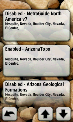
It’s bad enough that the buttons are huge, requiring you to often scroll down through even a small number of maps to reach the mapset you want. But you see that button at the bottom for the Arizona Geological Formations mapset? You’d think I’d be able to tap that to select it, but noooooo – it’s not completely on the screen. So I have to scroll down again until the button is completely on the screen before I can select it.
– There are occasions when you need to scroll through a long list. If you’re at the top of the list, you’d think it would make sense that if you hit the scroll button to go up, it would wrap around and show the bottom of the list right away; same thing if you’re at the bottom and want to jump to the top. Nope; have to scroll all the way through the list to reach top or bottom, regardless of where you are.
– The position indicator (the blue triangle on the map image above) is far larger than it has to be; it’s about 3-4 times larger than the comparable indicator on the 60Cx. Not a big deal with vector maps, but now that you can put raster imagery on an Oregon, it can block out too much of the image, especially if you have an aerial/satellite photo displayed.
… and I could go on and on. Organization of basic functions is scattered all over the place; accessing them takes way too much time and effort; the interface is poorly designed and laid out; more thought seems to have been given to making the interface look “cool” than actually making it functional and easy to use. I’ve been a huge Garmin fanboy for about a dozen years, starting with the 12XL, then the eMap, and then finally my most recent Garmin, the GPSMap 60Cx. The Oregon 450t isn’t a bad GPS unit, and I’ll be a bit sorry to send it back, but it’s a huge disappointment. Without a serious re-working of the whole interface, I’d have a tough time recommending the Oregon/Dakota series to anyone. Given the choice between the 2010-vintage 450t model and the 4-year-old 60Cx model, there is no choice – the 60Cx, for all its limitations, is a better GPS unit for field work.