See this post for Part I of this review.
Starting with their Colorado GPS unit, which had a click-wheel-like “Rock N Roller” controller, and moving on to their Oregon and Dakota units, which rely exclusively on a touch screen interface, Garmin has moved away from having multiple physical buttons on their units to access functions and different screens. There’s nothing inherently wrong with that; replacing physical buttons with a touch screen lets you make a smaller unit, with less parts that can break. And it can give you greater flexibility in designing an optimal user interface. But separate buttons also allow you immediate access to unit functions regardless of what’s currently being displayed on the screen; you have to be careful and clever in designing a touch screen interface that works in a similar manner. Unfortunately, the touch interface for Garmin’s Oregon GPS units (and the Dakota series as well) fails in that respect; operations that were simple and easy on older units are now a chore on the newer ones.
Let’s take one of the basic procedures you’re likely to do on a regular basis with your GPS: record your current position as a waypoint. I’ve been using handheld GPS units for 17 years now, starting with the Motorola Traxar, the first “consumer-grade” GPS unit. With every one of those units up until the Oregon, if I wanted to bring up a screen to record and edit all of the parameters of my current position, regardless of where I was in the menu/interface, I could push a single button and bring up the waypoint recording screen. Fast, simple, easy.
Not so on the Oregon/Dakota. If you’re in the map display, which is where you’re likely to be most of the time, you’ll see something like this:
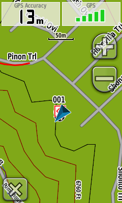
There’s no single button to push to record your position (the “x” in the lower left takes you back to the main menu screen); instead, you have to:
1. Exit from the map screen.
2. On the menu screen, press the “Mark Waypoint” button.
3. Choose either the “Save” option (to save it with the default name and icon), or press the “Save and Edit” button to bring up another screen to let me modify various parameters.
4. If I choose to edit, I have to scroll down a screen of various parameter buttons (Name, Photo, Symbol, Comment, Depth, Elevation, etc.), press a button to change that single parameter, exit that screen, press another parameter to change that one, and so on.
You have more parameters to choose from, I suppose, and the touch screen makes entering data a bit easier. But why isn’t there a simple way to reach a single screen that lets you see and modify all the parameters at once, instead of this “one-at-a-time” piecemeal approach? What should be the simplest operation you do on a regular basis becomes a chore. Why isn’t there the option for one or two user-selectable buttons that can access common functions with a single press from any screen? Or, for that matter, a few more physical buttons on the outside of the unit that the user can assign functions to?
The more time I spent with the Oregon, the more frustrated I became with the interface choices Garmin made; everything seems to be organized to take far more time than necessary. Take, for example, the main menu where you access functions. There are about 20-odd functions that can be included in this main menu, but Garmin made the function buttons so large that only six can appear on the screen at one time, two columns by three rows:
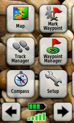
To access additional functions, you have to use the scroll buttons at the bottom; if you leave all the function buttons enabled, that’s four screens to scroll back and forth across. Shrink the buttons just a bit, and they could fit 3 x 4 = 12 buttons on a single screen, and all the buttons on two screens.
A few more annoyances:
– Garmin is in love with scrolling/expanding/shrinking display changes, when a function screen appears or disappears. It’s clever the first few times, but rapidly becomes a pain, especially as you have to dive through five or six of these screen changes to reach a desired function. It wastes time, and processor power; just let the screen pop up instantly, OK?
– With the old GPSMap and eTrex interface, track management and control was consolidated in a single screen. I could turn tracking on, record a track, turn the tracking off, and then save the track under its own name with minimal effort. Not any more. While there is a Track Manager function, you can only turn tracking on here. If you want to turn it off, you have to exit the Track Manager, go to the Setup Screen, choose Tracks, go to the Track Log button, and turn off track recording. Same thing for changing the track recording method and intervals. Why is all this functionality not available from a single screen, as it used to be?
– On older units, if you were looking at the map display and wanted to change the map data you were looking at, or map parameters, those screens were a few quick button pushes away. Not any more; once again, you have to exit the Map Screen, go to Setup, go to Select Map, scroll (slowly) through the list of available maps, click the button for the map you want to display, then press the Enable button. The ability to change the map data being displayed is one of the most commonly-used functions on such a GPS unit; why is there no option to make this accessible via a single button push?
– While I’m on the topic of maps; take a look at the list of available maps that I loaded on my review unit:
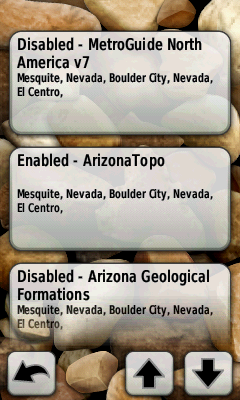
It’s bad enough that the buttons are huge, requiring you to often scroll down through even a small number of maps to reach the mapset you want. But you see that button at the bottom for the Arizona Geological Formations mapset? You’d think I’d be able to tap that to select it, but noooooo – it’s not completely on the screen. So I have to scroll down again until the button is completely on the screen before I can select it.
– There are occasions when you need to scroll through a long list. If you’re at the top of the list, you’d think it would make sense that if you hit the scroll button to go up, it would wrap around and show the bottom of the list right away; same thing if you’re at the bottom and want to jump to the top. Nope; have to scroll all the way through the list to reach top or bottom, regardless of where you are.
– The position indicator (the blue triangle on the map image above) is far larger than it has to be; it’s about 3-4 times larger than the comparable indicator on the 60Cx. Not a big deal with vector maps, but now that you can put raster imagery on an Oregon, it can block out too much of the image, especially if you have an aerial/satellite photo displayed.
… and I could go on and on. Organization of basic functions is scattered all over the place; accessing them takes way too much time and effort; the interface is poorly designed and laid out; more thought seems to have been given to making the interface look “cool” than actually making it functional and easy to use. I’ve been a huge Garmin fanboy for about a dozen years, starting with the 12XL, then the eMap, and then finally my most recent Garmin, the GPSMap 60Cx. The Oregon 450t isn’t a bad GPS unit, and I’ll be a bit sorry to send it back, but it’s a huge disappointment. Without a serious re-working of the whole interface, I’d have a tough time recommending the Oregon/Dakota series to anyone. Given the choice between the 2010-vintage 450t model and the 4-year-old 60Cx model, there is no choice – the 60Cx, for all its limitations, is a better GPS unit for field work.

Interesting, I have both a 60CSx and an Oregon 400i (and a bunch of other units, mostly Garmins, the first ones being the Magellan Trailblazer and the Garmin II). So I’m not a newcomer to GPS units. I use my GPS mainly for SAR and my Oregon has replaced my 60CSx as my main unit. Simply, it is a much more capable GPS. The profiles allow me to change from task to task, whether on water or land, the maps, the units, the sampling rate, everything is set ahead of time and changed all at once with a profile change, including track on or off. The touch interface is different from the buttons and the change, at least for me was welcomed. Entering data is simple, in a single screen, no scrolling with a mouse, just hitting the touch screen and it works even with gloves on. I think that the author has not spent enough time to get familiar with all the functions of the Oregon and if the touch interface were as bad as described, many comments about it would have been made on the Oregon Wiki, yet that has not been a source of complaints. As for the large icons, males have larger fingers, thus for me it is not a problem at all, smaller ones might have been. The location wedge is a little large, but easy to see, even at my age when reading glasses are a must. And having the possibility to have the compass right on the map screen is something I always wanted! For me, the Oregon, while not perfect, is a winner. I have an Oregon 400i, the 450 has some interesting new features and if I had to buy one now, the 450 would be it. But I’ll be waiting a bit more to see what the next generation will bring. I’d like to see a smoother way to have aerials, the current Custom Maps are an unexpected leap forward but I’m sure it can be much improved on.
The 60CSx is still a good unit, mind you, one that is well worth recommending. But IMO, it is no longer the best there is (and I’m the co-listowner of the 60CSx Yahoo mailing list…)
Amir K9CHP
It may be an issue of what you use a GPS for. I use mine not just for navigation, but for recording positions and tracks for use in field work, and for that I find the Oregon’s scattershot interface just too frustrating. Not having a working WAAS doesn’t help, either.
Given the size of the scroll/back/exit buttons at the bottom of the screen, I don’t see why Garmin couldn’t shrink the button size on other controls to a comparable size, and fit more functions onto a single screen.
I have access to both the Oregon 550 and the 60Cx and when it comes to the best unit overall I have to agree with Leszek. For me however my biggest peeve is still the screen visibility outdoors. I’ve placed both side by side and as much as I try to I just can’t settle with the oregon. In my opinion the biggest asset that the oregon has over the 60Cx is the ability to enter data quickly(ie. waypoint names) but it doesn’t help alot if you have to shield the screen and tilt it this way and that way to enter in data…and that’s with the backlight on max. Panning the map in the oregon is a bit of a pain too and still prefer the 60Cx button method.
Well, I left out the fact that the Oregon can have 200 saved tracks of 10000 points each, all accessible, meaning can be used, vs. the 60CSx 20 saved tracks reduced to 500 points and ist gpx backup tracks (if set to do so) that are not accessible other than by use of a computer.
The Oregon also has the capability of looking at more than a single img file. Yes, there are limits on total memory size and number of tiles (munch greater than the 60CSx but I don’t recall the exact number off the top of my head). This is very useful when you go to a new area, you can add another img file, whether compiled by Mapsource or other means.
Finally, as for the touch screen, while IMO, the iPOD Touch/iPhone interface is the best of that mode, just as with the latter, on the Oregon you can re-arrange the icons so that page flipping is minimalized for your personal use.
Amir K9CHP
I didn’t leave that out, either – it’s in the first part of my review, which I think is extremely positive about the Oregon’s capabilities (except for WAAS). The 60Cx can hold 2025 map segments, and I believe the the Oregon can hold 4000. I’ve never come close to either number, but I can see that being an advantage.
Yes, I re-arranged the icons as well, but that doesn’t solve the issues of having to jump around from screen to screen to get things done. I don’t doubt that it’s possible to have a touch interface that’s easy to use with lots of features; I just don’t think Garmin has succeeded with the Oregon.
Leszek, I absolutely agree with you on the issue of the touch screen and the Oregon user interface. Instead of making things easier, the way the interface is organized now, it’s just too fiddly. In fact I’ve had a similar rant 6 months ago when I switched from Vista to Oregon: http://wiki.openstreetmap.org/wiki/Garmin/Oregon_series#Compared_To_eTrex_Vista
Leszek, thank you very much for this sophisticated review! The points you checked are very interesting. It will help me a lot to make a decision buying the 60CSx or the 450t. I have to test both devices to get a own impression. I’m afraid, that the scrolling on maps with the oregon is much easier (faster?) then with the 60CSx. Moving the cursor around the map to scrol is painful (tested on Edge705). I expect, that this will be much easier on 450t.
Lescek, Thank you for your very thorough review of the Oregon 450t. I am just about to purchase my first GPS device and was leaning heavily towards this unit, so your observations are a big help. I’ve hiked and backpacked in Utah, Colorado and New Mexico for years without one but have decided it’s time to add it to my gear. I do no fieldwork just days of meandering through the mountains and canyons, many times solo. I know you are very busy but if you have any recommendations for a GPS novice I would appreciate it. Money is not the issue – cheap or expensive is fine – I would just like to have a good, reliable unit that will fit with what I do.
Thanks again for your excellent review. RC
If you can wait a bit, there may be an acceptable alternative coming up. Garmin will be releasing the model 62 in a few months, which has the same new operating system as the Oregon (which I thought was OK), but no touchscreen – it uses the same button layout as the Garmin 60CSx series. I don’t know how well the buttons will work with the new OS, but it has to be better than the touch screen. At a minimum, you can now enter a waypoint with a single button push. Rich Owings has more on the new model at his site:
http://gpstracklog.com/2010/05/garmin-gpsmap-62-series-first-pics.html
If you can’t wait, the Garmin 60CSx is currently on sale for $200 at REI, Bass Pro Shops and Cabelas.
This thing looks great for those who like to explore. Right now I ride with a Garmin Quest, Polar HRM and Shimano Flight deck mounted on my handlebars. I do alot of explorative riding and once I started using the Quest, I wouldn’t be caught without it. Battery life is a concern, Quest advertizes 20 hrs and is pretty true with back light off but the comment regarding the 305 drain to 6.5 with cadence/hrm is a concern. Still eliminating the handlebar clutter/weight to one device with mapping is real tempting. Plus I get a barometric altimeter which the Quest doesn’t have, the gps altimeter is pretty inaccurate and the Polar HRM with barometric costs over $300. Does it support multiple waypoints per route? Quest does, Nuvis don’t, critical for programming in exploration routes.
What a great page, i am looking for a GPS at the moment, I am tech savvy but a gps newbie, most important to me is the ability to be able to turn it on when i enter the bush or mountains and know its going to be able to help me find my way out ( i carry a compass as a backup)later that evening or the next day.
The ability to save the route and mark POI on the way then view them on google earth is also very important.
I just ordered the 450T and hope I figure out how to use it I use a E trex now and the orange screen is tough to read in most lights including dark! If shading the screen works I am happy. As far a s entries go most of us use alot less of the features you seem to need for work. I want to find my treestand in the dark, get back to my truck in the dark and explore new areas from time to time. I think the mapping feature will be awesome. With My e trex I will find my way home but have no idea where the lake or next road(s) are.
when was this review published??? it would help a lot if this website had dates for reviews and posted comments..
This is a great review with lots of info to help me but I have to agree with Mike. It’s December 2010 & I cannot tell if the info is one week, one month, or one year old.
I just got the Oregon 450T a couple of weeks ago.
And the UI is really a disaster and so is BaseCamp and MapSource which looks like it haven’t had an update for the last 8 years.
Also traks suddenly disappear from the unit even if I archived them and imported them to BaseCame.
What a disappointment.
(comment added Jan. 25 2011.)