So, the week of December 15-19, when I was supposed to be out doing field surveys in northern Arizona, we got snow. A lot of snow. And it kept going until about December 26th. It’s kind of hard to do a field survey when the ground is covered with snow, but I’ve been hoping the recent bout of warm weather would melt that snow quickly, and let me get back out in the field.
To monitor that situation, I’ve been consulting the US National Weather Service’s National Operational Hydrological Remote Sensing Center (with the snappy acronym NOHRSC). At this time of year, they supply a large number of snow-related data products, including:
Continue reading ‘Snow Cover Maps’
At the Visited Countries site, fill in a checklist for a list of US states, Indian states, or world nations:
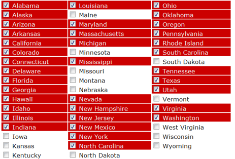
and get back a link to an image you can embed on your website or blog:

visited 36 states (72%)
Create your own visited map of The United States or try another Douwe Osinga project
Guess I need to spend some time in the Plains states :). There’s also a button which leds you embed the map directly into your Facebook page. For a site that creates a similar KML file for Google Earth, try
Color Your Map.
Via Cartophilia.
From comments on my previous post on the Web Fire Mapper come two more links to fire-related mapping sites:
– The Wildfire Information Portal (from Pitney-Bowes and the San Bernardino Sun) uses a Virtual Earth Interface to display wildfire-related layers with the transparency adjustable using sliders. Check a box to view a layer, click on the description to select it (Fire Boundaries in this case):
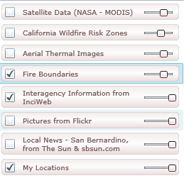
Below the layers panel, additional information and links to current data will appear:
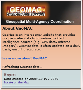
Click on “Locate on the Map” for a data entry, and the map display will zoom in to the selected area:
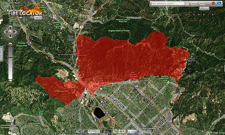
There’s a link to a video tutorial at upper right. It’s definitely California-oriented, and the only data currently visible is for that state, but the video indicates that the site displays data for the entire United States.
– From NOAA comes a viewer for their Satellite Services Division (SSD) Fire Detection Program, showing fire and smoke data for the US, Central America, and southern Canada:
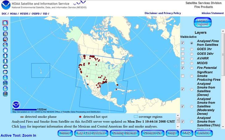
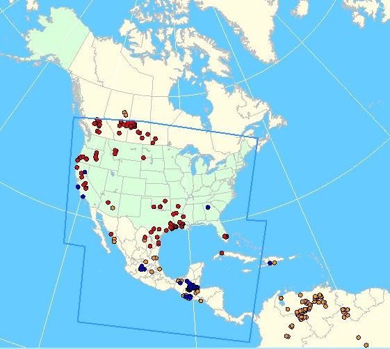
The default coverage (“Analyzed Fires from Satellites”) is shown above, but additional data for Central and South America can be seen by checking the AVHRR and MODIS boxes, then clicking “Refresh Map” at the bottom of the layers section:
HTs to joelarso and amlohdi.
A timely data resource given the recent wildfires in California, the Web Fire Mapper plots the locations of fires across the globe as determined by measurements from the Aqua/Terra earth observation satellites:
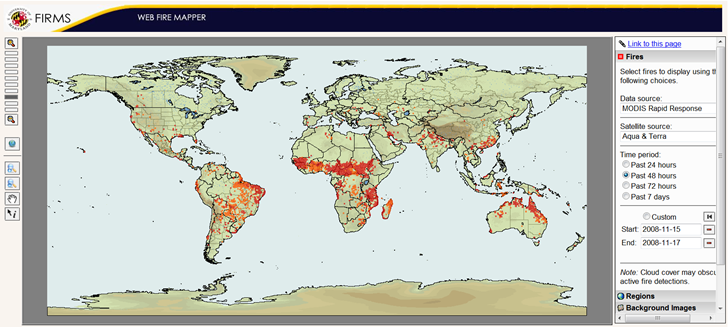
- Plot fires as seen by Aqua, Terra, or both, using MODIS (Moderate Resolution Imaging Spectroradiometer) observations
- Choose a pre-selecting time period, or enter your own start/end times
- Choose the background image: Blue Marble, Elevations and Rivers (as above), or None (just country outlines)
- Enable additional layers: Administrative Boundaries (e.g. states), Cities and Protected Areas
- The Download function isn’t working yet, but includes a link to a page where you can download GIS shapefile data for fires over the last 48 hours or last 7 days
- If you create a view you like, click on “Link to this page” to create a bookmarkable link that saves those settings
Via La Cartoteca.
I’m never quite sure what to make of the US Government’s National Atlas website. Don’t get me wrong, I really like the site, but that’s as much a function of the serendipitous nature of the maps and data you can stumble across as it is its utility. I don’t know that I’d send someone there to look for a specific set of data, since the datasets and categorization are all over the place. But it’s a fun site to poke around in. Among the stuff you can find:
- GIS-ready data in shapefile, DBF, SDTS-TVP and GeoTiff formats, covering a wide variety of topics both pedestrian (census demographic data, water bodies) and exotic (maps of butterfly distribution; magnetic field intensity)
- An onsite MapMaker that lets you browse through information about different datasets, and then plot them interactively for export or printing
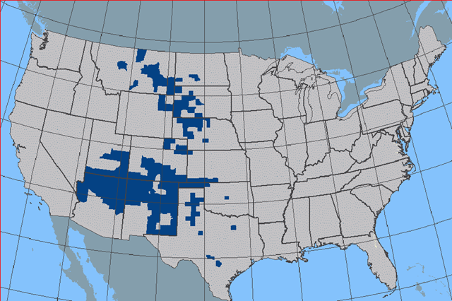
Distribution of Strecker’s Giant-Skipper butterfly in MapMaker
You may not find exactly what you’re looking for at this site, but it’s worth checking out just to see what they have.
In the same vein as the StatPlanet app covered last week come another site for world demographic and economic data presented in a Flash map interface. The OECD Regional Statistics sites (Level 3 for small-scale data) :
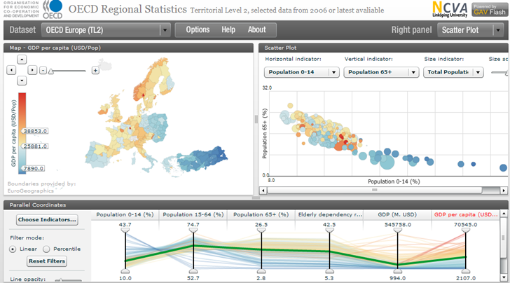
There’s a limited number of plottable datasets (about 17), but the interface is terrific, perhaps the best I’ve seen for a site of this type. It was constructed using the Geovisual Analytics Visualization (GAV) Flash toolkit being developed at Linkoping University in Sweden. The data can be exported by selecting “Raw Text Data” from the dropdown menu at the upper right, and then copying/pasting the data into a text editor or spreadsheet; even more data is available from the OECD.Stat Extracts website.
A while back, I posted on GeoFabrik’s repository of Open Street Map (OSM) data in shapefile format, covering mainly Europe and parts of Asia. CloudMade now has this data freely available for download as well, but not just in shapefile format, and not just Europe, but every continent (including Antarctica). Broken down by country/state, you can download:
- OSM XML extracts
- Garmin Map Files (OSM.err edition)
- Osmosis country bounding polygon
- Shapefile extracts
- Navit maps
- GPX POI
- TomTom POI
The latter two are a bit lacking in data now, to put it mildly, but presumably will grow in size with time. CloudMade is developing APIs to deliver the OSM map data in web and mobile format, but these are currently in alpha and limited to developers.
The Garmin data comes as a gmapsupp.img file, which you can copy directly to the SD/microSD card of a compatible Garmin unit; see this post for more info. The problem with Garmin map data in this format is that you are limited to having only the data embedded within that single file loaded into your GPS; you can’t combine it directly with other Garmin mapsets. And because the gmapsupp.img file can contain multiple sub-tiles, you can’t add it to the MapSource program using MapSet Toolkit; trying to do so will only make a single sub-tile visible. But there’s a way to split that gmapsupp.img file into its constituent sub-tiles, making it installable into MapSource, and I’ll cover that in tomorrow’s post.
Just released by Frank van Cappelle of SACMEQ (Southern and Eastern Africa Consortium for Monitoring Educational Quality) is StatPlanet, an interactive application for exploring worldwide demographic, educational, health and socio-economic indicators. Plot choropleth and proportional maps, bar and scatter plots:
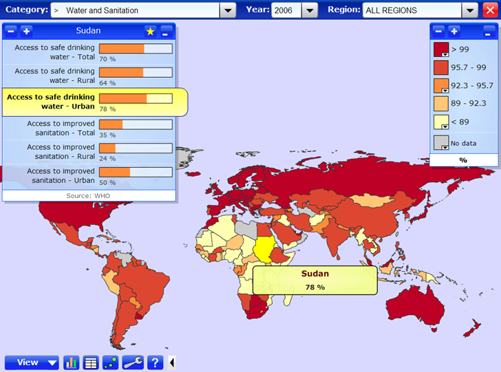
The application is highly interactive – pass your cursor over the map, or a plot, and get additional data breakdowns. There’s both an online version and a downloadable stand-alone Flash version for Windows systems, and an excellent one-page Features/How-To section on the main download page.

