Last week, I posted on how to create an animated depiction of sea level rise due to a storm surge or global warming. Here’s a movie of the flooding for the Manhattan/NYC area:
Got a note from Frank Taylor over at the Google Earth Blog saying that it looked pretty interesting, and that he would have linked to it if it were in Google Earth. That got me to thinking about how you could show the effects of coastal sea level rise in Google Earth with high spatial resolution, both static and animated. I’ll start with the easy one: static.
There are already a few related resources for both Google Maps and Google Earth. The Flood Maps website allows you to enter a flooding level in a Google Maps interface, and see the potential effects of sea level rise, with good accuracy for many locations. But it uses Shuttle Radar Topography Mission (SRTM) data, which can be way off in urban and forested areas. B. Zoltan created a sea level rise animation for both Google Earth (and Google Maps) by creating a globe-sized sea level overlay for the earth, and then raising the sphere’s size meter by meter to account for sea level rise, but the spatial resolution for that Google Earth animation is low. So there’s an opening for depicting sea flooding in Google Earth using high-spatial-resolution data, like the 10-meter data available from the USGS Seamless Server.After obtaining the digital elevation data (DEM) for the area you’re interested in, load it into MicroDEM, and flood it to the level you want (see this post for the basic details on how to do that). Here’s lower Manhattan flooded to 8 meters:
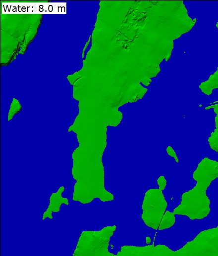
I could just save this image, and overlay it onto Manhattan in Google Earth (and in fact I’ll post on the topic of graphic overlays in Google Earth soon). But overlay images have to be positioned in place in Google Earth, and can consume large amounts of memory and computing power. Google suggests that you not use an overlay greater than 2000 x 2000 pixels in size. You can get around that with tiling (another topic to be covered soon), but in terms of memory and computing power, the best solution would be to convert the area covered by the sea after an 8-meter rise into a vector polygon KML file.
First off, I only want to convert the area covered by seawater into a polygon, and that requires getting rid of the other terrain details. To do that, right-click on the DEM in MicroDEM, and choose Display Parameter => Blank. I won’t show the resulting image, since it’s a plain, blank window; but the elevation and position data is still there. Next, following the same kind of procedure used in this post, I will flood the “blank terrain” to a level of 8 meters. You can’t see where the ocean and land are in the blank image, but the position and elevation will show up in the bottom status bar as you move the cursor across the map. So when you we select the location to start the flood basin from, double-click on any point where the elevation is 0 meters (sea level). By setting the “Reservoir top” to 8 meters, unchecking the “Label maps” box, and clicking on the “Flood” button, I get the following image:
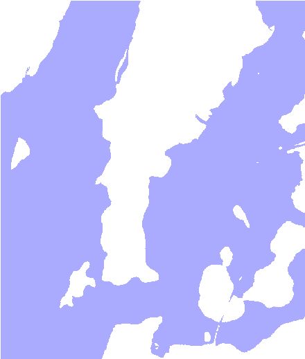
I now want to convert the colored area into the KML polygon vector format. The first step is to convert this raster image into a vector shapefile format. I’ve already covered the basics of this in a previous post, and I’ll use a similar process here, but it’s actually bit easier in the final steps. First, save the image in MicroDEM as a GeoTiff (File => Save map as image => As GEOTIFF, screen scale). Then, follow steps 2-6 in the previous post to convert the raster image to a vector shapefile image, and load it into a GIS like MapWindow:
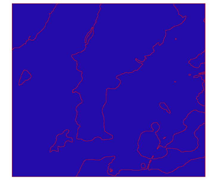
Continuing on in the general manner described in steps 7-9, you will create a new layer that contains just the water data; for this, just select any open area of water with the Select tool on the toolbar, then use GIS Tools => Vector => Export Selected Shapes To New Shapefile to create a new “water “layer:
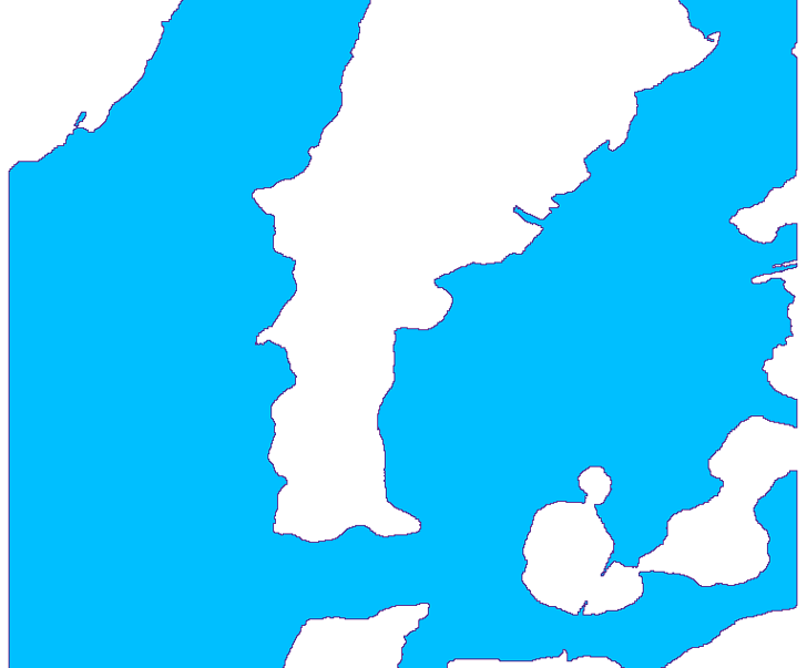
If there are no “islands” in the original image, you might be done at this point, but since there are in the image above, I have to go on.
Now go back to the original layer, select the same shape you exported above, and delete it using the “Remove shapes” command on the toolbar to create this “land” layer:
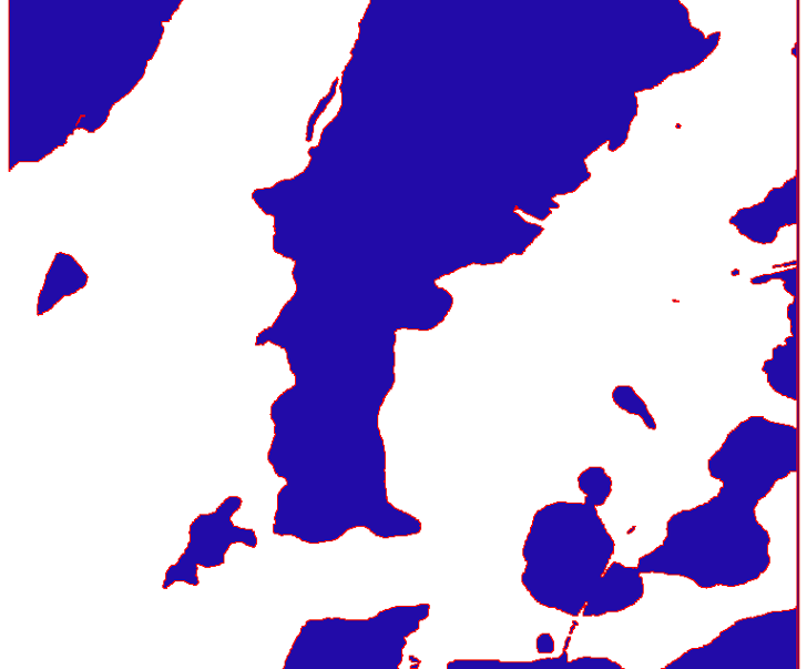
Subtract the “land” layer from the “water” layer, and you get the final correct polygon vector shapefile outlining all the areas covered with water; compare this with the original raster image above:
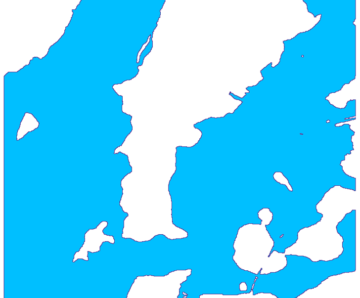
At this point, it would be a good idea to run the vector shapefile through MapShaper to simplify it; I’ve found that this can shrink the final KML file size dramatically.
Now to convert the shapefile into a Google Earth KML file. For this, I’ll use the $30 MapWindow plug-in Shape2Earth (you can try it out in free demo mode for this as well). The steps are straightforward, and similar to the ones described in this post:
1. Open the final shapefile created above in MapWindow
2. Set the color of the shape to something appropriate, maybe light blue, by double-clicking on the layer in MapWindow to get the properties window
3. Choose Export to KML from the Shape2Earth menu at the top in MapWindow(if it’s not there, make sure it’s enabled in the Plug-Ins menu)
4. Set the opacity to 80%, Altitude Mode to “Absolute”, use “By Input” and set it to 8 meters (or whatever flood level you set above). You can always adjust these properties later in Google Earth if you want.
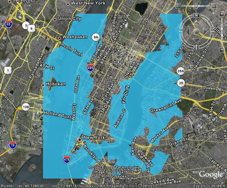
5. Create the KML file, and open it in Google Earth; here’s what it looks like from directly above:
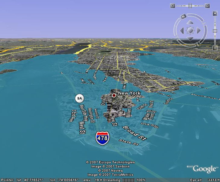
And from the an oblique angle, looking at the southern tip of Manhattan:
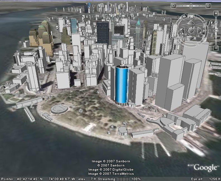
Of course, it gets really interesting when you turn on the buildings layer, and see how far up the side of the building the flooding goes. Here’s lower Manhattan, with buildings and no flooding:
Now bring in 8 meters of flooding:
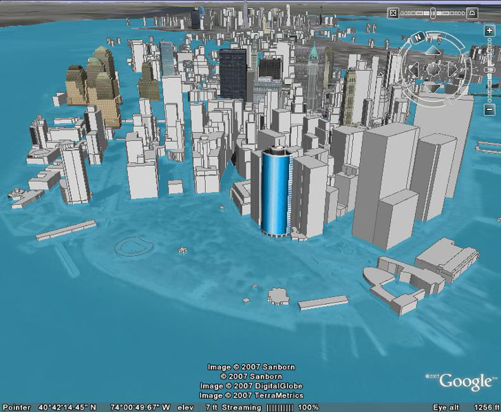
Oh, the humanity!
Here’s a link to the KMZ file, so you can play around with it yourself. For some reason, the water disappears sometimes at certain zoom levels and angles; just change the zoom level or the angle again, and it will re-appear.
How does this compare with the BZoltan Google Earth animation in terms of accuracy? Here’s my KML data drawn on top of BZoltan’s:
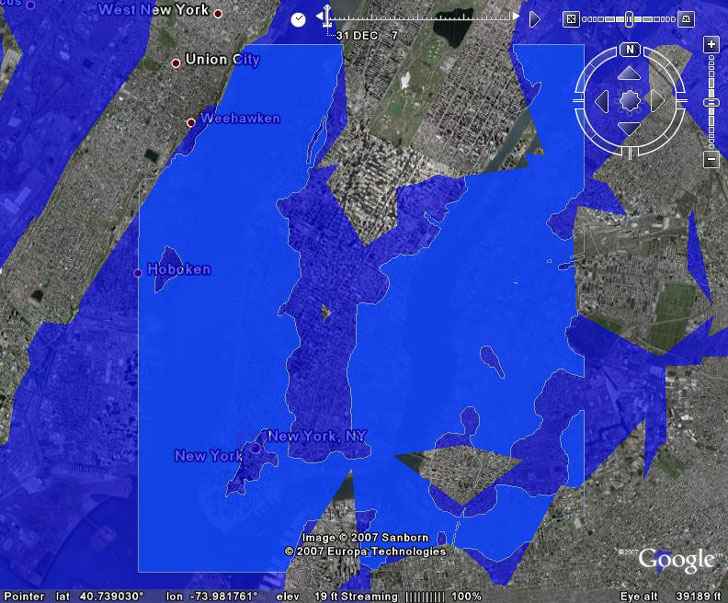
The only place you can directly compare the two is within the bounds of the original terrain data I used, but I could have used a larger set of terrain data if I had wanted to (would have made the calculation time a bit longer, that’s all). But within that area, my KML file shows the extent of flooding for a sea level rise of 8 meters with greater spatial accuracy than the BZoltan depiction. Once again, that’s just a limitation of the original elevation data accuracy that BZoltan’s approach uses. With my method, you can also do high-spatial resolution river and lake flooding overlays as well (see the latter half of this post for how to create river flooding images).
Addendum: Since writing this post, Google has incorporated higher-accuracy elevation for the US, equal in resolution to what I used in my example (10-meter spacing). So for the US, results from BZoltan’s simulation and my analysis match up far more closely. For the rest of the world, the accuracy of the simulation will depend on the resolution of the data for both Google Earth and my approach. For much of the world, the best publicly-available data for both is SRTM-90, with 90-meter spacing between elevation data points, almost a factor of 10 worst than that for the US. This might lead to unrealistic results for both approaches. So use caution. HT to Lars in comments for point out that I didn’t emphasize this.
Of course, Frank says that BZoltan’s data is still cooler, because it’s animated. And I’m working on that :). First, I’ll attempt to do the same thing with a graphic overlay instead of a polygon KML file. And then hopefully, ultimately, I’ll figure out a way to create an animated KML file showing the sea level rising the same way that BZoltan’s files does, but with greater spatial accuracy for a smaller geographic area. Haven’t figure out yet whether vector data (like the KML file above) or raster data will work better.
Impressive! (both your work and the effect :)
But the described method has one limitation: it won’t work for large areas (larger than few sq km) if you use extruded polygons – in GE they (their ‘roofs’) don’t follow the Earth curvature.
I was about to agree with you, when I remembered that I had seen extruded polygons that I thought did follow the earth’s curvature. Created an extruded polygon of Brazil with Shape2Earth to check that out, and it does indeed follow the earth’s curvature when the elevation mode is set to absolute. You can download that KMZ file here. Oddly enough, it seems to follow the topography of Brazil to a certain degree, which it shouldn’t if it’s in “absolute mode”, but that didn’t seem to be a problem with the flooding KML file I created for New York City.
I made a World Wind plugin that does this:
http://forum.worldwindcentral.com/showthread.php?t=8592
It’s more suited for medium-scale changes though, the detail is limited by the precision of the rendering. This means you get z-ordering artifacts in places where a terrain triangle is nearly the same location as the flood mesh.
How cool it would be to see new york become a kind of venice. yellow cab would have to purchase a fleet of boats.
Unfortunately this approach is limited to the coverage of the USGS Seamless Server, which is basically the U.S… right? So for the rest of the world, this approach offers no improvement over the Flood Maps web site or Zoltan’s animation?
If so, you might want to mention that limitation prominently. It’s a critical limitation for most of the world, and it’s not obvious from your post.
Lars
A reasonable point – I’ve added a short note to the post referring to this (and also pointing out that since writing the post, the elevation data for the US in Google Earth has been upgraded to 10m accuracy).