blankblank blank


Archive for the 'cartography' Category Page 13 of 14


Handy Online Lookup Of EPSG Coordinate System Codes

The European Petroleum Survey Group (EPSG; now defunct, and superseded by the OGP Surveying and Positioning Committee) created and maintains a spatial reference database, assigning EPSG code numbers to spatial reference systems (combinations of coordinate systems, projections, and datums). There really is no way to figure out the spatial reference system from just the code number alone, or vice versa, so you need to look them up. The official database is in Microsoft Access format, not terribly easy to use; the code list in tabular format isn’t much better. There’s now a convenient online version of the database, searchable by keywords or code number. You can then access additional information for that spatial reference system in a number of different formats:

  • Human-Readable OGC WKT
  • Proj4
  • OGC WKT
  • JSON
  • GML
  • ESRI WKT
  • USGS
  • MapServer Mapfile
  • PostGIS spatial_ref_sys INSERT statement

Users can also upload their own spatial reference definitions, which I suppose is a good thing as long as you exercise caution in using them.

Via import cartography.


US/Global Terrain Shading Data And Landcover Imagery

Tom Patterson is a cartographer with the US National Park Service, and runs the Shaded Relief website, with many articles, tutorials and links related to terrain shading techniques in cartography. But he has also created fantastic terrain and landcover imagery and data, all of which is freely downloadable, license-free and reproducible in any format. These would make great background imagery for national and world maps created using GIS software. Some of the files are very large (well over 100 MB in size), so downloading them may take a while depending on your connection speed.

Continue reading ‘US/Global Terrain Shading Data And Landcover Imagery’


Cartographic Utilities In MicroDEM: Datum Shift, Magnetic Declination, UTM Grid Deviation From True North, And Sunrise/Sunset/Twilight Times

While its primary functions deal with DEM/terrain display and analysis, MicroDEM has some handy cartographic functions as well for any position on a georeferenced map. It can calculate the amount of shift in position between different datums for both UTM and geographic coordinates; determine the current angular variation between true and magnetic north; find the deviation from true north for the UTM grid, and label sunrise/sunset/twilight times for multiple points on a map.

More after the fold …

Continue reading ‘Cartographic Utilities In MicroDEM: Datum Shift, Magnetic Declination, UTM Grid Deviation From True North, And Sunrise/Sunset/Twilight Times’


Better Map Color Schemes With ColorBrewer

When creating a thematic map where color represents different attribute values, there’s always the question of whether the color scheme you’ve selected will look good. and more importantly whether it will convey the information you’re trying to represent to its audience. Trial-and-error is one approach, but the ColorBrewer is a Flash web applet which lets you interactively experiment with different color schemes to see which ones work visually (and which ones don’t). It was created by Professor Cindy Brewer of Penn State University, author of Designing Better Maps: A Guide for GIS Users, and will run in any browser with Flash support.

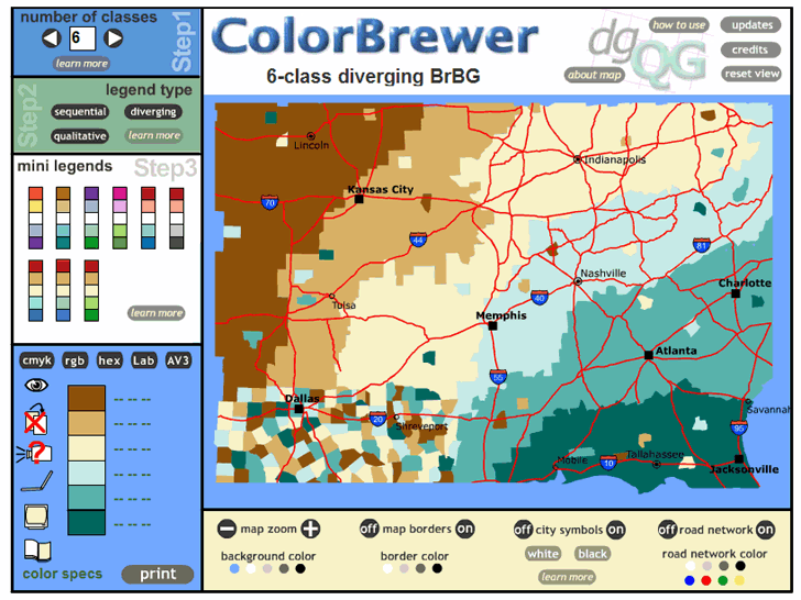
ColorBrewer doesn’t actually display any of your data – it uses a dummy map of what appears to be counties in the US Southeast to plot different color schemes in sequential, diverging or qualitative fashions. It’s not intended as a data plotter, just to evaluate the visual impact of different color schemes. Inputs include:

  • Number of classes
  • Sequential, diverging or qualitative schemes
  • Mini-legends (pre-built color schemes)
  • Turning map borders, city symbols, road networks on and off
  • Selectable colors for map borders, city symbols, road networks, and the map’s background color.

Here’s a screenshot of the application in action (click on the image for a larger view):

designing better map color schemes with ColorBrewer


Meet Your Friends Halfway II

I posted earlier about a.placebetween.us, a site that lets you enter two addresses, then finds a business of a specified type located about halfway between those locations as a convenient meeting place. GoogleMapsMania posts about a similar site called Mezzoman that does essentially the same thing. It’s a bit more convenient to use in entering the addresses compared to a.placebetween.us, but has a smaller map window with less flexible map controls (i.e. no zoom slider, just Zoom In/Out buttons). The initial drop-down business type selector is limited, but you can enter the business type of your choice in the Google Search box that appears after you click the “Mezzoman Go!” button.

Edited 6/13/07 to fix mistake pointed out in comments (thanks, Moawall!).


Elevation, Slope, Terrain And 3D Anaglyph Map Shading In MicroDEM

For general map relief shading, my first choice is usually 3DEM, since it usually gives the best results. But MicroDEM also does a decent job at terrain relief shading, and has a few other shading options that 3DEM lacks.

Continue reading ‘Elevation, Slope, Terrain And 3D Anaglyph Map Shading In MicroDEM’


Drawing Lines Between Points In Google Maps, Straight And Great Circle

In comments from a previous post, TommyBoy writes:

“What I’m looking for and just can’t seem to find; is a simple line plotting tool for Googlemaps. On the weather sites, they’ll say “a storm is expected south of so-and-so to so-and-so to so-and-so. I’d like to pop those cities into a GMap, and have is simply display a straight line connection one city to another, so you can see the storm line. Not following roads and directions, just a point to point to point line. I’ve search high and low, and can’t find anything that simplistic. Ever come across something like this?”

Why yes, I have. Of course, if I hadn’t, I wouldn’t be writing this post :).

The RoutePlanner website allows you to plot routes between locations on a Google Maps interface that you define either by clicking on the map, or entering the location into a search box. For drawing a straight line between two cities, you would do the following:

a. Skip the first step the interface, which zooms in on a location of interest – in most cases the zoom will be at too high a level to be useful.

b. Enter the points you want to draw a straight line between, either by clicking on the Google Maps interface, or entering a location (at least city and state) into the search box. When you enter the first point, it will zoom into that location. Entering the second point will not zoom to that location, though, and you will probably want to zoom out to see both markers on the map.

c. You have two sets of options in the third step on the page. The first is supposed to give you the driving route between the two points, but I can’t seem to get it to work (possibly because of pop-up blocking issues). The other draws a “as the crow flies” straight line between the two points, which is what I think you want. There are two options, “Get Crow Route As Entered” and “Get Best Crow Route”, but they usually seem to give the same results for two points. There are times, though, when one of the “Crow” options doesn’t work, while the other does, and that appears to be a problem with clearing out locations from a previous operation.

d. Once you’re done, you can zoom out to see the line between the two locations, clear everything and Start Over, or even save the points and drawn line in a permanent URL you can bookmark, like this one.

One thing to keep in mind, though, is that only North/South and East/West lines will be “true” in terms of direction. I believe Google Maps uses the “Plate Carree” (“flat and square”) or equirectangular projection, where the grid uses an equal spacing for latitude and longitude degrees in the y and x directions. But on the earth, the distance spanned north/south by a degree of latitude is constant, while the distances spanned east/west by a degree of longitude is greatest at the equator and shrinks to zero at the poles. So line drawn on the map that isn’t exactly east/west or north/south doesn’t represent the bearing angle from one point to another correctly, but will be skewed southward somewhat. For the purposes you want to use this for, though, it’s not that big of a deal.

Another thing to remember is that on a flat representation of a curved surface, like a map of the earth, a straight line is usually not the shortest distance between two points. For that, you’d want a “Great Circle” route plotter, and there’s a pretty good one with a Google Maps interface at the Great Circle Mileage Calculator and Display website. Unlike the RoutePlanner website, you have to manually choose the two points you want to draw a Great Circle between, but creating the points is easy:

1. Enter the locations that you want to create a Great Circle between in the box at the top.

2. Click on Start Course

3. Click on the first point marker, then the second, then click “End At Last Point”; the Great Circle Route will be drawn between the two. You can also add markers to the map manually at this stage as well.

The other options are fairly easy to figure out.


Two Fun Cartographic Google Maps Tools

– Dig a hole through the center of the earth from any location, and find out where you’ll come out. Also useful if you’re making an earth sandwich.

– Set off in a constant compass direction from a location, and find out what path you’ll take around the world.

Via GoogleMapsMania.