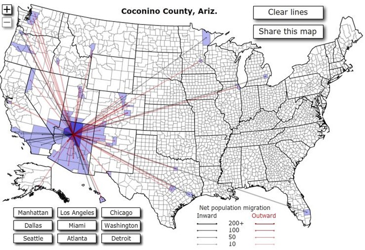
Forbes Magazine has an interactive US map showing migration patterns between counties in the US for the year 2008.
Click on a county, and lines connect that county to other counties where 10 or more people have either moved to that county (black lines) or away from that county (red lines):

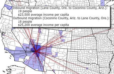
Mouse over a colored county to see the inward/outward numbers, and average per-capita income in both counties:

At least 10 people have to move in or out of a county for data to show up.