blankblank blank


Archive for the 'Web apps' Category Page 2 of 10


Create Your Own Farm Map With Farm-File.Com

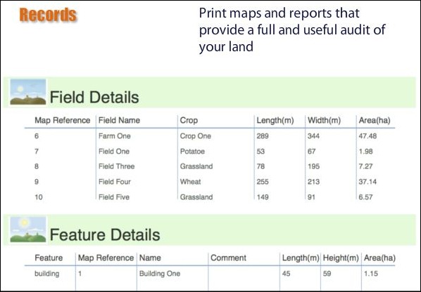
Just got an email from MSSB Consulting about their new website, farm-file.com, which lets you create maps of your own farm/rangeland using their web app. Basically, you navigate to your farm’s location in Google Maps and trace over the boundaries of individual features; farm-file then creates a printable map of these features drawn to scale:
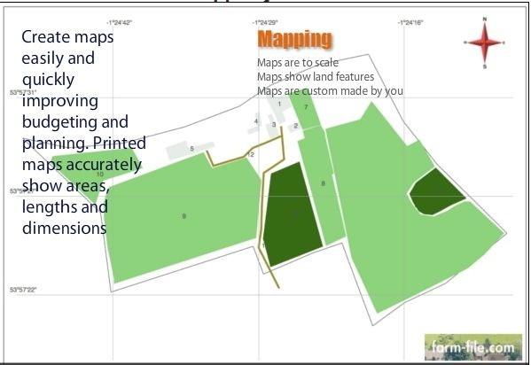
ff1

Along with additional data pages:

ff2

If you want a higher-quality, larger version of your map, you have the option of buying that from the site. There’s a full set of instructional videos, but for the most part it’s so easy to use you probably won’t need to watch those. And while designed for farm mapping, it might prove useful to anyone wanting to calculate the areas of various features visible in Google Maps.
Address Maps In A Hand-Drawn Style With Destination Maps

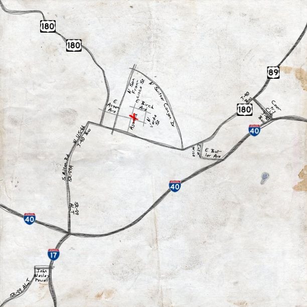
I don’t use Bing Maps that often, but after seeing the Destination Maps app, maybe I’ll check it out more often. Enter an address, select an area that you want a map of, and then select a style, and the app will generate a printable map in your choice of a number of styles, including several that look like they’re hand-drawn, like Sketchy:

sketchy

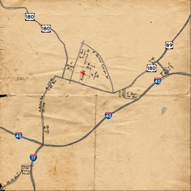
And Treasure Map:

treasure

Save them in your choice of resolutions (regular, large, and extra large), and formats (PDF and JPEG).

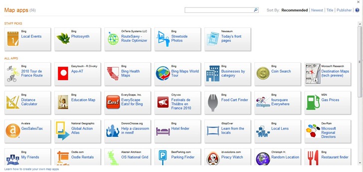
Had some layout problems with the app in the Google Chrome browser, but it worked perfectly in Internet Explorer 8. And while you’re there, try clicking the Map Apps button at the bottom to see more apps built on Bing:

mapapps

Via the Bing Maps Blog.


GeoServer News

GeoServer is …

an open source software server written in Java that allows users to share and edit geospatial data. Designed for interoperability, it publishes data from any major spatial data source using open standards.

GeoSolutions, an open-source consulting company, has created a free GeoServer workshop disc in iso format. You can run this iso in a free virtual machine environment like VirtualBox, or burn it on a DVD to use as a bootable Ubuntu Linux OS disc, or to install it on a computer. The disc contains:

  • Tutorials on installing GeoServer, running it, adding data and querying it, and Google Earth/Maps support
  • An installation of GeoServer with sample data
  • Copies of the GIS programs uDIG and qGIS, which support creating datasets for use with GeoServer

OpenGeo, another consulting company, has also recently released the latest version of the Community Edition of their OpenGeo Suite. This is the free unsupported version, and includes not only GeoServer, but some additional tools: GeoWebCache, a web map caching app, and GeoExt, a “JavaScript library that provides a groundwork for creating rich web mapping applications”.


Satellite Prediction/Tracking In Google Earth/Maps

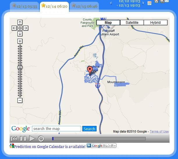
The SightSpaceStation website offers some eye-catching satellite position tracking and position web apps. Set your home position in Google Maps (scroll, then click on the home icon near the top):

home

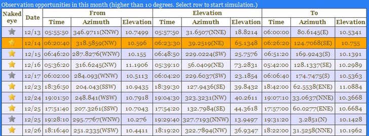
And get a table of upcoming International Space Station (ISS) flyovers near your home location, with “good” ones (good chance of spotting it with your naked eye) highlighted with gold starts:

table

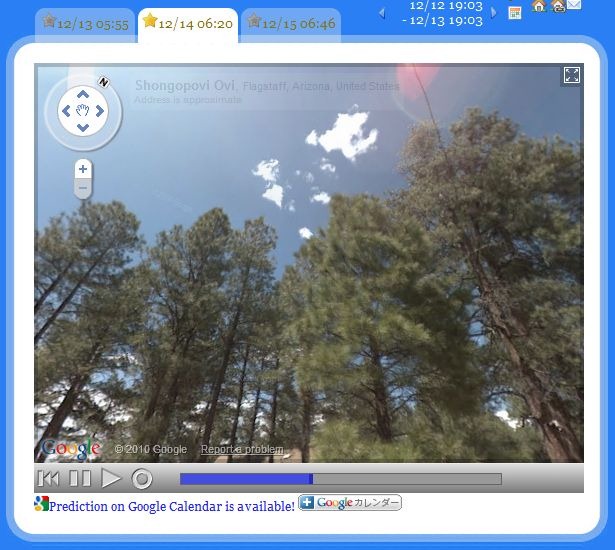
There’s even a link that will let you add the flyover time to your Google Calendar. If Google StreetView data is available for your location, you can play an animated view of the ISS’s sky track in Google View to see where it will track relative to your local landmarks:

track

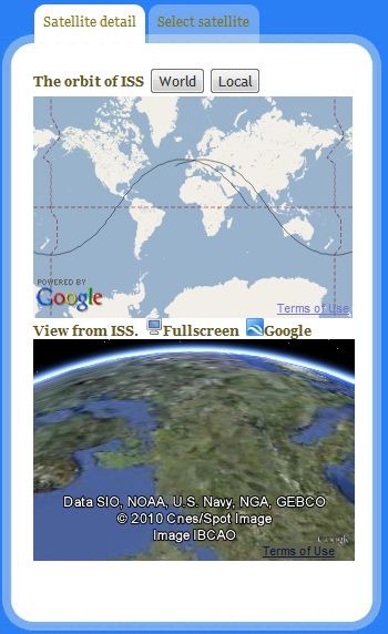
There’s a mini-map screen showing the position of the ISS at that moment, plus a second “out-the-window” view showing what the ISS occupants would see below them as they orbit the earth:

mapscreen

When you play a StreetView flyover, this mini-map will switch to show you the position of the ISS during the flyover, as well as the view out of its window.

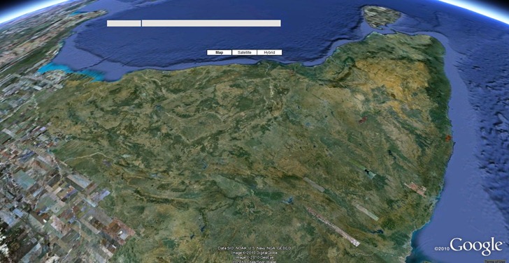
You can load that animated “window view” full-screen into your browser using the Google Earth plugin, or download a KML file which will display it in the stand-alone  (which looks very cool, especially in animated format):

ISS_view

There are a few other satellites you can choose from: Hubble, Resurs, TRMM, UARS.

Site can be a bit quirky, and you may have to reload/refresh it to get out of some screens, and back to the main screen.


Another Earth Updated To Add Historical Imagery

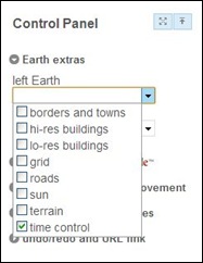
Not long ago, I posted about Another Earth, a site that loads two Google Earth views side-by-side, and lets you either view two locations separately for comparison, or synchronize movements between the two. I said that it was very useful as-is for comparing geographical features, but would be awesome when it added the ability to view historical imagery in one window, and compare it  with current imagery in another. John at Another Earth just emailed me to say that the historical imagery option is now active at the site. You’ll need to make sure that the time sliders are enabled for one or both Google Earth windows in the Control Panel (layout is slightly modified from the previous version):

aecp

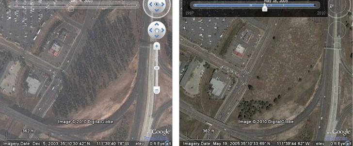
Then move the time sliders to an available imagery date; tick marks in the slider panel mark dates with available imagery. In the sample below, I compare a wooded knoll on the left from 12/2003 with a later view in 5/2005, after the owner had illegally chainsawed through the tree trunks to kill them, and clear out the lot:

flagcompare

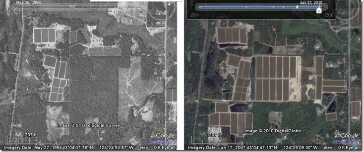
Here’s another comparison near Bandon, Oregon, showing growth of cranberry bogs  between 1994 and 2010:

bandon

You’re restricted to whatever imagery Google Earth has available for that area for a particular time, which for much of the US doesn’t seem to go earlier than the 1990s. Still, this is pretty awesome as-is for looking at man-made landscape changes or the effects of natural disasters, and will only get better with time as Google adds more historical imagery to their database.


Two Javascript Mapping Libraries

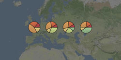
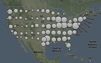
Cartographer: Free Javascript libraries (MIT License) for generating basic thematic maps.

ex_choropleth
Choropleth
ex_pies Pie charts ex_cluster
Cluster

Links to additional live examples at the website. You can hard-code data values, or retrieve them from an online source like a Google Spreadsheet.

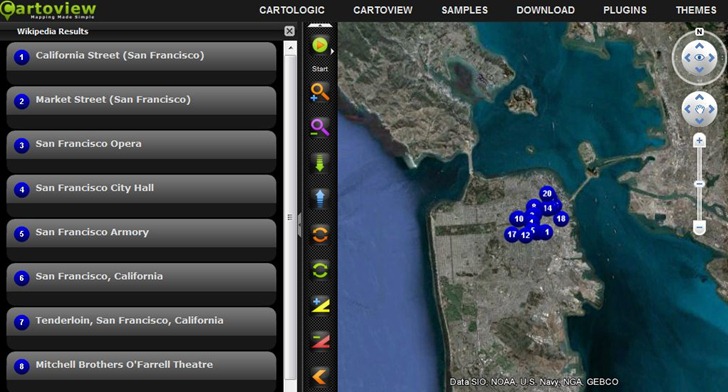
Cartoview: Open source software that “makes building and editing maps a breeze…”. I wouldn’t go quite that far – I think you’ll need quite a bit of experience with Javascript, Google Maps and webservers to get this up and running. But there’s a substantial amount of help available, including tutorials, online help files, and a user forum. There are also a number of online demos, with links to downloadable source code for the demos to help you figure out how to do stuff. I gotta say, some of the demos look very impressive, like this Google Earth plugin view that lets you plot points/data from online resources (Wikipedia, Yelp, Foursquare, Twitter, etc.), with user-definable interface styles:

cartoview


Cartography 2.0 – Online Textbook

Cartography 2.0 is (was?) an attempt by geographers at Penn State, University of Wisconsin – Madison, and Axis Maps to create an online up-to-date textbook (Creative Commons license) on making modern digital interactive maps. Current chapters online:

  • Overview of Animated Maps: Learning from others
  • History Of Animated Maps
  • Conceptualizing Time, Change and Geographic Process
  • Representing Time on Animated Maps
  • Representing Time on Static Maps
  • Cartographic Text
  • Cartographic Interaction: Introduction and Overview
  • Multiple, Coordinated Views, Brushing, & Highlighting
  • Data Probing and Info Window Design
  • Overview: The User Interface
  • Interface Evaluation 1: Philosophy
  • The Nature of Geospatial Information Uncertainty

Not a how-to guide, more a discussion of history and basic principles, but worth reading just for that. Status is unclear: all of the above chapters are dated September 2009, and while the site states it’s active, there don’t appear to have been any recent additions. I hope it is still active – lots of good stuff just in what’s been posted already.


Easy Heat Maps From Spreadsheet Data With OpenHeatMap

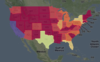
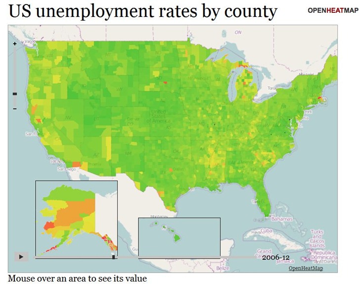
The OpenHeatMap site lets you create heat maps and choropleths from uploaded spreadsheet data (CSV format), or Google Docs Spreadsheet data (which makes it continuously updatable). It supports location coding by latitude/longitude coordinates, or by a large number of name/code attributes (e.g. address, FIPS code, zip code, state, province, country). And as a bonus, you can also have time as a variable, letting you create animated heatmaps or choropleths. Here’s a snapshot of a time-animation of US unemployment by county (see the live map here):

ohm1

There’s a gallery of sample maps, some of which are embeddable, like the map below of fast-food locations in the US. It’s still a little buggy; the map on the gallery page lets you select between McDonalds, Subway, and Chik-Fil-A, while this embedded map doesn’t show those options.

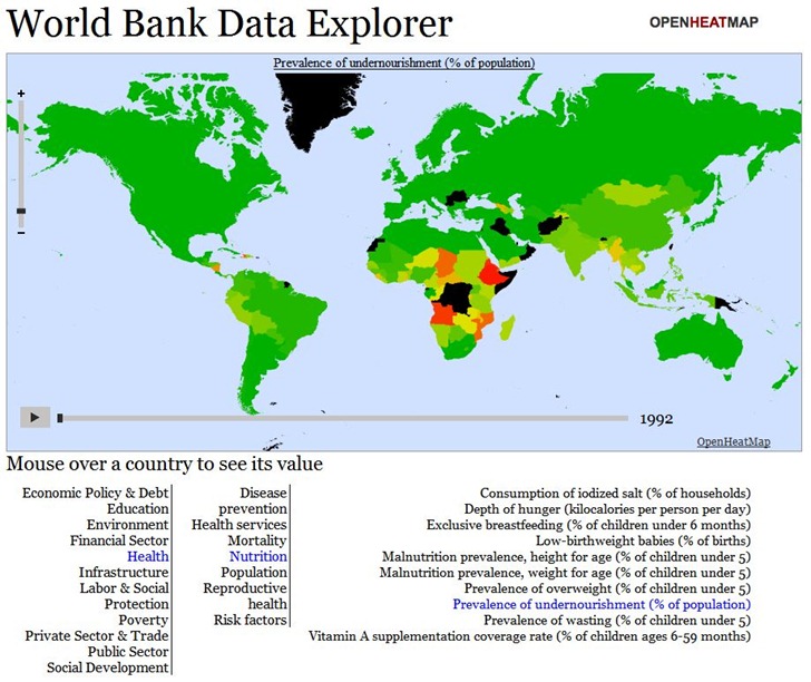
If you’re willing to dive deep into Javascript, you can create fairly sophisticated online maps allowing the choice between hundreds or even thousands of datasets. Below is a snapshot of the World Data Bank Explorer map from the Gallery; this map lets you choose from over 1000 different demographic/economic datasets, and offers animated views over time:

ohm2

But you’ll need to dive deep into Javascript to create such a sophisticated map; there’s a documentation wiki, but the available documentation is a bit sparse. Basic maps are pretty simple to create, though, and the data upload page offers links to sample datasets (Google Docs spreadsheet links) that you can create sample maps with; copying and pasting the Google Docs spreadsheet link addresses into a browser will give you examples of how the data should be formatted.

Here’s a short video from Pete Warden, developer of the site, with a intro to the service: