blankblank blank


Archive for the 'Google Maps' Category

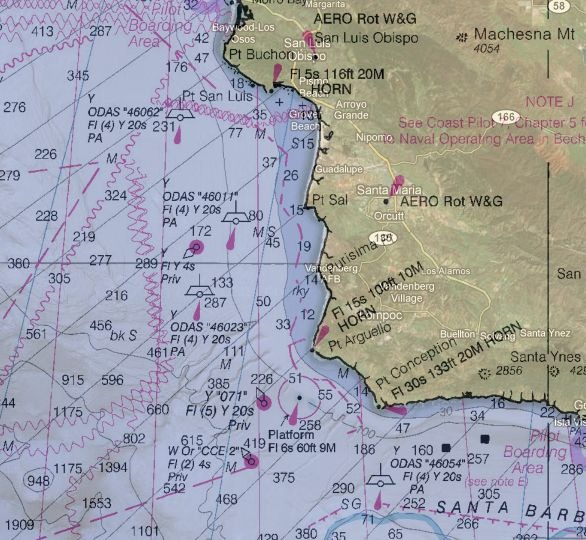
Free Marine Chart Views, Plus An Online Waypoint/Route Editor With GPS Export

The Marine GeoGarage site offers free online views of marine charts from the following countries:

  • USA
  • Bahamas
  • Argentina
  • Brazil
  • Netherlands

A  10-euro monthly subscription (free 14-day trial) gets rid of the ads, and adds charts for the following countries:

  • UK and vicinity
  • Canada
  • Australia

Choose the country from the list at upper-right:
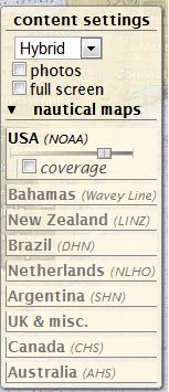
gg_1

The slider controls the transparency of the marine chart overlay in Google Maps; slide it all the way to the right, and the map disappears completely (more on this shortly). Map detail level scales with the zoom, so if you start zoomed out:
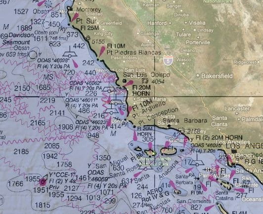
gg_2

And then zoom in :

gg_3

Map detail scales accordingly, if maps are available at different scales.

There are three checkboxes in the control section:

  • photos – shows geotagged panoramio photos. There’s usually so many of them near coastal areas that this feature is pretty useless.
  • fullscreen – Blows up the map interface to full size (but doesn’t get rid of ads in the free version).
  • coverage – Shows the coverage areas for all marine charts available at different scales, useful for seeing whether you can zoom in for more information:
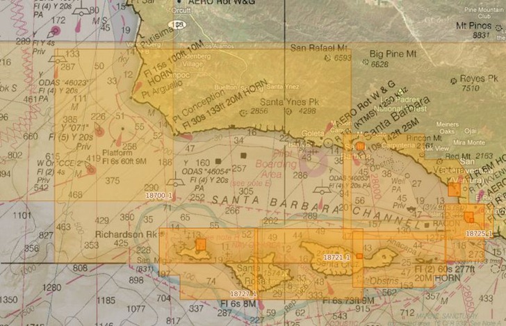
coverage


There’s a scalebar at lower left, with the option to set the distance units used, and view the cursor coordinates (though the latter is a bit slow to update):
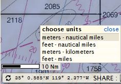
scalebar

So far, useful mainly for mariners. But the site also has editing tools that let you create GPS waypoints and routes; while these are useful for marine navigators, setting the map transparency to 100% lets you create terrestrial GPS waypoints and routes anywhere in the world. For example, by using the waypoints and routes toolbar:
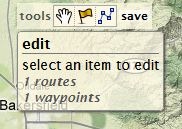
tools

Plus setting the marine charts invisible, and setting Google Maps to Terrain view, I can create/edit waypoints and routes:
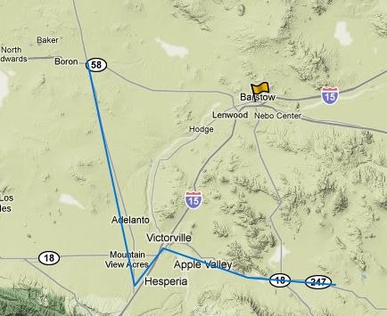
wr

And then export them to a GPX file for use on my GPS:
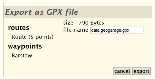
export

If you own a Garmin GPS unit, and you have the free Garmin Communicator plugin installed on your browser, you can even export the data directly from the website to a connected Garmin GPS.  Logging in with either free registration, OpenID, Google login, or other credentials, lets you save this data online for future editing and use.
Generate Custom Color Code For Google Maps

The Google Maps Colorizr website lets you set alternate colors for various features in Google Maps, preview the results, and then generate the Javascript code to implement that color change on your own maps.

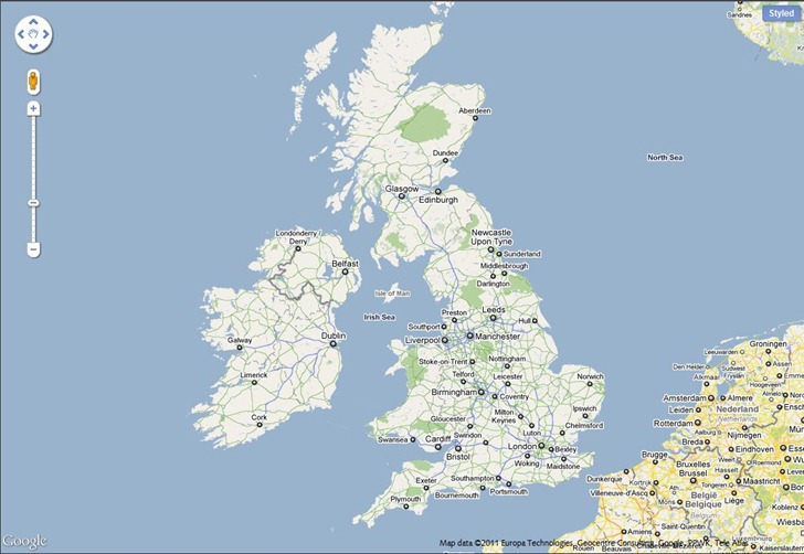
Start out with the original colors:

map_orig

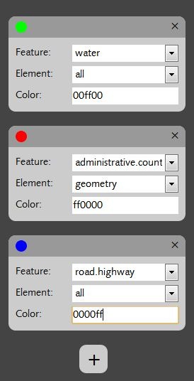
At left, you can add feature/color sets with the “+” button, select from all the features types using a dropdown menu, choose geometry/label/both, and then specify the color (RGB hex code, e.g. ff0000 is full red, ff00ff is magenta):

codes

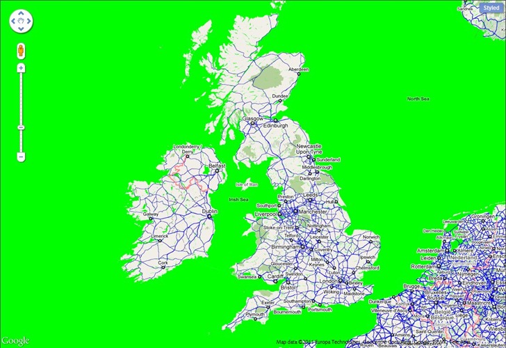
Color changes are updated on-the-fly in the map view:

map_alt

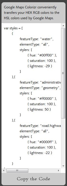
And at right, the code that will create these changes on your site is displayed in a text box; just copy and paste it into your code:

code

Nineteen feature types are currently included in the dropdown. Source code for the site is available at github, so you can create your own custom version of the site if you like. A neat little tool to make your own Google Maps more distinctive and unique.


Panorama Generator For Parts Of Europe, Asia And Africa

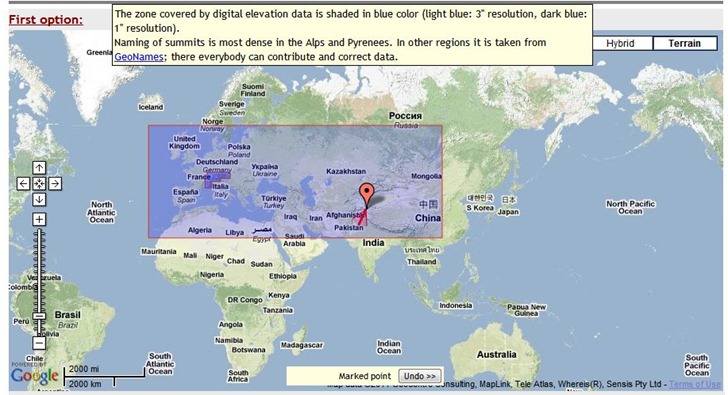
The Generate a Panorama site lets you generate high-quality panorama views, with labeled peaks, for some areas of Europe, Asia, and Africa; moving your mouse cursor over the “Covered areas in Europe, Asia and Africa” link near the top of the page shows the coverage area:

2011-04-26_192531

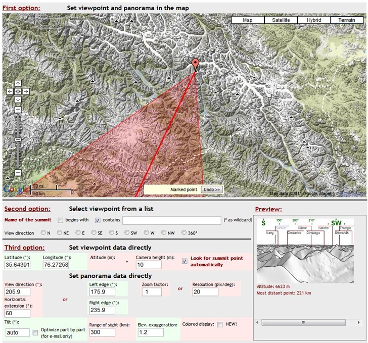
You have three options for setting the peak location:

  • Clicking directly on the map to set the location, then adjusting the direction of view.
  • Choosing peaks from a searchable list
  • Entering the exact latitude/longitude, and also setting camera height, distance, viewing angles and more.

As you adjust the position and parameters, you get a mini-preview of the view at lower-right:

pg_2

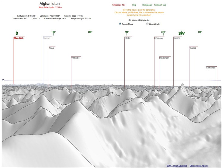
When everything is set, you have the option of either emailing a copy of the panorama to yourself or someone else, or viewing it in the browser:

pg_3

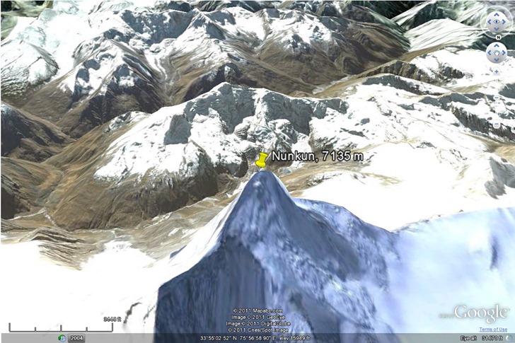
Peaks are clickable, and you can choose to have a peak location highlighted either in Google Maps, or the Google Earth browser plugin:

pg_4

There’s also a “Telescope 10x” option to blow up a section of the panorama, but I couldn’t get that to work.

Data resolution is 1 arc-second (30 meters) for the Alps, and 3 arc-second (90 meters for the rest of the world). Hopefully, the rest of the world will be covered at some point in the future. The panoramas look better than the ones generated by the HeyWhatsThat site, but that site offers worldwide coverage, and additional features like viewshed export to Google Earth.

Via Google Maps Mania.


View NGS Benchmarks, UTM Zones, PLSS Meridians And More In A Web Interface

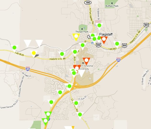
The Surveying.Org website plots a number of useful survey-related data features in a Google Maps interface; select one or multiple data features to display with a checkbox.

National Geodetic Survey Benchmark locations

ngs_control

Takes a few seconds for them to pop up. The different symbols correspond to various classes of accuracy for the benchmarks, both horizontal and vertical. Click on a benchmark icon …

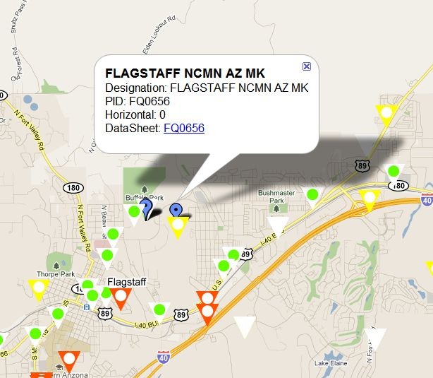
datasheet_popup

… and get at popup with the name/designation of the benchmark. Clicking on the datasheet link brings up a full datasheet with coordinates, quality information, and more.


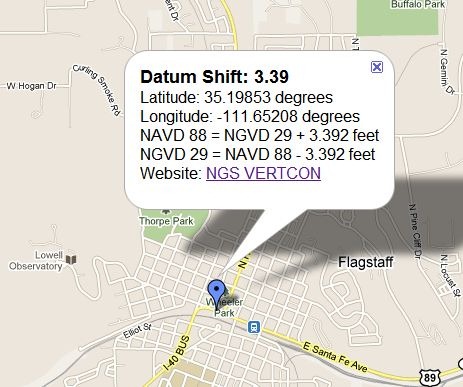
NGS Vertcon info

vertcon


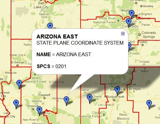
State Plane Coordinate System (SPCS) Zones

spcs

A few of the icons/popups are slightly misplotted, like the second one in the lower left, but they’re close enough to their respective SPCS zones to let you figure it out.


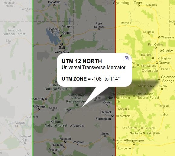
UTM Zones

utm

This is the only dataset that’s good for outside the US; UTM zones are displayed for the entire world.


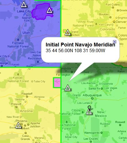
Meridian locations for Public Land Survey System (PLSS) designations (Township/Range/Section)

plss

Also slightly misplotted in a few cases, as with the Navajo Meridian above, but close enough to figure out.


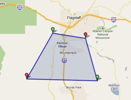
Area/length measurements

areaplot

Finally, you can put the web app into either line length or area mode, and then click on the map to define vertices for a measurement. Above, an area is defined …

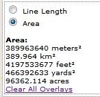
areadata

… and the area given in various units. Click and drag on a vertex to move it; Ctrl-click on a vertex to delete it. Doesn’t seem to be a way to add a vertex to a line segment, though.


Monitor Ship Positions And Tracks Real-Time With MarineTraffic.Com

If you’re at all interested in maritime traffic, the MarineTraffic.com site is a terrific resource. And even if you’re not, it’s worth checking out as an example of how you can display real-time data in many different ways on one site using the Web.

mtweb_1

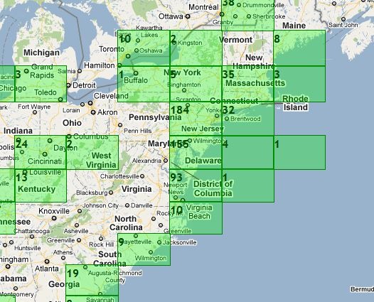
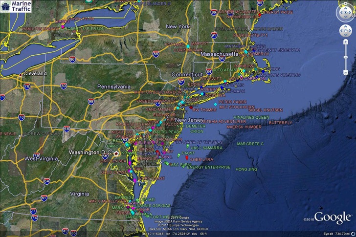
The main map view shows green gridded areas where the site has information on marine vessels; this includes not just the ocean, but also major inland waterways like the Great Lakes and the Mississippi River. Click on a grid square to zoom in.

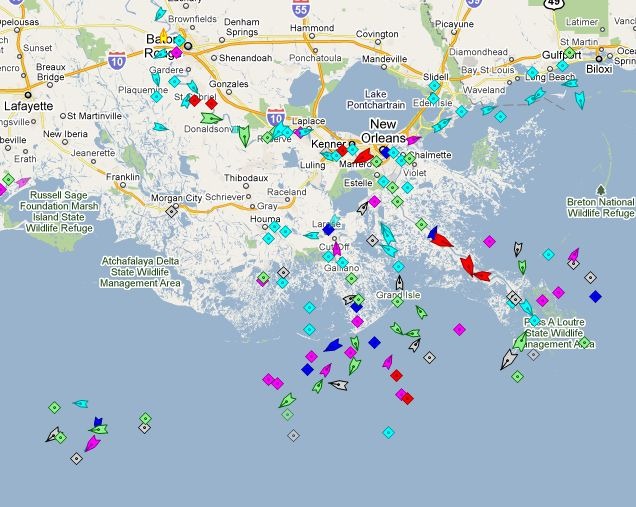
mtweb_2

Triangles are ships in motion, with the point showing direction; diamonds are anchored/moored ships, or navigation aids.

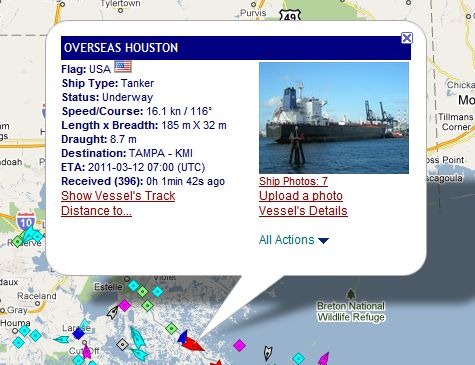
mt_popup

Click on a ship to pull up a popup balloon with more info, and links to even more information.

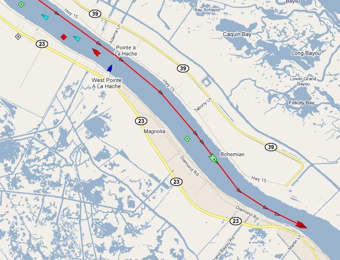
mt_track

Clicking on “Show Vessel’s Track” brings up its recent travel path; passing the cursor over the track brings up time/speed/bearing data for every marked point.

mt_options

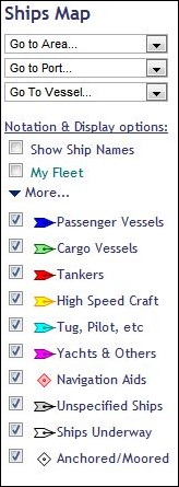
The map’s options section shows you the ship color legend, and lets you turn on/off display of various types, as well as showing their names. You can “bookmark” ships into “My Fleet”, and also go to specific ports/areas/ships with the dropdowns.

The Services section offers many other data options, including:

– The ability to embed a map with real-time ship data on your website.

– Apps for iPhone and Android (Android app reviewed today at AndroGeoid).

– A mobile-enhanced website for use on other mobile platforms.

– A KML network link for use in Google Earth.

mt_GE

HT to Goya Bauwens.


Satellite Prediction/Tracking In Google Earth/Maps

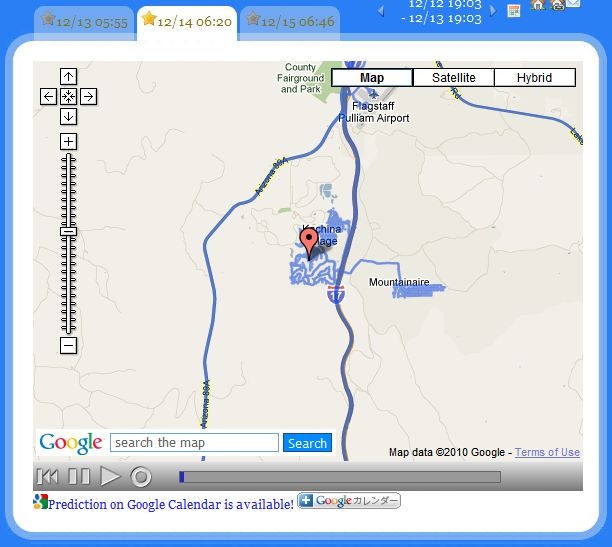
The SightSpaceStation website offers some eye-catching satellite position tracking and position web apps. Set your home position in Google Maps (scroll, then click on the home icon near the top):

home

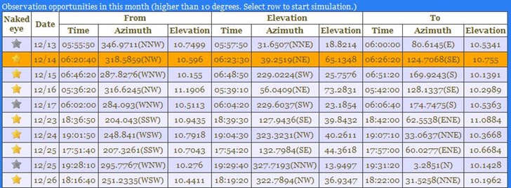
And get a table of upcoming International Space Station (ISS) flyovers near your home location, with “good” ones (good chance of spotting it with your naked eye) highlighted with gold starts:

table

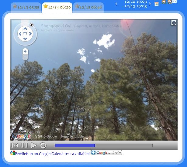
There’s even a link that will let you add the flyover time to your Google Calendar. If Google StreetView data is available for your location, you can play an animated view of the ISS’s sky track in Google View to see where it will track relative to your local landmarks:

track

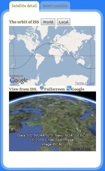
There’s a mini-map screen showing the position of the ISS at that moment, plus a second “out-the-window” view showing what the ISS occupants would see below them as they orbit the earth:

mapscreen

When you play a StreetView flyover, this mini-map will switch to show you the position of the ISS during the flyover, as well as the view out of its window.

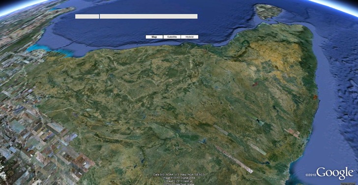
You can load that animated “window view” full-screen into your browser using the Google Earth plugin, or download a KML file which will display it in the stand-alone  (which looks very cool, especially in animated format):

ISS_view

There are a few other satellites you can choose from: Hubble, Resurs, TRMM, UARS.

Site can be a bit quirky, and you may have to reload/refresh it to get out of some screens, and back to the main screen.


Nuke A City With The Ground Zero Mapplet

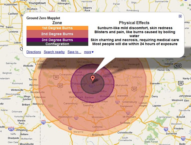
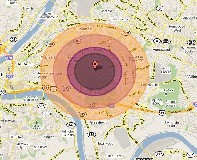
Bit of a grim app, but the CarlosLabs Ground Zero Mapplet will show the effects of various-sized nuclear weapons on a number of preset world cities. Here’s the impact on Pittsburgh of the “Tsar Bomba” blast, the most powerful nuclear weapon ever tested at 50 megatons:

tsarbomba

Most other blast options are for much less, like the 15 kiloton “Little Boy” dropped on Hiroshima:

hiroshima

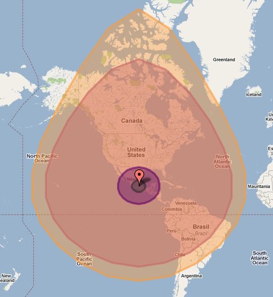
But the largest explosion model available is an asteroid impact comparable to the Chixculub impact 65 million years ago that caused dinosaurs to go extinct:

asteroid

The main version is a Google Maps Mapplet, so you’ll need a Google account to use it in your My Maps collection. There’s a direct link to install it into My Map at the CarlosLab website. The Maps API link will take you to a page with embeddable code that lets you put a comparable app into your web page, like the live example below:

Unlike the Mapplet, the embedded app lets you select any location, but the overall map size is constrained. Source code for this app is available at the link above.


Two Javascript Mapping Libraries

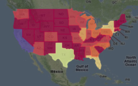
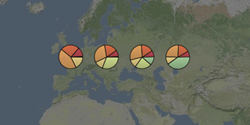
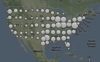
Cartographer: Free Javascript libraries (MIT License) for generating basic thematic maps.

ex_choropleth
Choropleth
ex_pies Pie charts ex_cluster
Cluster

Links to additional live examples at the website. You can hard-code data values, or retrieve them from an online source like a Google Spreadsheet.

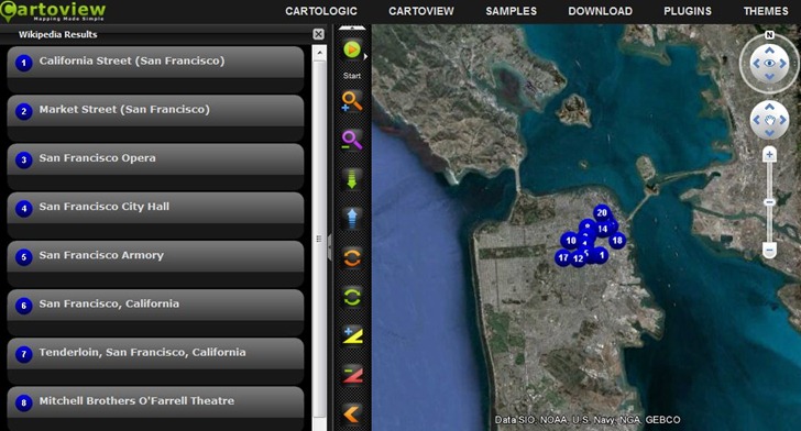
Cartoview: Open source software that “makes building and editing maps a breeze…”. I wouldn’t go quite that far – I think you’ll need quite a bit of experience with Javascript, Google Maps and webservers to get this up and running. But there’s a substantial amount of help available, including tutorials, online help files, and a user forum. There are also a number of online demos, with links to downloadable source code for the demos to help you figure out how to do stuff. I gotta say, some of the demos look very impressive, like this Google Earth plugin view that lets you plot points/data from online resources (Wikipedia, Yelp, Foursquare, Twitter, etc.), with user-definable interface styles:

cartoview