Chris Duncan writes to let me know about his online mapping tool/service, Plug and Play Maps (slogan: “Just Add Data”), that lets you take data in number of formats:
- Spreadsheet/text (CSV)
- JSON string
- DBF
- KML
- Shapefile
- Web database
And display it as a thematic map in Google Maps, with colors/shapes representing thematic values (with limitations for some formats like KML and shapefile). Some live examples shown on the website include:

Icons colored by discrete category

Icons colored by variable value

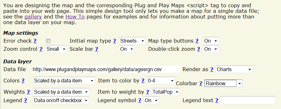
Plug and Play maps only provides the scripts to create the maps, but doesn’t host the maps themselves; you’ll need a free Google Maps API keycode to add the maps to your web pages. And while the site has a simple Designer tool with map preview that can help create basic maps …

… accessing all the features, and getting everything to look the way you want, will likely require you to work with and modify the script code generated by the site. So despite the “Just Add Data” slogan, I wouldn’t really call it “Plug And Play”; it does require some work. But there’s an extensive documentation section, all the examples in the gallery come with the script code used to generate them, and the script code itself is straightforward enough that anyone with minimal coding skills (e.g. basic HTML) should be able to figure out how to get things done. For example, here’s the code used to generate the pie chart map shown above:
<script src='https://www.plugandplaymaps.com/js?datafile1=http://www.plugandplaymaps.com/gallery/data/agesrgn.csv&sym1=charts&chartitems1=0-4,5-17,18-29,30-49,50-64,65-up&chartcolors1=lightblue,yellow,orange,lightgreen,lightgray,lightred&weightitem1=TotalPop&weightminval1=2500000&weightmaxval1=60000000&legtext1=Age Distribution&datafile2=http://www.plugandplaymaps.com/gallery/data/regions.csv&loctagitem2:ST=State&sym2=areas&coloritem2=Region&colorbar2=pseudo&legtype2=none&perimopacity2=0&weight2=0.25&zoominit=25.5,-124.5|50.5,-65.5'></script>
Click on the CSV data links to take a look at the data; compare the code, the data, and the map generated, and along with the documentation you should be able to figure out what’s going on.
On a related note, if you’re interested in thematic shapefile display in Google Maps, check out this old post on Google Map Creator.