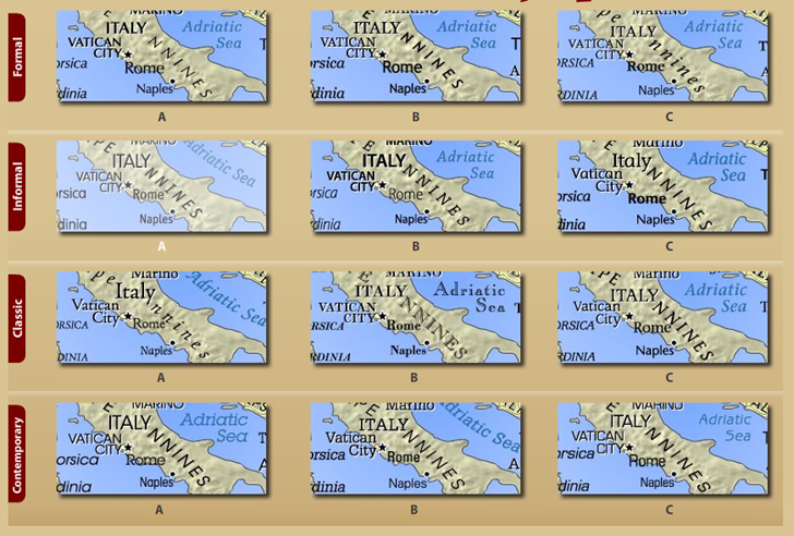
I’ve covered ColorBrewer, an application for assessing color schemes for maps, in a previous post. In the same spirit comes TypeBrewer, an online application that “offers a quick and easy way to explore typographic alternatives and see the impact that various elements of type have on the overall look and feel of a map”. It doesn’t actually design a map, but rather shows you how different fonts and styles appear on a sample map. Select a set of sample font types from the initial choices:
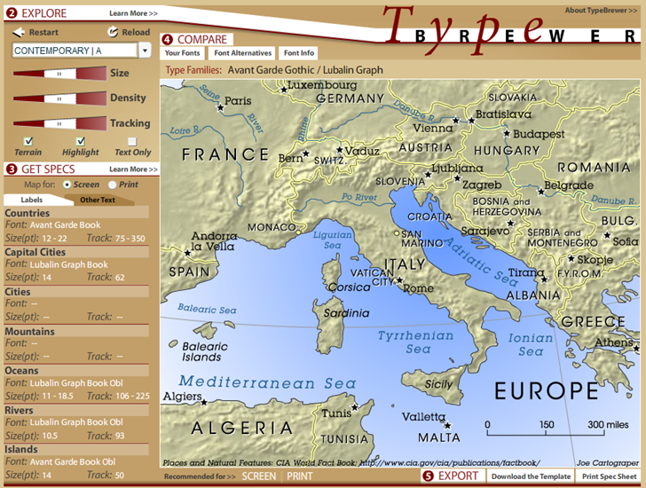
And get a control screen that lets you adjust some of the font/map parameters:
If you find a font scheme you’re happy with, you can export it as a template for Adobe Illustrator, or print a spec sheet that lists all the data onscreen in a convenient format.
The biggest limitation is the inability to add/substitute your own fonts to the viewed schemes, although you can see what fonts are on your system and compare them to the used fonts. Still, TypeBrewer is worth playing with for a few minutes, especially for novice cartographers.