Zonums Solutions has a new free online utility called “Color Your Map” that lets you create a custom KML file representing a country as a filled-in polygon with a specifiable color. For some countries, you can break the representation down further by subdivisions such as province or state, and for the US, you can create state polygons broken down by county.
At the Color Your Map site, select the single desired country/state from the table by clicking on it (click on the image for a larger view):
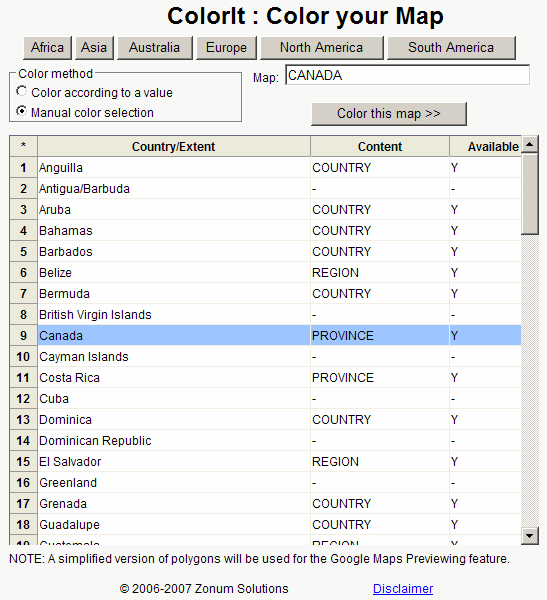
The table lists countries/extents, “Content” (whether the selected country is further delineated by subdivisions), and whether it’s available or not. Clicking on the continent buttons at the top brings up the appropriate table for that continent/area. You have two choices for coloring areas that have subdivisions:
- “Color according to value” lets you set starting and endpoints for a color spectrum, and numerical values for every subdivision; Color Your Map will create a choropleth map based on those colors and numbers
- “Manual color selection” lets you choose the individual colors for every subdivision
Click on the “Color this map” button after making your selections, and you’ll get the color selection screen:
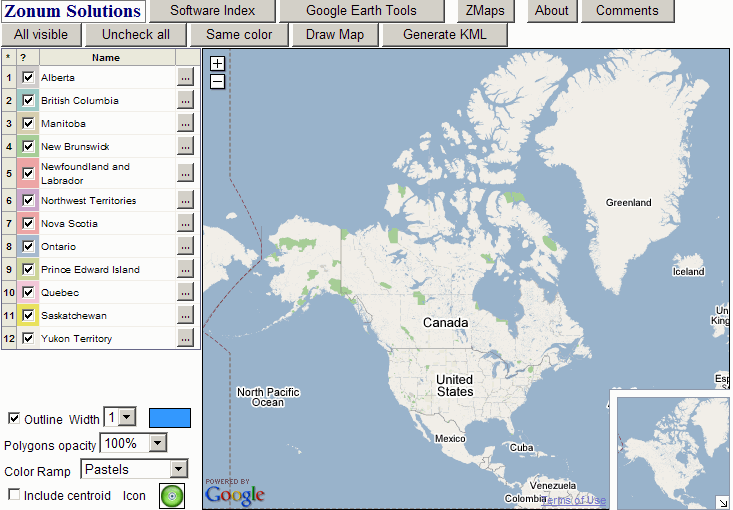
Unchecking a box for a subdivision will render it invisible in the final product; clicking on the box to the right of the subdivision name (gray with three dots) brings up a palette selection to let you change the color used to draw that subdivision:
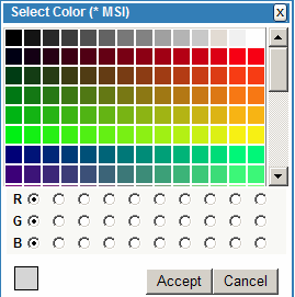
You can also change the set of colors used for the subdivisions by selecting a different “Color Ramp” from the drop-down at the lower left (Pastels, Minerals, Cool Tones, etc.). There, you also set the polygon opacity, outline color and width, and polygon centroid, but you can also modify those directly in Google Earth as well. If you want all the subdivisions the same color, clicking the “Same color” button at the top brings up the palette to let you set that “same color”, and then sets all the subdivision colors the same; change the “Color Ramp” if you want to go back to different colors again.
To see a preview of the color scheme, click on the “Draw map” button, and it will appear in the Google Maps window on the right:
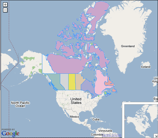
If you’re not happy with this set of colors, change what you want, and click on the “Draw map” button again. You may notice that some of the polygon edges are a bit ragged, and don’t conform exactly to the boundaries on Google Maps. But if you create the KML file by clicking on the “Generate KML” button, and load it into Google Earth …
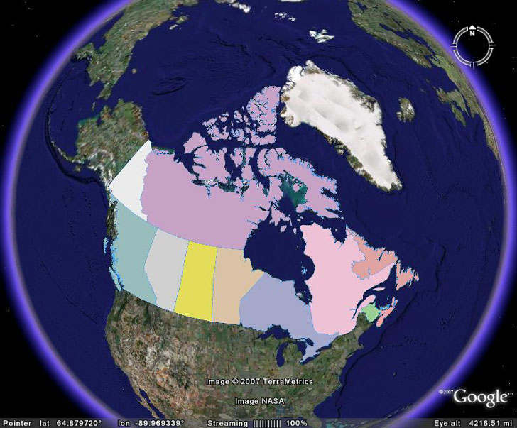
… you’ll see that the final version doesn’t have that problem.
If you selected “Color according to value” in the initial step, the color selection process is slightly different:
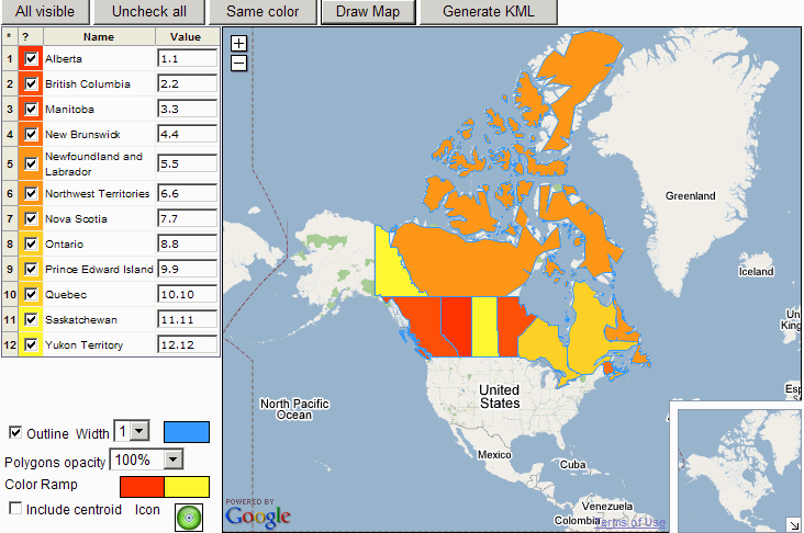
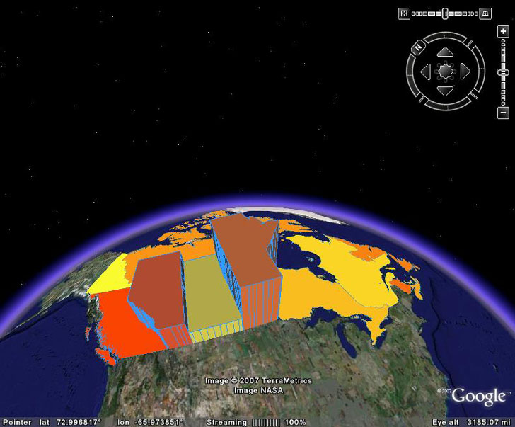
Here, you select the start and end colors for the color ramp by clicking on the “Color Ramp” colors in the lower left, and specify the subdivision colors by entering numbers in the boxes to the right of the subdivision values. The default values are just arbitrary numbers based on alphabetical order, but you could easily enter statistical data values (e.g. population density, income, etc.) to make the colors more meaningful. While you can’t specify the polygon height in “Color Your Map”, you can do that in Google Earth by right-clicking on a subdivision and changing the altitude:
Great find! This will really help with making maps.