blankblank blank


Archive for the 'Web apps' Category Page 3 of 10


Basic Google Maps Heat Map

Tixik Heatmaps – Lets you add a basic heat map to a simple Google Maps display. Create a “CSV” file of latitude/longitude pairs, with coordinates separated by a semi-colon, and each pair on a new line:

48.0043953135;0.2025604248

39.7117426603;3.4630966187

42.6976396896;2.8954124451

etc.

(Taken from the sample file).

Put the file online someplace, and then substitute its web address for “CSV_URL” in the Google Maps code below:

var tilelayer = new GTileLayer(new GCopyrightCollection(), 0, 17);
 tilelayer.getTileUrl = function(tile, zoom) {
   return 'http://api.tixik.com/scripts/tile.php?x='+tile.x+'&y='+tile.y+'&zoom='+zoom+'&csv=CSV_URL';
 };
 tilelayer.getOpacity = function() {return 0.7;}
 map.addOverlay(new GTileLayerOverlay(tilelayer));

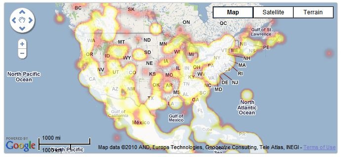
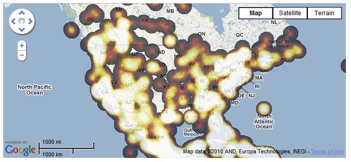
Add this code to your Google Maps embed code, and get a basic heat map (sample map from Tixik website):

heat1

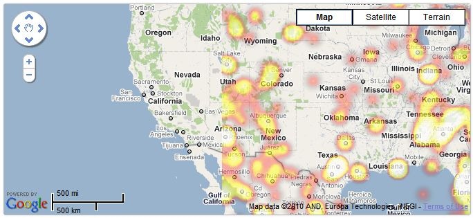
Fast, simple and basic – not a lot of options. Bit quirky/buggy, too – check out this zoomed-in area, which dropped some of the data (rest of the world looked fine:

heat2

Colors can also vary depending on the browser you use; the examples above are from Chrome, while the same map in Internet Explorer 8 looks like this:

ieheat

For quick and dirty heatmaps with Google Maps, Tixik Heatmaps seems like a decent option. But there’s an option for use with other map backgrounds that’s more flexible in display options, data format, and embeddability; more on that tomorrow.
Displaying GPS Data On A Website

Got an email a few weeks ago from someone who wanted to post data taken with a GPS, in GPX file format, and display it as an embeddable map on his blog; he couldn’t find anything on that on the web. I offered one possibility, and he in turn suggested that I might put up a brief post on the topic. Here’s a few ways to do it, off the top of my head.

Some of these will require you to convert your GPX data into an alternate format, like KML or shapefile. A search of this website will bring up lots of programs that can do these conversions, but probably the simplest way is to load your GPX file into Google Earth, then export the data in KML or KMZ format. Note: All of these sites require you to create a free account.

Google Maps My Maps – The alternative I suggested; not a lot of features, but very easy to use. Import KML/KMZ files from your computer or a web link, use the built-in editor to add additional features. You can then display the map on your website using a widget.

Google Docs Spreadsheet – If you convert your GPX files to CSV files using a program like DNRGarmin or GPXToPOI, you can import the data into a Google Docs spreadsheet; Google offers a tutorial on converting that data into a KML network link for display in Google Maps or the Google Earth plugin.

GeoCommons – Just posted about this yesterday; upload your data and display it in widget format. All data you upload will be available for anyone to use or download.

MapChannels – Lots of map creation features, and embeddable maps.

ScribbleMaps Pro – Similar to Google Maps My Maps, but offers lots more import options and drawing tools. Highly recommended.

Feel free to add your own recommendations in the comments section.


GeoCommons Relaunches

Been meaning to post about GeoCommons for quite a while now, and while I’d like to take credit for knowing that they had a major site reconstruction in order, it’s more like I just hadn’t gotten around to it yet. GeoCommons lets you upload and map data in a number of formats:

  • Shapefile
  • KML (upload or web link)
  • Comma-separated variable CSV
  • GeoRSS (upload or web link)
  • RSS / ATOM (web link)

The “Commons” part comes because any data you upload is freely available to anyone else, so this isn’t a site for those who want to keep their data private or control it. Once uploaded, you can plot it in a variety of styles (with help from a Color Brewer color picker), against any number of available backgrounds:

  • Road:OpenStreetMap, Google, Bing, Yahoo, World Bank, MapQuest
  • Aerial: Google, Bing, Yahoo, NASA Blue Marble
  • Hybrid (roads and aerial): Google, Bing, Yahoo
  • Terrain: Google
  • Or a solid background color

Multiple layers can be plotted if desired. Once completed, you can send people to a permanent link at the GeoCommons page to view it, or embed it into a website (like below; feel free to scroll and zoom):


View full map

You can also view the data in 3D using the Google Earth browser plug-in.

I found the map creation process incredibly easy, but the data upload process needs some work. It took me five tries to get this fairly small Arizona faults shapefile uploaded; hopefully these bugs will be ironed out soon. This shapefile data was in geographic coordinates, WGS84; if you have shapefile data in any other coordinate system, you’ll need to upload  a .prj file with it; and if you don’t upload the .shx and .dbf files with your .shp file, it will ask for them. All other data formats have to be in latitude/longitude, WGS84 datum. And it will ask you for a substantial amount of metadata to be associated with the actual data files, although much of that isn’t mandatory.

Any data uploaded to GeoCommons can also be exported in shapefile, KML and CSV formats (Beta ATOM, JSON and Spatialite format export available). The recent release has also added address geocoding, time animation, and “GeoJoining” (connecting names with common datasets). A paid version of the service called GeoIQ offers a bigger feature set, including advanced analytical tools.


Compare Geographic Areas With “How Big Really”

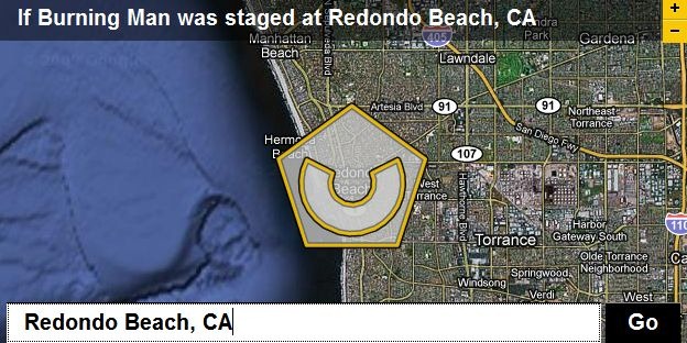
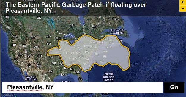
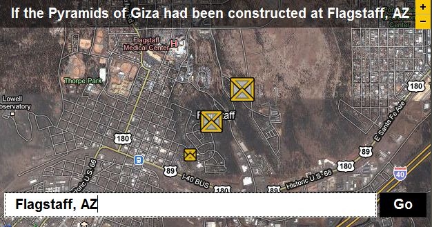
The previously-covered “Move Outlines” site let you trace a border around a geographical feature, then compare that border size with any other area in the world. The BBC’s Dimensions website (aka How Big Really) is a nice companion site; while it doesn’t let you draw your own border, it has pre-drawn areas covering a number of different topics, like Environmental Disasters:

garbagepatch

Ancient Worlds…

pyramids

Festivals and Spectacles …

burningman

… plus Space, Depth, The War on Terror, The Industrial Age, Battle Of Britain, and Cities In History. Great for getting a sense of scale.

Via Digital Geography.


Online Map Check And Area Calculator

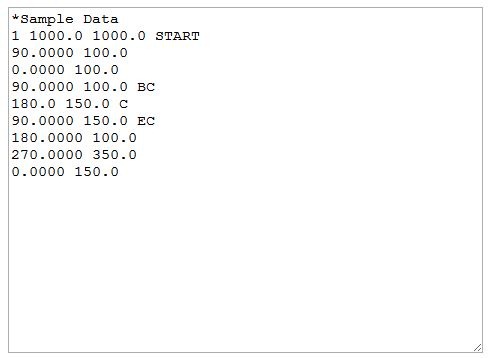
Here’s a unique free web app from Underhill Geomatics Limited. The Online Map Check And Area Calculator lets you enter bearings and distances, say for the boundaries of a parcel/plot, check on their closure, plot the parcel/plot and calculate the area enclosed. Enter a starting coordinate, and get coordinates for every point entered by distance/bearing. Circular curves are supported by entering the center point of the curve and radius of curvature. Full instructions included on the main site page, and a sample dataset is preloaded into the data entry box:

sampledata

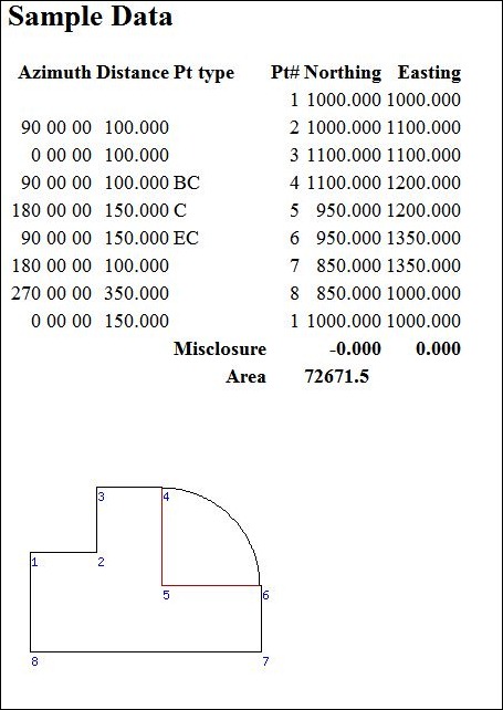
Press Calculate, and get the results:

sampleresults

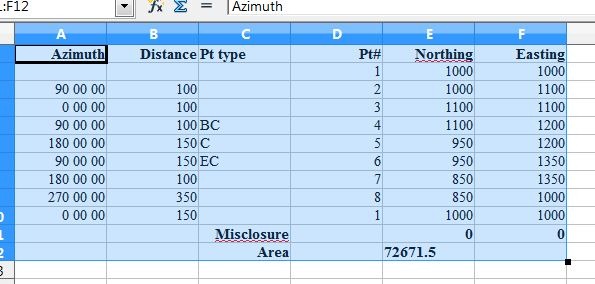
Select and copy the data from the web page, and you can paste it into the desktop app of your choice, say a spreadsheet:

tabdata


Daylight Hours Explorer

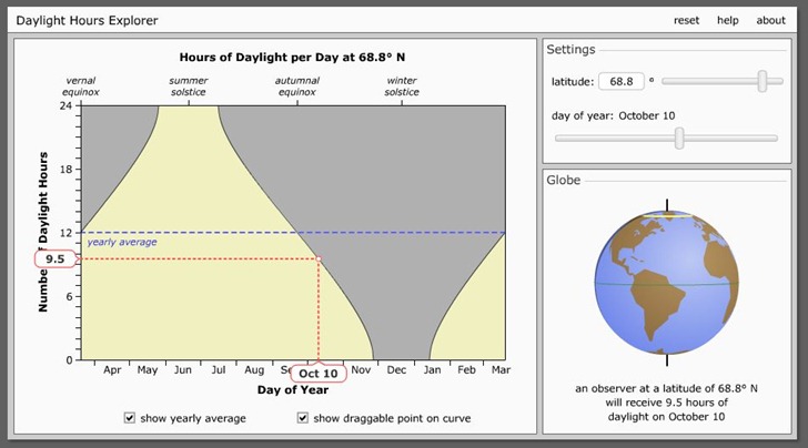
Daylight Hours Explorer is a simple online tool to visualize how many hours of sunlight a particular latitude gets during the course of a year. Move the upper-right slider to change the latitude; move the lower-right slider to change the date, with hours of daylight below the globe. With “show draggable point …” checked, you’ll see the dotted lines on the graph, and also be able to change the date by clicking and dragging on the point on the curve:

daylight

Option to show yearly average (as above). You can also click and drag the globe to spin it around, useful for seeing how the day/night terminator orientation changes with time. Links to download the Flash animation to your desktop for offline use. From the University of Nebraska-Lincoln Astronomy Department; site has lots of additional animations, most astronomy-oriented (but a few with geographic connections).


Compare Point Latitudes And Longitudes With Iso-Longitude-Latitude

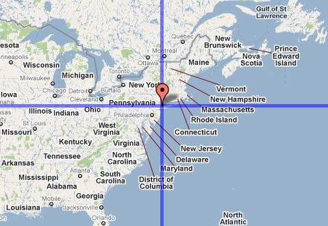
For some reason, I have this mental picture of Europe being at about the same latitude range as the US, and I’m often startled when reminded that much of Europe lies well north of the lower 48’s northern border. The Iso-Longitude-Latitude site shows this graphically; put a marker on a point in a Google Maps interface, say near New York City:

nyc

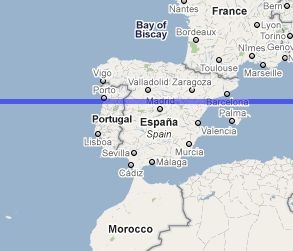
And lines of constant latitude and longitude will be drawn through that point in the first map window, and in a second one directly below it. By scrolling the map eastward, I can see that Madrid is at about the the same latitude as NYC:

madrid

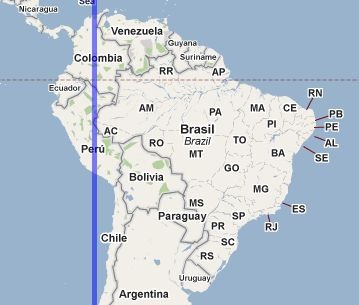
And that most of South America is east of NYC:

sa

You have the option of showing the “anti-latitude” and “anti-longitude” of a point as well; anti-latitude is the equivalent south latitude of a northern latitude (and vice-versa) e.g. +40 and -40, while anti-longitude is180 degrees opposite longitude, e.g. –75 and +115. “Anti” lines are drawn in red.

You can enter multiple point positions on a map, and their coordinates will show up in a text box; alternately, you can copy and paste coordinates into the text box and display them on the map. Finally, you can save a URL that will save and display all the points you’ve entered.


Distances And Calories Burned With The Gmaps Pedometer

Another route-drawing app for Google Maps, but with some unusual features. The Gmaps Pedometer lets you create a route by clicking in a Google Maps interface, as do many other similar apps. Some of its features are:

  • The route can be straight lines between points, or be automatically routed for either running-friendly or cycling-friendly routes
  • Optional mile markers can be drawn along the route
  • Total route distance is calculated on the fly
  • You can display a graph of elevation change over the route
  • You can automatically do an out-and-back calculation for a return trip by the same route
  • Enter your weight and get an estimate of how many calories you’ll burn
  • Save the route as a permanent link
  • Print the map
  • Export the route to GPX (this is an external link to the GMapToGPX site)

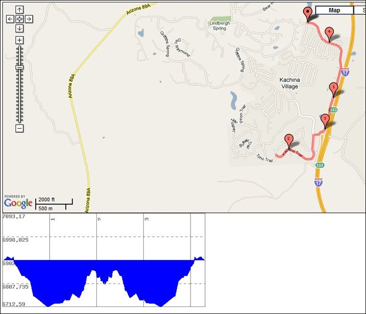
Map/route and elevation display:

mapandelevationdisplay

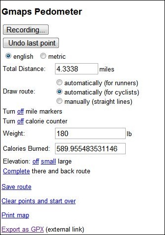
Control panel and info readout:

cp

Tips:

  • Set all parameters (units, calorie counting, mile markers, etc.) before you start adding points; there doesn’t seem to be a way to change those after you’ve created the route and have those changes reflected in the map/display
  • Press the “Start Recording” button to start entering points, and double-click on the map to enter a point
  • If you want to export the route as a GPX, you should visit the GmapToGPX site first, and configure your browser as indicated to allow GPX export.
  • I modified the Gmaps Pedometer link slightly so that it would start out centered on the US; to customize it for your own center point, take the link URL (http://www.gmap-pedometer.com/?centerX=-90&centerY=35&zl=13&fl=m) and substitute your desired longitude for the centerX value, and latitude for the centerY.