So I mentioned to a friend that I had just received a review copy of the new second edition of Making Maps by John Krygier and Denis Wood, and she exclaimed, “Oh, our university GIS department loves that book!”. No surprise – since its publication in 2006, the first edition has a become a staple on many mapmakers’ bookshelves, and I expect the second edition will “suffer” a similar fate. If you make maps, you’d be well-advised to have some version of this title nearby for inspiration and guidance.
One thing to keep in mind is that this isn’t really a how-to guide, or a cookbook on how to create maps. Krygier and Wood look more at the rationale you should use in making basic design decisions for your map and how to put it all together, and less so at how all the pieces fit together at the end (though that’s not entirely ignored). Examples abound, but usually look at the individual pieces of a map (color, typeface, symbology, classification, projection, etc.) rather than the whole. Think of this as the mapping equivalent of McGee’s kitchen science classic, On Food And Cooking; it will give you the information and understanding needed to figure out why a recipe works, but doesn’t actually give you any recipes to follow. For examples of good mapmaking practices, you might consider Brewer’s Designed Maps: A Sourcebook for GIS Users; for a more how-to oriented approach, Peterson’s GIS Cartography: A Guide to Effective Map Design is very good, albeit crazily over-priced. But Making Maps is the book I’d consult first for guidance and inspiration.
One point to keep in mind is the book’s design; it’s very visually-oriented, and the layout on most pages isn’t what I would call linear. This makes it a poor choice for a reference title, but that’s not really its intent. The design forces you to go through entire sections to pick up their meaning, and I’m pretty sure that was the authors’ intent. They don’t want you to pick up just a piece here and there about various aspects of map design, they want you to think about the whole process of putting together a map.
I do have a few quibbles with the book, two minor, the other major:
1. The book is primarily in grayscale, with a few random color plates scattered about, and only the chapter dealing with color in full color. The authors explain at the end that the basics of map design can be explained without using color, and that therefore the use of color is kept to a minimum to keep the cost of the book down. I understand this, but can’t help but think that a greater use of color throughout the book would have made it more effective.
2. The book is likely to be adopted by many courses as a primary or supplementary text. While each chapter ends with a nice page of references to additional titles, one thing I would have loved to have seen are exercises/problems to engage the reader in a more active study of the issues raised by the chapter.
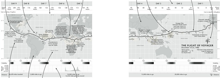
3. Finally, the book makes one major misstep. A map of the non-stop round-the world trip of the Voyager aircraft in 1986 is used repeatedly as an example to illustrate many of the ideas raised by the chapters. And it’s a terrific map to use for that purpose:

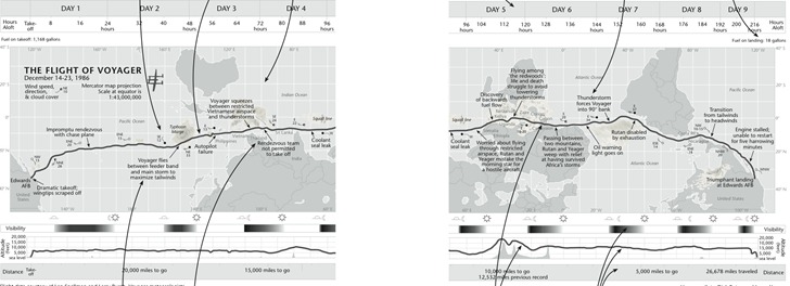
But about halfway through the book, the authors highlight that the direction of travel of the Voyager, from east to west (right to left), is counter to the normal direction we expect to see chronological events portrayed, from left to right. They suggested to their editor that they flip the map upside down to make the time direction left to right, but had this suggestion rejected. But since it’s their book now, they do that:

Noooooo! I couldn’t disagree more with this design decision. This is a map, a geographical construct, and geographic parameters should be primary here; you don’t mess with 500+ years of north being at the top unless there’s a very good reason for it, and time isn’t a good reason. Far better to put a few arrows in to indicate direction of travel/time than to make this directional flip. The author’s argument that the shape of South America is enough to “re-orient” the map for the viewer is undercut by the obscuring of the shape of Africa and North America, and the Pacific Ocean’s expanse, by plotted weather systems. It’s far easier to make the mental adjustment of time going right to left than dealing with “the world turn’d upside down”. I really hope they re-think this for the next edition.
If you don’t have the first edition, it’s a no-brainer for me to highly recommend this new second edition. But if you do have the first edition already, is the second edition worth the cost? Tough call. On his Making Maps blog, John Krygier goes through a list of the differences between the first and second edition, which included larger page size, adding extra map examples, and also paring down some of the content; the new edition is about 50 pages shorter than the first. I compared my copy of the first edition with the second, and there still is a substantial amount of overlap in material between the first and second editions, plus there are a fair number of examples missing from the second edition that I would have preferred they kept. Overall, while the second edition works better at presenting and explaining concepts than the first edition, it’s a toss-up in my mind whether it’s worth spending the extra $40 to upgrade if you already have the first (though you could, of course, buy the second edition for yourself and give your first edition to a starving cartography student ;-). But if you don’t have the first edition, and are serious about making good maps, grab a copy – you’re unlikely to be disappointed.
mapwindow
Thank you for your givings.
Thank alot
Leszek,
I have an unrelated question to this post.
I need to collect data points while driving. When I get back data points need to be imported to Google Earth. Currently I am using GPS Essentials app (which I found on your Android site by the way – awesome app), making pictures that have GEO tag embedded, then I load those pics to GE. So picture is my “data point”. Based on those pics, then I zoom in GE find the object I was interested in and draw a polygon around it.
Is there a better way to collect data points?
Mark
Any app that lets you take “waypoints” should work fine; examples include Locus, OruxMaps, GaiaGPS etc.; a search of the website should reveal a bunch more.
Thank you!
Leszek,
GE paid version has traffic counts data… Unpaid – not.
Do you happen to know if traffic count data is available anywhere that could be loaded into Google Earth?
Mark
Hahah! Maybe they should have mirrored the image, instead! :P